Quantcast
Channel: Art Contrarian
Viewing all 1106 articles
Browse latest View live

Molti Ritratti: Mrs. Musters

$
0
0
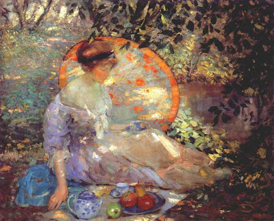
Where I live, the main art museum exhibits run the gamut from ghastly (a recent showing of feminist art from Paris) to mediocre to good. Those are my opinions, anyway.

Happily for me, the Seattle Art Museum is one of four U.S. sites for an exhibit of paintings from London's Kenwood House. Kenwood is undergoing restoration, so the artworks assembled by Edward Cecil Guinness, first Earl of Iveagh (1847-1927), he of the Dublin brewery family, had to be vacated to storage or the road. Guinness was extremely rich and astute enough to beat even more wealthy American art collectors to the punch during the late 1800s rush to acquire masterpieces.

The exhibit's title features the names of Rembrandt, Van Dyck and Gainsborough to attract visitors. But for me, the most interesting works were by British portrait painters active roughly 1750-1830. These included Joshua Reynolds, Thomas Lawrence, George Romney and Henry Raeburn, among others. Also on view was a very nice non-portrait chiaroscuro by Joseph Wright of Derby, a dramatic hawking scene by Edwin Landseer and the excellent Pieter van den Broeke by Frans Hals.

Whether by accident or design, on adjoining walls were hung portraits of the same subject by two different artists. That subject was Sophia Heywood, the Mrs. John Musters (1758-1819), a well-known at the time, socially prominent beauty of the late 1700s. The dirt on Mrs. Musters can be found here, and another piece that strikes me as being less well researched is here.

Here are the paintings I saw:

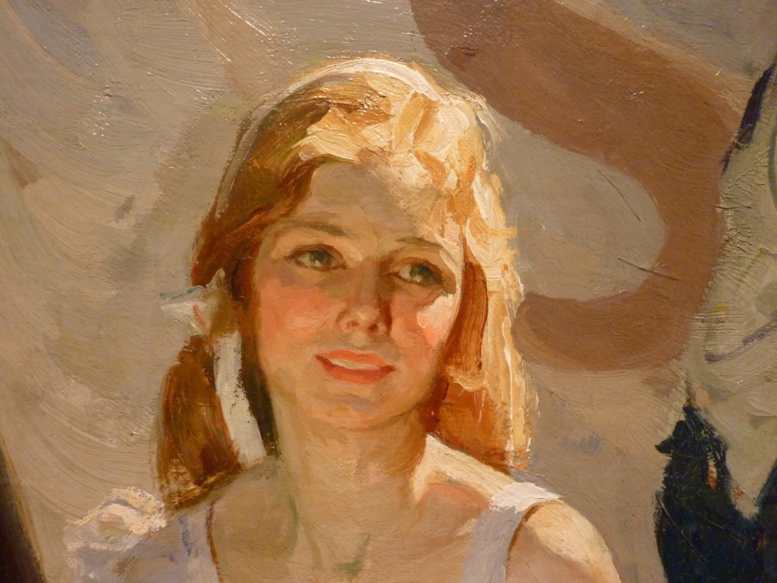
By Joshua Reynolds - "Mrs. Musters as 'Hebe'" - 1782

By George Romney - 1779-80

Glancing back and forth between the two works, I was struck that two highly competent portrait painters created images that, at a glance, didn't quite seem to be the same woman. Closer comparison reveals many similarities, however; what threw me off briefly were the darker, heavier eyebrows in the Reynolds painting and the darker hair.

By Joshua Reynolds - no date
Reynolds painted Mrs. Musters more than once. This is a formal portrait comparable to that by Romney. Again, the artists differ as to hair coloring. But they agree that she had a long nose, a small mouth and chin, and that her eyes had prominent lids.

By George Stubbs - "John and Sophia Musters Riding at Colwick Hall" - 1777
Famed painter of horses George Stubbs also painted Mrs. Musters as part of an equestrian scene that included her husband and his estate.

Detail of Stubbs painting

This is a detail of the Stubbs painting that someone was kind enough to leave on the Web. Mrs. Musters' image is probably tiny in the original, so it's hard to realistically compare Stubbs' version of her to those of Reynolds and Romney. Stubbs does give her a more seductive expression, however.

What I find puzzling is why so many men were attracted to Mrs. Musters. By my lights, if the portraits are accurate, she had fairly average looks. I suspect that her coloring, personality and the way she carried herself created her attraction. Sort of like people we've known who are attractive yet don't photograph well.

Airliner Cockpit Windows

$
0
0
Aircraft designers have comparatively little wiggle room when it comes to applying aesthetic considerations to a plane's design. This is especially true when it comes to airliners, where much of the fuselage is necessarily in the form of a tube for containing passengers, their luggage and some cargo.

Before the Jet Age, when aerodynamic refinement for high speeds was less important, designers could indulge styling whims on parts of aircraft such as in the shape of the vertical stabilizer/rudder element. For example, the de Havilland company favored a shape that for years was a kind of trademark.

One detail that has been comparatively immune to engineering consideration is the arrangement of windows in the cockpit. True, visibility, outside airflow and (since around 1940) pressurization considerations have always been important. But the number of windows, their placement and shape also admit to some aesthetic judgment.

Below is a gallery of airliners with differing cockpit window treatments for your consideration. Wide-body jets are left out to simplify comparisons.

Gallery

Ford Tri-Motor and Boeing 727
The Ford didn't fly very fast, but was comparativly "clean" for its late 1920s time. The windscreen is sharply V'd. The Boeing 727 is from the mid-1960s. Its window treatment is the same as that of Boeing's original jetliner, the 707 and was continued for the Boeing 737 which remains in production today and for the foreseeable future. The windshield is sloped and V'd and there are two main side windows, the leading (transitional) one having a dropped lower rear corner. Two small cockpit roof windows are above both the pilot's and co-pilot's positions for upward visibility.

Curtiss Condor
The Condor dates from around 1930, but is of the obsolescent biplane configuration. It features large cockpit windows that crudely blend with the otherwise fairly streamlined fuselage.

Boeing 247
The Boeing 247 is considered the first modern airliner. But some of them featured an odd windscreen design that was fashionable in the early 1930s that (I suspect) was intended to be relatively free from raindrop obstruction even though it was aerodynamically questionable.

Douglas DC-2
The more successful DC-2 and DC-3 airliners had a simple combination of a sloped, V's windscreen plus a single side window. This was continued in later four-motor Douglas piston engine transports, though with 2-piece panels on each windscreen V section.

De Havilland Albatross
The beautiful but flawed Albatross of the late 1930s used a similar window configuration. Note the characteristic de Havilland tail.

Boeing 307
The 307 was the first airliner with a pressurized cabin. Perhaps the designers were being cautious given the new technology, so the cockpit features many small windows in a wraparound configuration. For Seattle buffs, the background is a circa-1940 view of Beacon Hill, the tip of Sward Park, Mercer Island and beyond to the east. All of this but the extreme background is now built up.

Curtiss Commando
The Commando was intended as an airliner, but appeared and the start of World War 2 and was built as the C-46 transport/cargo plane. It was used post-war by secondary and tertiary airlines. The designers wanted to attain a curved fuselage profile, so avoided the stepped windscreen arrangement. The window design features excellent downward views to the sides.

Lockheed Constellation
Like the Boeing 307, the Constellation was pressurized and designers opted for small, multiple windows.

Boeing Stratocruiser
The Stratocruiser was derived from the B-29 bomber that also had a rounded front profile and many windows. Yet again, Boeing provided upward views from the cockpit.

Airspeed Ambassador
The Ambassador follows the DC-3/Albatross pattern, but the cockpit roof is shallow and the windows more slit-like.

Avro Tudor
On the other hand, the Tudor had a generously high roofline, but still had slit-like windows.

Bristol Britannia
The Britannia was a large British airliner that had the misfortune of entering service about the time of the 707. Here we find multiple windows plus Boeing-style overhead panes.

SNCASO Bretagne
Given its early post-war debut and mid-wing configuration, I doubt that the Bretagne was pressurized. Which is perhaps why the cockpit windows are so large.

De Havilland Comet
Another beautiful and ill-fated de Havilland design, the Comet was the first jet airliner to enter service, this in the early 1950s. Multiple windows are again in evidence, though in this case the transition windows on each side are triangular.

Vickers Viscount
The commercially successful Viscount featured odd, bulged cockpit area shaping and less windscreen sloping than was common at the time.

Douglas DC-8
Douglas' first jet airliner did not have a V's windscreen treatment. It actually could not because, in place of the V was a central pane. Douglas also used this arrangement on its DC-9/MD-80 twin-engine airliners. Boeing-style ceiling windows were incorporated.

Airbus A320
Europe's Airbus 320's primary windscreen pattern is similar to Boeing's practice except that the rearmost side window is taller the its neighboring transition window. No overhead windows, however.

Boeing 757
Boeing dropped overhead windows for its 757 series. The window treatment and general shape of the nose area have an awkward appearance. This was because Boeing wanted to have the cockpit interiors match those of its wide-body 767 as closely as possible so that airlines ordering both models could simplify pilot training.

Seeing the Girl and Her Earring

$
0
0
Perhaps the hottest item on the traveling art show circuit this year is Jan Vermeer's "Girl with a Pearl Earring." It's normally housed in Mauritshuis in The Hague, Netherlands, but the museum is undergoing renovation, so apparently that was considered a good reason to send some of its best paintings on the road. "Earring" is currently on display in San Francisco and then will move on to Atlanta and, finally, New York City. I saw it in San Francisco recently.

The painting is around 350 years old and suffered some wear and tear as well as a restoration that wouldn't pass muster today. It went through another restoration in 1994. I failed to study the painting at really close range (the price one pay's at a popular exhibit that attracts lot of viewers), but my impression was that its surface was in pretty good shape.

As for the most recent restoration, here is some information and here is an interview with the man who directed it.

And it seems that there is more than one way to do a restoration. Nowadays it's possible to do the deed digitally, as this site indicates.

Below are before and after images of "Girl with a Pearl Earring." I'm not sure about the source of the "before" image -- there were dozens of duplicates on Google. The "after" image was taken from the Mautishuis web page, so I assume it is a correct representation. Click on the "Before" image to enlarge; the "After" is at maximum size.

Gallery

Before

After

Restorations are necessary at times. The question is whether or not they represent a "necessary evil," given that the hand of the restorer is not the same hand that painted the original version. I suppose we have no choice but to take the validity of restorations on faith.

Up Close: Frank Schoonover

$
0
0
This is part of an occasional series dealing with detail images of paintings featuring the brushwork of the artist. Previous posts can be found via the "Up close" topic label link on the sidebar.

The present post deals with Frank E. Schoonover (1877-1972), a student of Howard Pyle. Additional information on Schoonover can be found here, here and here.

Featured here is "Woefully Exhausted as He Was -- His Brain Was Clear: Darby's Friend" an illustration (also known as "Trapper and Mac") for the story "Mac battles for the Code" by Hubert Reginald Evans in the "American Boy" magazine's February 1929 issue.

The source of the detail images is explained below:

* * * * *

The Kelly Collection has what is probably the outstanding holding of American illustration art by private individuals (not organizations). I was able to view part of it at The Frederick R. Weisman Museum of Art at Pepperdine University in Malibu, California towards the end of a January 12 - March 31, 2013 exhibition run. The collection concentrates on illustration art created roughly 1890-1935 and one of its purposes is to further knowledge and appreciation of illustration from that era.

Non-flash photography was allowed, so I took a large number of high-resolution photos of segments of those original works. This was to reference the artists' techniques in a manner not always easy to obtain from printed reproductions. (However, the exhibition catalog does feature a few large-scale detail reproductions.)

I thought that readers of this blog might also be interested in seeing the brushwork of master illustrators up close to increase their understanding of how the artists worked and perhaps to serve as inspiration for their own painting if they too are artists.

Below is an image of the entire illustration coupled with my work. Click on the latter to enlarge.

* * * * *

This image is from the Kelly Collection website.


Schoonover was older than the other illustrators from the Kelly exhibit shown in this Up Close series. He studied under Pyle with the likes of N.C. Wyeth whose works were also on display. Like Wyeth, Schoonover was influenced by Impressionism in that he seldom covered an area of a canvass with a single color, but instead layered his colors, sometimes over contrasting hues. For example, notice his treatment of the sky in the image above.

Noel Sickles' Scorchy Smith Evolution

$
0
0
The appearance of a comic strip usually evolves, especially in the early years when the artist is gaining understanding the characters he created and experimenting with presentation techniques. Perhaps this is less evident nowadays as newspapers shrink their page counts and page size, resulting in noticeably smaller, harder to view comic strip print formats than, say, in the 1930s when comic strips and sports pages were important circulation drivers.

Creating comic strips was and is a demanding task, making the artist a slave to his drawing board for years and sometimes decades on end. If a strip becomes successful in terms of the number of newspapers subscribing, the artist is likely to hire an assistant or two to do some of the grunt work such as drawing and inking backgrounds. In some cases, the artist might simply focus on creating plots, hiring another artist to "ghost" the images. For example, ace fantasy artist Frank Frazetta ghosted Al Capp's "Li'l Abner" strip for several years.

Then there is the case of the original artist abandoning the strip and another artist taking over. When Alex Raymond was killed in a car accident, his "Rip Kirby" strip was taken over by John Prentice who was skilled enough to maintain its general appearance. George Wunder replaced Milton Caniff on "Terry and the Pirates," and followed Caniff's pattern fairly well aside from drawing faces with oddly-shaped noses and other features.

An important artistic succession in terms of the the history of American comic strips and their appearance had to do with the "Scorchy Smith" aviation-related comic strip. Its creator, John Terry (brother of Paul Terry who created the Terrytoons animated cartoons) was dying of tuberculosis and had to abandon it. Its syndicator, the Associated Press, wanted to save the strip because it was fairly popular. So staff artist Noel Sickles was asked to take over.

Details regarding this along with many examples of Sickles' illustration work plus all his Scorchy Smith panels can be found in this outstanding book.

It seems that Terry could hardly draw and that Sickles was extremely skilled at depicting nearly everything. For the first few months of ghosting Scorchy (no one was sure if Terry could return to work, but assumed that he might), Sickles gritted his teeth and mimicked Terry's style, even signing Terry's name. Within a few months it became clear that Scorchy was now Sickles' strip, so he began a careful stylistic evolution away from Terry's crudely done panels to a bold style that influenced other comics artists working on strips dealing with real people as opposed to cartoon characters.

Below are a few panels showing Sickles' progression. In later years (he worked the strip for about three years), Sickles played around with other styles, though his core draftsmanship shone through.

Gallery

By John Terry - 27-28 November, 1933
Terry's work is so poorly done, I'm surprised that the strip survived at all.

By Sickles (signed Terry) - 15-16 December, 1933
When he had to, Sickles could imitate Terry pretty well.

By Sickles (still signed Terry) - March 17, 19, 1934
By this point, Sickles is still signing Terry's name, but the images are much better. Note the female character who introduces herself as "Bunny." Sickles is including his pal Milton Caniff's wife Esther (who was usually called "Bunny") in this episode.

By Sickles - May 28-29, 1934
Sickles began signing his own name as of the April 2, 1934 panel. By May, we find a huge transformation from the Terry product. Note the varying perspectives and use of chiaroscuro brushwork replacing stage-type views and pen drawing. Caniff picked up this general style and applied it to Terry and the Pirates in masterly fashion.

Guy Rose: Impressionism from Giverny to Laguna

$
0
0
Guy Orlando Rose (1867-1925) was essentially an Impressionist. In America, he is known as a California Impressionist, but he spent about a third of his professional life in France, many of those years at the artist colony around Giverny, home to prototypical French Impressionist Claude Monet.

Certain oil paints are known to provoke lead poisoning, and Rose was particularly susceptible. Diagnosed in his late 20s, he dropped painting for illustration for a while but returned to oils. He eventually suffered a stroke and died a few years later. I have no idea if the stroke was related in any way to lead poisoning.

A brief Wikipedia biography of Rose is here. A slightly more informative one from a museum specializing in California Impressionism is here. There are also books dealing with Rose himself as well as California Impressionism.

Aside from growing up in California, Rose spend comparatively little time in the state. Nevertheless, he created a number of fine plein-air paintings of its coast and a few of its mountains.

Gallery

The Potato Gatherers - 1891
When Rose painted this he seems to have been influenced by Bastien-Lepage rather than the Impressionists.

The Poppy Field - c.1910
Claude Monet painted poppy fields, and so did Rose.

The Bridge at Vernon - c.1910
Giverny fans know that Vernon is the first sizable town downriver on the Seine from Giverny, and a convenient point to get to the south bank.

The Blue Kimono - 1909
Monet and many others were entranced by Japan.

From the Dining Room Window - c.1910
I find this interesting because the interior is painted in a crisp style, and the bit shown outside the window is Impressionist.

Carmel Valley
This is pretty much what the valley still looks like, though a dotting of houses is now evident.

Carmel Coast - c.1919
Hmm. 1919. That's the year that the Pebble Beach Golf Links was established. On that distant shore, approximately.

Laguna
Compared to the Carmel area, Laguna now has buildings covering several of its hills. When Rose painted this, the place was an artist colony.

San Gabriel Road
San Gabriel Mission
Scenes from where Rose was born and raised.

Marguerite - c.1918
One of his later portraits. This and some of the other California paintings indicate a drift from French to American Impressionism with its greater focus on drawing and solidity of subject matter.

Up Close: Saul Tepper

$
0
0
This is part of an occasional series dealing with detail images of paintings featuring the brushwork of the artist. Previous posts can be found via the "Up close" topic label link on the sidebar.

The present post deals with Saul Tepper (1899-1987), a leading illustrator from the 1920s into the 1950s. Additional information on Tepper plus a number of his illustrations can be found here.

Featured here is a painting that clearly seems to be an illustration. But so far, the Kelly Collection people (see below) do not have the date it was painted, nor is it known if it was ever used in a publication.

The source of the detail images is explained below:

* * * * *

The Kelly Collection has what is probably the outstanding holding of American illustration art by private individuals (not organizations). I was able to view part of it at The Frederick R. Weisman Museum of Art at Pepperdine University in Malibu, California towards the end of a January 12 - March 31, 2013 exhibition run. The collection concentrates on illustration art created roughly 1890-1935 and one of its purposes is to further knowledge and appreciation of illustration from that era.

Non-flash photography was allowed, so I took a large number of high-resolution photos of segments of those original works. This was to reference the artists' techniques in a manner not always easy to obtain from printed reproductions. (However, the exhibition catalog does feature a few large-scale detail reproductions.)

I thought that readers of this blog might also be interested in seeing the brushwork of master illustrators up close to increase their understanding of how the artists worked and perhaps to serve as inspiration for their own painting if they too are artists.

Below is an image of the entire illustration coupled with my work. Click on the latter to enlarge.

* * * * *

This image is from the Kelly Collection website.


I prefer other Teppers in the Kelly Collection (see here), but this and another one that I liked even less were what got exhibited. Still, the detail image shows Tepper's style from his heyday as an illustrator. Along with the likes of Mead Schaeffer, Dean Cornwell, Harvey Dunn and other illustrators treated in this series, Tepper painted his oils thickly (impasto) and used strong brushwork. He was also something of a colorist: note the touches of green on the girl's skin in shaped areas.

Separated at Birth: Hudson Step-Down and Jaguar XJ

$
0
0
My e-book on automobile styling argues that there hasn't been much evolution in the appearance of sedans since about 1950. Yes, technology has improved in terms of metal stamping, autoglass forming, headlamp structure and other fields related to how cars look. And there has been increased attention since the early 1980s regarding improved aerodynamic efficiency as a means of reducing fuel consumption. But the dominant factor is fashion. Automobile styling fashions come, go, and occasionally return.

A case regarding the return of a style is the design of the current Jaguar XJ model. It took me a while to make the connection, but it finally dawned on me that the XJ can be considered a modern version of the "step-down" Hudson of the 1948-1954 model years.

Let's take a look:


Here are the cars in profile, the XJ above, the Hudson below.


And here are rear 3/4 views that offer more information on the treatment of the "greenhouse" -- styling jargon for the glassed-in top part of a car.

Both designs might be called "almost-fastback," where the top gradually curves downward and meets the lower body slightly in front of the back of the car. Both designs use a "six-window" treatment, each door having a window plus a window placed to the rear of the rear door. (A "four-window" style has only door windows.)

True, there are differences in appearance. The XJ makes plenty of use of technological refinements and wind tunnel testing, but the most visible difference is that its rear wheels are exposed, whereas the Hudson's are skirted. Nevertheless, the cars separated by the Atlantic Ocean and 60 years are conceptually similar in terms of basic shape.

The Gallery Scene

$
0
0
I really should devote more time to the gallery scene, but for some reason I get inhibited because I am not at all a buyer of serious art and don't want the sales people to get their hopes up. Nevertheless, I'm trying to shed this hangup. In March I actually did manage to prowl through some of the galleries along El Paseo in Palm Desert, California while my wife was in Indian Wells watching the tennis tournament. And a while ago I visited and wrote about my favorite Santa Barbara, California gallery.

El Paseo galleries run the painting gamut from modernist to semi-schlocky to traditional. As of early 2013, my favorite of the lot is the SR Brennen gallery that was displaying some works by contemporary artists that I'd previously viewed in art magazines and on Web sites. So I got a real treat.

Here are a few of the paintings I saw. The images are from the SR Brennen site linked in the previous paragraph.

Gallery

Daniel Greene: "Antiques Dealer with Folk Art"
Greene is a true veteran, pushing 80 years old, but still doing fine work. Some information about him is here.

Adrian Gottlieb: "Anticiaption"
Gottlieb, on the other hand, is under 40 and well launched on his career. Here is a post dealing with his technique at Matthew D. Innis' outstanding Underpaintings blog.

Steve Hanks: "Classical Elegance"
Hanks is a brave soul who works mostly in water-based media, though the results seem as solidly done as if they were in oil. Information about Hanks is here.

Nelson Shanks: "Salome"
I previously posted Shanks' "Salome" here, and plan to write more about him soon. For those interested in learning more about him click here.

Painting One Area at a Time

$
0
0
My readings in the How To Paint genre usually advise that a painting should be worked up as a whole rather than completed area by area. The concept is that balance can be maintained regarding colors and values (degree of dark-light).

This seems to make sense, but not all artists follow the advice, portrait painters in particular. I suppose that they think it's best to make sure that a likeness is captured. Once that is accomplished, then the remainder of the painting can be completed. The alternative would be to risk spending too much time on an overall workup and then failing to achieve the likeness.

Here are some examples of development by area.

Gallery

Anne-Louis Girodet de Roucy-Trioson - Napoleon

Sir Thomas Lawrence - unfinished portrait

George Romney - unfinished portrait

Nancy Guzik at an early stage of painting a portrait

Boris Vallejo - illustration in progress
Vellejo is a well-known fantasy - science fiction illustrator. I'm not sure about his present practices, but 30 years ago when the above image was created, he would paint from background to foreground. The main subjects would be painted by section in a systematic manner.

Mel Ramos - Unfinished Painting #5 - 1992
Ramos usually likes to have a little fun. In the early 90s he made a series of paintings titled "Unfinished Painting" wherein outlines and a little shading were introduced to create an mostly monochrome image that was supplemented around the subject's face by a full-color treatment.

Karl Albert Buehr's Ladies and Parasols

$
0
0
According to this account, it seems that Karl Albert Buehr (1866–1952) was a successful Chicago area artist and teacher (at the Art Institute), one I hadn't heard of until recently.

He was born in Germany and emigrated to America as a teenager with his family. He later spent time in the Giverny, France artist colony near where Claude Monet lived. So Buehr was Impressionist-influenced, but his non-landscape paintings were of the American version of Impressionism that featured stronger drawing than the classical French style of Monet.

Sometime around when he was in Giverny, Buehr did a number of paintings of young women that included brightly colored, Japanese inspired parasols. Here are a few:

Gallery

Red-Headed Girl with Parasol - c.1912

In Repose - c.1915

Picnic on the Grass

Under the Parasol

Woman with Parasol

More Frank Duveneck Studies

$
0
0
Frank Duveneck (1848-1919) was an American painter who was influential in certain circles in the late 1800s. I wrote here about illustrator Greg Manchess being influenced by Duveneck's method of making studies for final paintings. The Wikipedia entry on Duveneck is here and a site devoted to him is here.

As with most artists' studies, Deveneck's seem to have been dashed off fairly quickly, though some have evidence of greater effort. The latter make use of a "square brush" technique whereby each brush stroke can (and often does) indicate a plane of the subject. Manchess tends to use a square brush style, so it was Duveneck's similar handling that served as inspiration.

Below are some examples from Duveneck.

Gallery

Guard of the Harem - study - 1879
This is on display at San Francisco's de Young museum. The subject's body and clothing are depicted loosely, but the face receives a careful square brush treatment.

The Music Master - 1879
Hardly any square brushwork here.

Seated nude - c.1879
But more here, especially on the subject's face and left arm.

Elizabeth Boott - study - 1886
Despite her father's disapproval, Boott wanted to marry Duveneck, and they did. The title (which might not be a formal one) suggests this was painted before they were wed.

Elizabeth Boott Duveneck - 1888
Here is Duveneck's portrait of his wife, completed around the time she died. An account of Deveneck and Boott's relationship is here. Note that square brushwork is not evident in this finshed work.

Up Close: James E. Allen

$
0
0
This is part of an occasional series dealing with detail images of paintings featuring the brushwork of the artist. Previous posts can be found via the "Up close" topic label link on the sidebar.

The present post deals with James Edward Allen (1894-1964), who spent much of his career creating lithographs as well as illustrations. Maybe that's why I wasn't aware of him until I saw one of his works in the exhibit mentioned below.

Featured here is an illustration for "A Carolan Comes Home" by Mary Synon in the January 1929 Ladies' Home Journal magazine.

The source of the detail images is explained below:

* * * * *

The Kelly Collection has what is probably the outstanding holding of American illustration art by private individuals (not organizations). I was able to view part of it at The Frederick R. Weisman Museum of Art at Pepperdine University in Malibu, California towards the end of a January 12 - March 31, 2013 exhibition run. The collection concentrates on illustration art created roughly 1890-1935 and one of its purposes is to further knowledge and appreciation of illustration from that era.

Non-flash photography was allowed, so I took a large number of high-resolution photos of segments of those original works. This was to reference the artists' techniques in a manner not always easy to obtain from printed reproductions. (However, the exhibition catalog does feature a few large-scale detail reproductions.)

I thought that readers of this blog might also be interested in seeing the brushwork of master illustrators up close to increase their understanding of how the artists worked and perhaps to serve as inspiration for their own painting if they too are artists.

Below is an image of the entire illustration coupled with my work. Click on the latter to enlarge.

* * * * *

This image is from the Kelly Collection website.


The composition of this painting is odd, but perhaps it makes sense in terms of the story being illustrated. That aside, the detail photo suggests that Allen had a nice touch as an oil painter. Like Dean Cornwell, Mead Schaeffer and many others dealt with in this series, he painted both thickly and comparatively freely: note the treatment of background items.

Lincoln Grilles : Dip Into the Parts Bin

$
0
0
For a couple of decades, we in North America have become used to seeing Lincoln automobile grilles that looked like these shown below.

These are Lincoln Town Cars, a model recently dropped after many years in production. The upper photo is of a 2002 model, the lower shows a Town Car from around 2011. Their shield-like grille shape dates from the 1993 Lincoln Mark VIII, though rectangular grilles with wide chrome frames and thin, vertical bars continued on some models until the 2002 model year.

Changes in grille design rapidly accelerated by 2007 as Lincoln sales continued to dwindle from the 1989-90 peak. 2013 models have faces such as on the new MKZ model shown here.

I don't like this latest grille design. But I do find it interesting how Lincolns stylists raided the marque's historical parts bin, so to speak, in a search for a different theme from of 1993-2007 and the 20-odd years before that.

Consider the Lincoln Navigator SUV (sport-utility vehicle). The upper photo is of a 2003 model, the lower one shows the 2007 Navigator with a different grille theme. Where might that theme have come from?

Probably from the design Lincolns sported for the 1946-1948 model years. Shown here is a Lincoln Continental Cabriolet.

Then there is the grille on the 2013 Lincoln MKX crossover SUV. It has been around for a few model years and is similar in spirit to the MKZ shown at the top except that the grille bars are heavy and are aligned vertically rather than horizontally. And where might this have come from?

Once source was probably this 1995 concept car called the Sentinel. But we can push the idea even farther back to...

...the 1939-1941 model Lincoln Zephyrs and Continentals (above is a 1941 model Continental).

In the midst of this stylistic thrashing about, he find the...

...2007 Lincoln MKX (upper) whose grille reminds of of the of the 1964 Lincoln Continental (lower photo).

Where else might Lincoln stylist care to dig for traditionally based grille themes? I suggest these as starters:

The upper image is of a 1942 Lincoln Continental Cabriolet, the lower shows the grille used on 1949 Lincolns.

Up Close: Mead Schaeffer (2)

$
0
0
This is part of an occasional series dealing with detail images of paintings featuring the brushwork of the artist. Previous posts can be found via the "Up close" topic label link on the sidebar.

The present post deals with Mead Schaeffer (1898-1980) when he was following the style that gained him success as an illustrator. Additional information on Schaeffer is here. A previous post in this series that deals with Schaffer is here.

Featured here is an illustration for the 1928 Dodd, Mead & Co. edition of "The Count of Monte Cristo."

The source of the detail images is explained below:

* * * * *

The Kelly Collection has what is probably the outstanding holding of American illustration art by private individuals (not organizations). I was able to view part of it at The Frederick R. Weisman Museum of Art at Pepperdine University in Malibu, California towards the end of a January 12 - March 31, 2013 exhibition run. The collection concentrates on illustration art created roughly 1890-1935 and one of its purposes is to further knowledge and appreciation of illustration from that era.

Non-flash photography was allowed, so I took a large number of high-resolution photos of segments of those original works. This was to reference the artists' techniques in a manner not always easy to obtain from printed reproductions. (However, the exhibition catalog does feature a few large-scale detail reproductions.)

I thought that readers of this blog might also be interested in seeing the brushwork of master illustrators up close to increase their understanding of how the artists worked and perhaps to serve as inspiration for their own painting if they too are artists.

Below is an image of the entire illustration coupled with my work. Click on the latter to enlarge.

* * * * *

This image is from the Kelly Collection website.


Most artists using bold brushwork and plenty of impasto would paint subjects' faces noticeably more carefully. An example is a Dean Cornwell story illustration featured in another post in this series. But here Schaeffer backed off only a little from his 1920s vigor when he dealt with the count's face. Note the green on the face, shirt and shadow on the shirt, this in contrast to the red background.

Paintings at the 2012 Whitney Biennial

$
0
0
A century and more ago, the salons -- major art exhibits -- were the creature of an Academy, the Art Establishment of the day. Nowadays, academies are often peripheral, the Art Establishment residing in the form of certain major museums, art dealers, university-based art schools and art critics and commentators. Establishment thinking as to what is the best in art is revealed in various venues, the most publicized being recurring exhibitions and awards such as the Turner Prize in Britain, the Venice Biennale and New York's Whitney Biennial.

Let's consider the most recent Whitney, which took place last year. The Wikipedia entry on the Biennial is here, and the Whitney's list of exhibitors in 2012 is here.

There were about 50 artists or groups selected. Of these, only about five dealt with drawing or painting, as best I can tell from the Web site. It seems the the Biennial curators are free to seek what they consider art wherever they can find it. The result is that I find it hard to deny the the American Art Establishment must consider juvenile attempts to be "creative" as the cornerstone of True Art. To me, it's at best a manifestation of public relations in the form of self-promotion by artists that benefits the Establishment by providing grist for displays and commentary.

But why read my screed when you can link to artist information from the Whitney Web site. Below are images from that site for the five artists who more or less were dealing in traditional graphic media. Enjoy!!

Gallery

Kai Althoff

Nicole Eisenman

Werner Herzog (yes, the movie guy)

Jutta Koether

Andrew Masullo

Fashion Photography: 1930s and Now

$
0
0
Obviously, some people are perfectly happy with it. But I'm not fond of the trend to a coarser society (c'mon pendulum, please start swinging back!).

One marker (one of those trendy intellectual-speak terms we notice these days) of this is the contrast in photography for women's fashions between now and 50 years ago. Take a look and maybe you'll understand what I mean.

Gallery

By Horst P. Horst - 1938

Toto Koopman by George Hoyningen-Heune - 1933

Marion Morehouse (right) and other model by Edward Steichen, for Condé Nast - 1930

Norman Shearer by George Hurrell - 1935
Yes, this is probably a publicity shot, but it could just as easily have been a fashion photo.

Zara ad campaign photo, Spring & Summer 2012

Chanel 2012 ad campaign photo by Karl Lagerfeld

Versace Fall 2012 ad campaign photo of Elza Luijendijk by Mert & Marcus

Ivan Kramskoi's Portraits of Character

$
0
0
There are contributing factors. One is the Paris-centric narrative of the history of painting since the mid-1700s. Another is the Cold War between Communism and the West where, despite various "cultural exchanges," paintings by pre-Socialist Realist artists from Russia were largely unknown to the the Western art public. Well, that was the case for me at least.  I never learned about them in art history classes nor did they enter my art appreciation radar for many years thereafter.

Therefore, it wasn't until I started blogging and delving into art history that I finally became aware of Russian painters active 1850-1914. One example is Ivan Kramskoi (1837-1887). His Wikipedia entry is here, but it's a bit sketchy. Another biographical source is here. It is more comprehensive, but perhaps misleading in at least one place. The writer, Cathy Locke, states: "Due to Kramskoi’s strong political beliefs, he always painted people who were either democratic intellectuals or close friends." Except that a few years before he died, Kramskoi painted portraits of the Czar and Czarina.

But portraits were his forte, and usually went beyond surface depictions. Here are examples of his work.

Gallery

Self-portrait - 1867

Christ in the Desert - 1872
Not a portrait in the accepted sense, but rather an illustration, this painting helped launch Kramskoi's career.

A Girl with a Loose Braid (or Girl with Unruly Disposition) - 1873

Mina Moiseyev (a peasant) - 1882

Woman Under a Parasol (In the Field) - 1883

Czar Alexander III - 1886

Portrait of an Unknown Woman - 1883
This is Kramskoi's most famous work. It is described in this Wikipedia entry. The painting normally resides in Moscow's Tretyakov Gallery, but a few years ago when I visited the gallery, the painting happened to be in New York.  Woe was me.

Up Close: McClelland Barclay

$
0
0
This is part of an occasional series dealing with detail images of paintings featuring the brushwork of the artist. Previous posts can be found via the "Up close" topic label link on the sidebar.

The present post deals with McClelland Barclay (1891-1943), a leading illustrator from the 1920s into the early 1940s. He was killed when his ship was sunk by the Japanese during World War 2. Additional information on Barclay plus a number of his illustrations can be found here.

Featured here is an October 1932 cover illustration for Pictorial Review magazine. It is similar to art he produced for Buick and Fisher Body (General Motors) advertising a few years earlier.

The source of the detail images is explained below:

* * * * *

The Kelly Collection has what is probably the outstanding holding of American illustration art by private individuals (not organizations). I was able to view part of it at The Frederick R. Weisman Museum of Art at Pepperdine University in Malibu, California towards the end of a January 12 - March 31, 2013 exhibition run. The collection concentrates on illustration art created roughly 1890-1935 and one of its purposes is to further knowledge and appreciation of illustration from that era.

Non-flash photography was allowed, so I took a large number of high-resolution photos of segments of those original works. This was to reference the artists' techniques in a manner not always easy to obtain from printed reproductions. (However, the exhibition catalog does feature a few large-scale detail reproductions.)

I thought that readers of this blog might also be interested in seeing the brushwork of master illustrators up close to increase their understanding of how the artists worked and perhaps to serve as inspiration for their own painting if they too are artists.

Below is an image of the entire illustration coupled with my work. Click on the latter to enlarge.

* * * * *

This image is from the Kelly Collection website.


Many of the illustrators featured in this series of posts painted in the impasto mode of thick paint and bold brush strokes. Barclay's style varied considerably over time, but the illustration shown here can be considered archetypical Barclay. Here he reverses the pattern seen in other posts where the face of the subject is treated more gently and with less impasto than other parts of the painting. In the detail image, we see some impasto on the woman's face, but her coat and hat are painted thinly.

30 Years of Personal Computing (For Me)

$
0
0
For most readers younger than 35 or so (in America, at least), personal computers have been part of your environment about as long as you've been mentally aware of the world around you. Chances are, if you are towards the higher end of the age range just mentioned, your family might not have had one at first, but maybe your school had a few or perhaps friends' families did. And of course there was advertising for them, not to mention specialized stores selling them.

Nowadays, personal computers are so common that many households have several. At my place, we have two desktop machines, one laptop computer and a tablet computer, with another tablet purchase contemplated. If you consider "smart phones" computers -- and a pretty good case for that can be made -- we have two of those. So the tally come to six computers for two people, or three per capita. I suspect this isn't unusual in middle-class America.

But for people older than 50, say, personal computers were a Big Deal when they first reached the market, especially for someone like me who needed to crunch numbers on a fairly large scale.

Back then, most "graphics" was in the form of X's and other symbols arranged on a screen, though before long one could buy a graphics card to insert on the motherboard, this allowing linear graphic displays. Remember the Hercules board, anyone? Today, of course, the graphical interface is the real computer, so far as the average user is concerned.

IBM Personal Computer - 1981

Apple II computers were too memory-limited for me, but the IBM PC had real potential. The machine shown above looks like the one I bought once I landed a contract to develop a software system using the APL programming language. The potential on-board memory was 640 KB, but I started with about half that because just about everything to do with personal computers 30 years ago (I got mine in May, 1983) was really expensive, especially memory (over the next couple of years I up-graded in steps to the maximum). My system, including a dot-matrix printer cost me around $3,500 -- about $8,200 in 2013 dollars according to a Bureau of Labor Statistics inflation calculator. A box of 10 floppy disks was something like $49, if memory serves.

My new machine wasn't bottom-of-the-line, however. Like the one in the picture, it had two floppy disk drives -- and they were double-sided drives so that my floppies could hold twice as munch data as earlier, single sided ones could. About the time I bought my PC, IBM came out with a PC that had an actual hard drive that could hold a massive 10 MB of data. (These capacities are microscopic compared to what a typical computer holds today.)

Even though I have fond memories of my first computer, I would never ever want to go back to using one like it. But in its day it was a marvel that helped me earn a living.
Viewing all 1106 articles
Browse latest View live


<script src="https://jsc.adskeeper.com/r/s/rssing.com.1596347.js" async> </script>