Prudence Heward (1896-1947) suffered from ill health for much of her life and died aged 50. Biographical links are here and here. The first mentions that she came from a wealthy family and received art training in both her native Canada and Paris.
Heward was of a generation of painters that interests me greatly because they completed training around the time that modernist painting was becoming respectable while at the same time having largely exhausted its ideological (anti-previous styles and subjects) possibilities. So there was no clear path for painters who saw themselves as being "creative," while other artists were forced to decide how much modernism they should incorporate in their work for marketing and prestige reasons. This is discussed in my book "Art Adrift."
Below are some examples of Heward's work in chronological order followed by some commentary.
Gallery
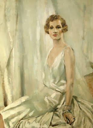
![]() Anna - 1927
Anna - 1927
![]() Girl on a Hill - 1929
Girl on a Hill - 1929
![]() Rollande - 1929
Rollande - 1929
![]() Farmhouse and Car - 1933
Farmhouse and Car - 1933
![]() Landscape - c.1935
Landscape - c.1935
![]() Girl in a Yellow Sweater - 1936
Girl in a Yellow Sweater - 1936
![]() Autumn Hills - c.1941
Autumn Hills - c.1941
![]() Portrait of Mrs. Zimmerman - 1943
Portrait of Mrs. Zimmerman - 1943
Heward was appropriately conservative and Canadian in her time. The portraits made in the late 1920s are largely realistic while incorporating a dash of simplification and solidity fashionable in those days. The landscapes, done a few years later strike me as containing as dash of Group of Seven and Emily Carr, as might be expected for a painter active in the Canadian art scene. The 1936 painting of a girl in a landscape combines the characteristics of the previous images. The final painting shows a bit less simplification than her 1920s portraits and is in line with what some other artists were doing during the early 1940s. I have to rate Prudence Heward as a competent, derivative artist. But then, don't most of us fall into that category?
Heward was of a generation of painters that interests me greatly because they completed training around the time that modernist painting was becoming respectable while at the same time having largely exhausted its ideological (anti-previous styles and subjects) possibilities. So there was no clear path for painters who saw themselves as being "creative," while other artists were forced to decide how much modernism they should incorporate in their work for marketing and prestige reasons. This is discussed in my book "Art Adrift."
Below are some examples of Heward's work in chronological order followed by some commentary.


Heward was appropriately conservative and Canadian in her time. The portraits made in the late 1920s are largely realistic while incorporating a dash of simplification and solidity fashionable in those days. The landscapes, done a few years later strike me as containing as dash of Group of Seven and Emily Carr, as might be expected for a painter active in the Canadian art scene. The 1936 painting of a girl in a landscape combines the characteristics of the previous images. The final painting shows a bit less simplification than her 1920s portraits and is in line with what some other artists were doing during the early 1940s. I have to rate Prudence Heward as a competent, derivative artist. But then, don't most of us fall into that category?


+-+1918.jpg)


+-+1993.jpg)