Quantcast
Channel: Art Contrarian
Viewing all 1103 articles
Browse latest View live

The Retro World of Robert LaDuke

$
0
0
Robert LaDuke (born 1961) paints small acrylics that, for some reason, I find both quirky and charming. Actually, that "some reason" probably has to do with the fact that the 1920s and 1930s greatly interest me. LaDuke states that his interests lie in the 30s and the 1940s and the objects he depicts are largely derived from toys of the 1930s.

There isn't much information about LaDuke on the Internet. A snippet is here, and a brief interview is here (scroll down). Read them to get a notion of where (he says) he's coming from.

A number of images of his paintings can be found in this Dieselpunk link. A few others are below:

Gallery

Northbound
The airplane is a Gee Bee racer from the early 1930s. We'll be seeing more of it.

Diver
Swan
Swimming
LaDuke, like the composer Jacques Offenbach, does not hesitate to recycle his own material.

Clipper

Mercury

Solitude

An Airplane I Should Have Known About

$
0
0

That's a C-46 Curtiss Commando transport pictured during its World War 2 heyday. (The nickname seems inappropriate, its closest relationship to real commandos lies in alliteration, though I suppose at one time or another some commandos or other special forces types might have parachuted from one.) A lengthy Wikipedia entry about it is here.

I have been aware of the Commando for almost as long as I've been aware of airplanes. Sometimes I must have seen one in the air, but the only real early memories I have were seeing some that were operated by non-scheduled passenger or cargo airlines sitting along the edge of Seattle's Boeing Field.

Commandos are probably best known for their role flying "The Hump" -- cargo plane routes from Allied bases in India over the Himalayas to bases in China when land-based supply to the Chinese sector was difficult or entirely cut off due to Japan's conquest of Burma. After the war, the Commando was mostly used as a cargo plane because scheduled airlines preferred the DC-3s they had been using pre-war and then purchased postwar airliners.

This future usage was unknown, of course, around 1937 when the Commando was first conceived as the CW-20 design. It was to be a large, twin-engine passenger transport with a figure-8 fuselage cross-section. The upper bulge was to be pressurized (a radical step, then) and the smaller, lower bulge left unpressurized for mail and other cargo. As it turned out, no pressurized version was ever built. As for "large," the Commando's wingspan was 108 feet (33 m), more than four feet wider than that of the brand-new Boeing YB-17, the Army Air Corps' newest four-engine bomber.

So what was it about the Commando that I was unaware of for all these years? It was that the prototype at first had twin tails instead of a single vertical stabilizer. It was only recently that I came across the images below via the Internet.

That's a wooden mockup of the CW-20 on display at the 1939 New York World's Fair. Note that only one of the twin tails exists; mockups didn't need to show every redundant feature.  The fighter in the foreground is a Brewster Buffalo whose markings indicate that it was about to be serving on the aircraft carrier Saratoga (CV-3).  (It's possible that this photo is from the 1940 version of the fair, because the Buffalo didn't enter service until late 1939.  But the Wikipedia link above states that the display was in 1939.)

The prototype on the tarmac. A pitot tube is attached to the nose for flight test purposes.

And here's the twin-tail CW-20 prototype in flight.

De Nittis: Proto-Impressionist

$
0
0
I'm not sure that dying young is a good career move, but nevertheless it has afflicted a number of noted artists including Vincent van Gogh and Henri de Toulouse-Lautrec. A currently not-so-famous painter who never celebrated a 40th birthday was Giuseppe De Nittis (1846-1884). Unlike suicidal van Gogh and dissipated Lautrec, De Nittis died of a stroke. The Wikipedia entry on De Nittis is here and a more extensive biography is here.

The second link above suggests that De Nittis never really formed a distinctive style by the time of his death, and that assessment seems about right. He came of age at exactly the right time to become an Impressionist and spent much of his brief adulthood in Paris during the years when Eduard Manet was active and the other Impressionists were holding their exhibits. So some of De Nittis' paintings were quite traditional (if not Academic), some are strongly influenced by Impressionism and others are in synch with the Macchiaioli, a group of Italian proto-Impressionists.

Regardless of how he might be pigeon-holed, De Nittis was clearly a talented artist. Take a look:

Gallery

Return from the Ball - 1870

La Place des Pyramides - 1875

Woman in a Canoe - 1876

Westminster Bridge, London - c.1877-78

Signora con cane (Returning from the Bois de Boulogne) - 1878

Snow Effect - 1880

La place du Carrousel et les ruines du palais des Tuileries - 1882

Le salon de la princess Mathilde Bonaparte - 1883

Peter Mcintyre: New Zealand War Artist and More

$
0
0
I suppose I'm just a spoilsport or even a contrarian (tee hee), but so far as I'm concerned, there is little or no need for the war or combat artist. Hasn't been such a need since the the 35mm Leica camera appeared in 1925. For the 80 or so years before that, photography existed, but cameras were generally too cumbersome to be taken into combat. So artists were hired to record military scenes more or less when they occurred and some of them along with other artists chronicled wars after the fact.

World War 2 war artists often used a sketchy, watercolor based style that had been fashionable in advertising illustration during the late 1930s. Nothing really wrong with that. Except many of those artists didn't depict military equipment convincingly, so the combination of free style and sloppy drawing makes such depictions useless to me and perhaps others who care about accuracy.

One war artist who did a decent job was New Zealander Peter Mcintyre (1910-1995). Biographical information on Mcintyre can be found here, though the writer unnecessarily lets his modernist bias show.

Mcintyre strikes me as having been a solid artist who incorporated modernist simplifications in some of his works, but did not usually take them very far. From a technical standpoint, in a number of instances his oil and watercolor paintings have a similar appearance, at least when seen on a computer screen. In his war work Mcintyre does best depicting people, falling down a little sometimes when dealing with airplanes and tanks.

Gallery

Self-Portrait
Photo of Peter Mcintyre - 1958
Nice, strong self-portrait. Better yet, it seems quite accurate when compared to the photo that was probably taken later.

The Alert at Dawn, 27th Machine Gun Battalion in Greece, April 1941
La Mitrailleuse by Christopher R.W. Nevinson - 1915
Another comparison just for the hell of it. Below is Nevinson's iconic take on French machine gunners. Mcintyre might have been aware of the Nevinson painting, but his version is pretty static and undramatic. Perhaps that's the way it really was when he passed by the team.

Forward Dressing Station Near Meleme (Crete)
Mcintyre was a war artist for the New Zealand army which saw most of its action in Greece, North Africa and Italy during World War 2.

Major General Sir Bernard Freyberg, VC, 28 March 1943
New Zealand commander.

Wounded, Tobruk

Long Range Desert Group

Breakout from Minqar Qa'im

Bombing of Cassino Monastery and Town, May 1944
The source for this image states that it was done in oil paints.

Waiwera
A New Zealand scene done in watercolor.

Grey Day, Hong Kong

A Neat Hanomag

$
0
0
I don't have any data to prove this (alas, and me a numbers guy!) but my impression is that very few low-price and mid-price European cars were imported to the United States in the 1930s. Those that were, were probably mostly occasional instances of personal cars purchased overseas and shipped home. And there might have been a few British cars that trickled over the border from Canada. That's why I have no recollection of seeing pre-World War 2 cars of that type driving around Seattle's streets when I was young. I would imagine that others didn't notice many or any either.

One result of this is that even American car buffs might be ignorant of lesser Europeans brands that faded before the post-war import boom. Which is unfortunate, because a number of those unknown (to Americans) brands had interesting styling.

One such make was Germany's Hanomag, briefly described here. To me, the most interestingly styled Hanomag was its 1.3 Litre car introduced in 1939. There are few images of that car on the Internet, but I did manage to find a useful trove here, three of which are shown below.

Gallery


The Hanomag 1.3 Litre was a low-priced car intended to compete at the high side of Volkswagen (at the time, called KdF-Wagen after Hitler's Strength Through Joy movement) that had not yet entered regular production.

The (likely) publicity photo at the bottom shows the scale of the car -- quite small. Yet the stylists were able to craft a trim fastback with nicely integrated 30s style teardrop profile fenders. Note that there is no exterior running board, a touch just being introduced in the USA at the time. A more archaic feature is the split rear window ("backlight" in stylist-speak).  But that feature is justifiable because the splitter is an extension of the central wind split extending from the center bar of the grille over the hood, between the windshield panes and over the top.  For some reason, I'm a sucker for wind splits, so this gimmick is okay by me. Oh, and it adds visual interest without quite becoming clutter.

In summary, a neat design for a small car. And maybe some day I'll finally have the pleasure of seeing a Hanomag 1.3 in person.

A cross-post from Car Style Critic.

Up Close: E.M. Jackson (2)

$
0
0
This is part of an occasional series dealing with detail images of paintings featuring the brushwork of the artist. Previous posts can be found via the "Up close" topic label link on the sidebar.

The present post deals with Elbert McGran (E.M.) Jackson (1896-1962) who painted covers for leading American magazines such as Saturday Evening Post and Collier's. Another post about Jackson in this series is here. Biographical information regarding Jackson is sparse, and this is the most detailed I could locate through a brief Google search.

Featured here is an illustration titled "The Customs Inspector" for a March, 1930 cover of Collier's.

The source of the detail image is explained below:

* * * * *

The Kelly Collection has what is probably the outstanding holding of American illustration art by private individuals (not organizations). I was able to view part of it at The Frederick R. Weisman Museum of Art at Pepperdine University in Malibu, California towards the end of a January 12 - March 31, 2013 exhibition run. The collection concentrates on illustration art created roughly 1890-1935 and one of its purposes is to further knowledge and appreciation of illustration from that era.

Non-flash photography was allowed, so I took a large number of high-resolution photos of segments of those original works. This was to reference the artists' techniques in a manner not always easy to obtain from printed reproductions. (However, the exhibition catalog does feature a few large-scale detail reproductions.)

I thought that readers of this blog might also be interested in seeing the brushwork of master illustrators up close to increase their understanding of how the artists worked and perhaps to serve as inspiration for their own painting if they too are artists.

Below is an image of the entire illustration coupled with one showing detail. Click on the latter to enlarge.

* * * * *

A reference photo I took


I noted in the previous post that Jackson's illustrations have a crisp look when reduced to publication size and printed, yet are fairly freely painted. That holds for the illustration featured here; I include it in this series because I like the way he did the faces. One difference from the previously shown Jackson is that the background paint here is not cracking.

Ettore Tito: The Last Really Good Painter from Venice?

$
0
0
A few hundred years ago, as this list suggests, Venice (and the hinterland it ruled) was host to a number of significant artists. These include Giovanni Bellini, Canaletto, Giambattista Tiepolo, Tintoretto, Titian and Paolo Veronese.

But Venice declined and its independence was finally snuffed out by Napoleon. So when we think of Venice, it is the city itself, which has been losing population for a long time and is now down to around 60,000. With such a small population base and its cadre of potential art patrons largely eliminated, it shouldn't be surprising that not many well-known Venice artists have turned up during the past couple of hundred years. One of the few exceptions to this dreary trend seems to have been Ettore Tito (1859-1941) who, as his Wikipedia entry indicates, spent most of his life in Venice.

I have to admit that I wasn't aware of Tito until recently, though I might have passed by some of his paintings while visiting art museums in Florence and Rome (the one time I went to Venice's Galleria dell'Accademia, it was closing early for a staff meeting!?!). This means I can't vouch that Tito's paintings are impressive when viewed in person. But they do look pretty good when seen on a computer screen, so let's take a look.

Gallery

La fa la modela - 1884

Raggi di sole - 1892

Bolla di sapone - 1894

Chioggia - 1898

San Marco - 1899

Dopo la piaggia a Chioggia - 1905

La signora Pellegrini - 1910

Descent from the cross - 1911

Le Ondine - 1919

La contessa Malacrida - 1926

I maestri veneziani - 1937
This pays homage to the great painters from Venice.

United States Cruisers 1900-1950

$
0
0
From the early 1900s into the 1950s, combat vessel types were largely understandable to the part of general public that paid at least a little attention to naval matters. As technology changed, new classes appeared, but types prominent during that period included torpedo boats, submarines, destroyers, cruisers, battlecruisers, battleships and aircraft carriers. Nowadays, matters are less clear, but that is a subject for another post on (probably) another blog.

The most controversial class was the battlecruiser, initially a fast, heavily armed but less well armored kind of battleship. British battlecruiser losses during the Battle of Jutland in 1916 cast doubt on the battlecruiser concept. And by the late 1930s, a new generation of battleships appeared that were fast as well as strongly armed and armored, thus eliminating the justification for the battlecruiser class.

Cruisers were not controversial, but problematical. And what was problematical was how to conceptualize suitable designs to fit a variety of potential roles within the constraint of naval construction budgets and constraints imposed during the inter-war period when naval limitation treaties were in effect. For example, cruisers were useful for "showing the flag" and maintaining a degree of peace and order in dangerous parts of the world; this was a major role for Royal Navy cruisers stationed far from the United Kingdom. Cruisers could be useful as commerce raiders, something that appealed to the German navy. Cruisers could be useful for sweeping commerce raiders from the sea. Cruisers were useful as long-range scouts for a battleship fleet. Cruisers were useful for screening battleship fleets and carrier task forces from attacks by enemy cruisers and torpedo-armed destroyers. They were useful for providing anti-aircraft protection for fleets and task forces.

The trouble was, one kind of cruiser did not equally satisfy all those tasks. Those naval treaties eventually codified two kinds of cruisers, light and heavy, the difference being in their armament. Light cruisers were limited to 6-inch (about 15 cm) guns that usually were fast-firing, smothering their target with shellfire. Heavy cruisers could have 8-inch (about 20 cm) guns that would be effective against similarly armed opponents, but had a comparatively slow rate of fire that made them less effective for close-range, rapidly moving combat. How many of each kind of cruiser should a navy build?

The American navy was at a disadvantage compared to other navies due to treaty weight restrictions. This was because US cruisers had to be able to operate at Pacific Ocean distances and potential opponents' cruisers could be shorter-range. Given the treaty limit of 10,000 tons displacement, American cruisers had to sacrifice some combination of armor, speed (related to power plant weight) or armament in order to make room (and weight) for attaining those long cruising ranges.

Until World War 2 when the aircraft carrier emerged as the most important kind of warship, battleships were the decisive element of naval power. Cruisers were always secondary, given their support roles noted above.

Yet to the general public, it could be hard to tell cruisers apart from battleships when casually viewing them. That was in part because they tended to look similar to each other and different from destroyers, aircraft carriers and such. Another factor is that cruisers tend to be long -- as long or longer than battleships, even. Although they were long, they were narrower than battleships because they had to have a high fineness ratio (length divided by width) to attain high speeds. And so they weighed considerably less than battleships of similar length, having less armor and smaller, lighter guns as well as the less width.

Cruiser Alaska (top) and Battleship Missouri (below)

The photo above, taken in 1944, offers a comparison between America's largest class of battleship and its largest class of cruiser. The Alaska's overall length, 808 feet (246 m), is more than 9/10ths of the Missouri's 887 feet. And that 808 feet was greater than the length of the two other World War 2 classes of American battleships, the North Carolinas (729 feet) and the South Dakotas (680 feet) or of the last pre-treaty battleships such as the Arizona and California whose length was 600 feet.

Below are photos of American cruisers of the period 1900-1950. The ship number prefix CA means the ship is a heavy cruiser and a CL prefix designates a light cruiser. The Alaska is a CB, a special designation for cruisers with near-battleship characteristics (but does not mean "battlecruiser").

Gallery

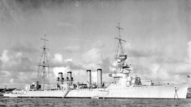
USS San Diego (CA 6)
The San Diego was originally named USS California but had to be re-named when the battleship California was ordered. Length was 505 feet (154 m). This was only 22 less than the length of the revolutionary battleship HMS Dreadnought that was laid down in 1905, three years after work began on the San Diego/California.

USS Omaha (CL 4)
Cruisers of this type appeared in the 1920s and did not look much like contemporary battleships. Note the spacing of the four smokestacks and that the main guns are well towards the bow and stern. Awkward looking, I'd say. Length was 556 feet.

USS Houston (CA 30)
The Houston was sunk early in World War 2 as part of a multinational force under Dutch command attempting to defend the East Indies from the Japanese assault. A nice looking ship of 600 feet total length (same as first-line battleships when it was commissioned in 1930).

USS Philadelphia (CL 41)
The Philadelphia was a Brooklyn class light cruiser commissioned in 1937. Its overall length was 608 feet, about the same as that of the heavy cruiser Houston. Armament was 15 6-inch guns. Three three-gun turrets are seen towards the bow. Note the the third turret is at the same level as the first, or forward turret. That meant that its guns could not be fired except in broadside.

USS Cleveland (CL 55)
The Cleveland was about the same length as the Philadelphia, but it had only 12 6-inch guns as main armament, the broadside-only turret having been eliminated.

USS Baltimore (CA 68)
The heavy cruiser Baltimore was 673 feet long and looks superficially similar to the battleships North Carolina and Washington.

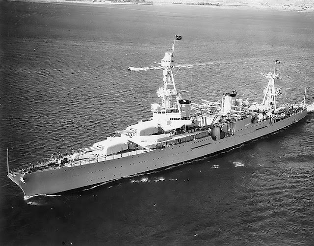
USS Des Moines (CA 134)
The Des Moines was laid down in May 1945 but not commissioned until 1948. Its length was 716 feet, putting it in the general length range of the the North Carolina and South Dakota battleship classes.

USS Alaska (CB 1)
A more representational view of the Alaska.  Something was going on with the forward turret when this was taken.  It held three 12-inch guns, but only two are visible and one is raised higher than the other.

Hal Phyfe's Pastel and Camera Portraits

$
0
0
Hal Phyfe (1892-1968), according to this report: "Great Grandson of Duncan Phyfe, the iconic furniture designer of the early republic, Herold Rodney Eaton "Hal" Phyfe was born in Nice, France, to a New York society family. Trained as a sculptor in France and a painter in Italy, Hal Phyfe began pursuing photography an an enlistee in World War I..."

That link contains the most detailed biographical information I could find in a quick Web search. According to it, Phyfe did pastel portraits of Hollywood and Broadway stars after the war, then shifted to photography starting about 1926. Pastels were the fashionable portrait medium for movie fan magazine covers during the 1920s and early 30s, perhaps because smooth blending was possible so that faces of female stars generally looked more flattering than if done in oil paint. Plus, pastel portraits could be made relatively quickly and cheaply.

It seems that Phyfe was something of an eccentric who nevertheless was acceptable socially. And his approach to portrait photography of women was practical: scroll down the link for his hints to sitters.

As best I can judge, his pastel portraits were about par for the fan magazine cover course, lacking the pizazz of masters of that small art such as Rolf Armstrong. And his photos also strike me as being competent, but not in the Cecil Beaton or Edward Steichen league.

So that we have below are decently made period pieces, which make them interesting to me and perhaps you.

Gallery

Bebe Daniels - 1923

Gloria Swanson - 1923

Gilda Gray - 1926

Colleen Moore - 1927

Billie Burke
Phyfe was one of Florenz Ziegfeld's photographers by 1930, but he made this pastel of Ziegfeld's wife Billie Burke for what seems to be a Follies promotional piece or program cover.

Photo in perfume ad - c.1926

Clara Bow - 1932

Marian Nixon

Una Merkel

Multi Ritratti: Antonin Proust

$
0
0
Antonin Proust (1835-1905) was a French politician, unrelated to Marcel Proust the writer. As the link above indicates, his career had its ups and downs, ending in his suicide.

Apparently not many portraits of Proust were made, but those that were, were created by the cream of the late 19th century artistic crop. I was made aware of Proust portraits by an article by Oliver Trostmann in this catalog for a recent exhibit at the Isabella Stewart Gardner Museum in Boston.

To set the scene, here is a 1877 photograph of Proust by a photographer known as Franck.

These are (top) a 1877 study by Édouard Manet and (below) a painting from the same year.

Manet painted this more finished portrait of Proust in 1880.

In 1885 the sculptor Auguste Rodin made this etching of Proust.

Anders Zorn painted this portrait of Proust in 1888.

Who did the best job? Not Manet, I'm afraid. And Rodin's etching is more a technical study than a portrait showing character. So in my opinion, Zorn wins, even though his painting was one of the first portraits he made using oil paints. (In his early career, Zorn usually worked in water-based media.)

Primative View of Mykonos

$
0
0

What you see here is a slightly cropped photo of an oil painting my wife bought while we were touring the Greek island of Mykonos in 2004. She loves to scoop up paintings from artists who sell their wares on the streets of places we visit. She brings them home, has them framed, and hangs them on walls all over the house. The painting shown here is in the main bathroom because its colors relate to the room's decor.

I know nothing about the artist who presumably was the man who sold the unstretched canvas to her.  And it's entirely possible the seller was simply an agent; he had perhaps a dozen or more similar canvasses draped over his arm.

Another thing I don't know is how skilled the artist actually was. Or maybe I should say "artists were" because I can't rule out the possibility that different people did different parts of the painting on something like an assembly line basis.

Let's analyze.

First, note that the sky and water are painted very smoothly. Also smooth are the gradations from lighter to darker. This is not easy to do, so I suspect some kind of professional mechanism was in place for that phase of the painting.

Other aspects are clearly primitive looking. See how huge the Mykonos style windmill is compared to the houses beneath it. In reality, Mykonos windmills are not very tall: about three storys high, according to the photo in the link.

To me the most primitive aspect of the painting other than that gross scale distortion is the treatment of light and shade.  The shadows from the picket gate and its adjoining wall suggest that the sun's direction is before us and to the right.  But there is sunlight on the wall to the right of the gate and along the nearby top, indicating that the sun is to the left and might even be a little behind us.  Clearly the real sun can't be both places at once.

Now here is the interesting part.  If sunlight and shadow were consistent, let's say it's the dominant case where it is to our right, then the gate area and the curved parts of the wall top would be shaded.  And this would hurt the composition, where the alternative lighting effects help to frame the scene.  For this reason, the painting might be more sophisticated than it seems.

Up Close: Mead Schaeffer (4)

$
0
0
This is part of an occasional series dealing with detail images of paintings featuring the brushwork of the artist. Previous posts can be found via the "Up close" topic label link on the sidebar.

The present post deals with Mead Schaeffer (1898-1980) when he was following the style that gained him success as an illustrator. Additional information on Schaeffer is here. Previous posts about Schaeffer in this series are here, here and here.

Featured here is an illustration for "Lucy of Limehouse: Greater Love Hath No Man -- or Woman" by Samuel Bertram Haworth Hurst in the August 1933 issue of Good Housekeeping magazine.

The source of the detail images is explained below:

* * * * *

The Kelly Collection has what is probably the outstanding holding of American illustration art by private individuals (not organizations). I was able to view part of it at The Frederick R. Weisman Museum of Art at Pepperdine University in Malibu, California towards the end of a January 12 - March 31, 2013 exhibition run. The collection concentrates on illustration art created roughly 1890-1935 and one of its purposes is to further knowledge and appreciation of illustration from that era.

Non-flash photography was allowed, so I took a large number of high-resolution photos of segments of those original works. This was to reference the artists' techniques in a manner not always easy to obtain from printed reproductions. (However, the exhibition catalog does feature a few large-scale detail reproductions.)

I thought that readers of this blog might also be interested in seeing the brushwork of master illustrators up close to increase their understanding of how the artists worked and perhaps to serve as inspiration for their own painting if they too are artists.

Below is an image of the entire illustration coupled with my work. Click on the latter to enlarge.

* * * * *

"I want to see Nick."


The reference image from someplace on the Internet was the one I was familiar with, so it surprised me to find the Kelly original with subdued colors. I prefer the altered version. The detail image shows the bold, but more controlled brushwork Schaeffer was using by the early 1930s in contrast to some of his 1920s swashbuckler illustrations for books. By the 1940s, his style evolved to sedate, "just the facts, ma'am" artwork that was of course competently done, though not as interesting (to me, anyway) as his earlier work.

In the Beginning: Man Ray

$
0
0
According to what I've read about him over the years, Man Ray, born Emmanuel Radnitzky (1890-1976), identified himself primarily as a painter even though most others considered photography his forte. I think he was indulging in wishful thinking. His Wikipedia entry is here and another take is here.

The Wikipedia entry states that his earliest paintings were traditional, but a quick Web search didn't turn up any of those. What I did find were images of paintings he made following the famous 1913 New York Armory Show that introduced French avant-garde art to America. The exhibits influenced him to become a modernist painter, as did his association with Marcel Duchamp who was living in New York for about eight years starting in 1915. Man Ray also was strongly influenced by the Dada movement that began in Switzerland in 1916. At different times he considered himself a Dadaist and a Surrealist in photography as well as painting, though he supported himself mostly through commercial photography.

Below are examples of Man Ray's work starting with his early modernist paintings.

Gallery

Still Life with Red Tea Kettle - 1913

Departure of Summer - 1914

Five Figures - 1914

Hills - 1914
These are among the earliest modernist Man Ray paintings I could locate.

Pisces - 1938

Self-Portrait - 1941
These were done years later.  Maybe I'm wrong, but I don't find them much better than what he was doing around 1914.  But that might just be because it's modernism, which tends to place skill (as opposed to "creativity") low on its list of desiderata.

Photo self-portrait

Electricite la Maison - 1931
Here are two examples of his avant-garde photography, a field in which he was a genuine innovator.

Fashion photo - c.1930
Finally, an example of his commercial photography.  Contrarian me, I much prefer it to his various modernist darkroom and paintbrush efforts.

The Astonishing Pegaso

$
0
0
Not many Pegaso automobiles were ever built during the period 1951-57 when the brand was active.  Cars were a minor activity of what was essentially a Barcelona based truck manufacturer described here.

There is also some Internet-based information regarding the Pegaso automobile line here and here. However, there is very little other than photographs having to do with the Pegaso that interests me the most.  In fact, there seems to be no agreement even as to its name other than it was one of the Z-102 series.  Besides Z-102, its name might have included "BS 2.5 Cúpola" or "Berlineta Cúpola" or just "Cúpola."

It is also unclear who styled it.  Some sources credit Italian coachbuilders, others suggest that Pegaso built it in-house.  I have been saying "it" having for years assumed that it was a one-off, but several sources indicate that two cars of the design were actually built.

What matters is that the Pegaso under discussion has a design that was astonishing when it first appeared more than 60 years ago and that continues to astonish (me, anyway) even now.  This is not to say the design is a great one, but it's a good one with the ability to fascinate as well as astonish.

Let's take a look.

Gallery

The original car was painted yellow, as shown here.  The most serious design defect was that the backlight (rear window) shape failed to blend with the roofline curve, as is evident in this side view.

After being introduced in Europe in 1952 it was displayed at the 1953 New York Auto Show, where this photo was taken.

Here is another early picture.  For a while a red (I think) stripe decorated the top of the car.

This is a fairly recent picture, probably taken at a concours d'élégance.  The paint is now silver, but it might be that second car whose original paint color is unknown to me.

Another view, this featuring the front end.  The wheel housings are mostly covered by the fenders, probably for aerodynamic reasons.  This implies a wide side overhang beyond the wheels which would give the Pegaso an awkward appearance (to our eyes in 2013) if seen from the rear.

This shows the Pegaso "opened up."  Well, not completely opened; the access panel covering the rear wheel remains closed.  Also note that the door windows do not roll down due to the extreme concave shape of the inner side of the door; instead, they swing out to open.

This article is also posted on Car Style Critic

In the Beginning: Giovanni Battista Tiepolo

$
0
0
Giovanni Battista Tiepolo (1696-1770) is one of my favorite 18th century artists. That's because, unlike many others who painted classical and religious scenes, his women's faces looked like those of real people rather than the idealized versions inspired by Greek and Roman sculpture. His Wikipedia entry is here, and I wrote about those women here.

Although he burst on the artistic scene when fairly young, a certain amount of ramping up was inevitable. In this post, we take a look at some paintings he made by the time he reached his mid-20s. Click on the images to enlarge.

Gallery

Virgin Mary Appearing to the Dominican Saints - 1747-48
This is a painting from Tiepolo's mature period indicating where he evolved.

Doge Marco Cornaro - c.1716
He was about 20 when this was painted. Most artists agree that hands are harder to depict than faces, but here Tiepolo does a decent job on the hands whereas the treatment of the Doge's face is questionable. But the Doge was a patron and helped Tiepolo to become established, so perhaps that's how the man really looked.

Apostolo Tommaso - 1715-16
Apostolo Giovanni - 1715-16
These are a pair of works fitted into the architecture of the Santa Maria dei Derelitti (Ospedaletto) in Venice.  I find these interesting because of the way Tiepolo includes many facets or planes while constructing the figures.

Scipio Africanus Fleeing Massiva - 1719-21

The Martyrdom of St. Bartholomew - 1722
By this point Tiepolo is settling into his oil-on-canvas style (his mural work was a different matter).

Millard Sheets: General-Purpose Artist

$
0
0
Millard Sheets (1907-1989), was a Californian involved in a variety of art-related activities ranging from watercolor and oil painting to mosaic design, architecture, and art school administration. This diversity of pursuits (perhaps along with the fact that he wasn't totally in the modernist/abstraction tank) might have diluted his image to the point where he isn't well known today.

Since I don't want this post to be too lengthy, I suggest that readers interested in details regarding Sheets' life and career link to here and here for plenty of information. His son maintains this site, the page I linked to containing examples of works that are confirmed as not being Sheets' paintings and others of dubious provenance.

Below are examples of what Sheets did.

Gallery

Angel's Flight - 1931
This early painting is perhaps his best-known. It deals with what might be the station platform for a funicular that transported people to the now vanished Bunker Hill neighborhood in downtown Los Angeles.

Tenement Flats - c.1934
This also looks like the old Bunker Hill area.

California - 1935

Padua Olive Hills Drive - 1940

World of Life - mural, Hesburgh Library, University of Notre Dame - 1964
Details regarding this project can be found here.

Home Savings Bank building - Sunset & Vine, Hollywood - 1968
Sheets was not a licensed architect. But his Millard Sheets Designs Company did have architects working under his direction. Sheets was responsible for many (most?) of the distinctive Home Savings buildings with sculpted motifs that graced California from the 1960s into the 1990s. Home Savings is no more, having been passed to Washington Mutual and then Chase. Many of the former Home Savings buildings have lost their former distinctiveness.

Placing People on Red Backgrounds

$
0
0
Many (most?) of the how-to-paint books I've read at some point deal with color relationships. They show the differing effects on a color of interest when it is juxtaposed to other colors.

An interesting case is the skin color of Caucasians (whites). Although there are variations, so-called white skin is actually a subtle mix of hues that can seem to vary depending upon lighting conditions, presence of fat, bone or blood under the skin, and, of course, neighboring colors. Those books often focus on mixing colors so that the appearance of skin is convincing.

When it comes to neighboring colors, the orange-red-yellow part of the spectrum that happens to match white skin most closely is normally the least aesthetically pleasing range where Caucasian skin is concerned. However, rules are supposedly made to be broken, so some artists will take the risk of using such background hues. This might be done to create a particular mood for a painting or illustration, or it might simply be a means for the artist to test his skill and maybe even show off a bit.

Below are examples of images where red is the background color.

Gallery

Detroit Auto Show
This is a photograph I found on the Internet of a model posing in front of a Ferrari at the 2013 Detroit Auto Show. It illustrates what painters face. Note how gray the girl's face and body seem with all that Italian Racing Red behind her, not to mention the outfit she's wearing.

Lady in Black (The Red Room) by Irving Ramsey Wiles
Wiles avoids the grey effect by exaggerating the yellow aspect of "white" skin. The use of blacks in the composition helps to isolate the subject from the background red.  (But keep in mind that this image might not reflect the colors of the actual painting, so my analysis might be flawed.)

The Count of Monte Cristo - by Mead Schaeffer
I posted about this illustration here. Schaeffer also uses blacks to isolate the skin color from the background to some degree. Still, in the image above, the Count's skin seems grayed like that of the model in Detroit. But the link contains a photograph I took of the actual illustration, and it can be seen that Schaeffer introduced a greenish tint to the face. Green being the normal color wheel opposite to red, this helps keep the face from being absorbed or neutralized by the red background.

Irving Ramsey Wiles, Portrayer of Women

$
0
0
I measure artists' skill by how well they depict human beings. By this, I do not necessarily mean that such depictions are a measure of artistic greatness. There is more to greatness than how well humans are represented on a canvas or other surfaces, though in many cases I consider it an important factor.

One artist who skillfully portrayed many women was Irving Ramsey Wiles (1861-1948). Internet information on Wiles is pretty sparse. Here is his Wikipedia entry, and Charley Parker posted about him here. At the bottom, Parker mentions a book about Wiles that was forthcoming at the time he wrote the post. I looked it up on Amazon and saw that some of the reader reviews were very negative, mostly because the book apparently was poorly illustrated (few images, and those mostly in black and white).

Luckily for us, the Internet has a nice collection of Wiles' works in color. Here is a selection:

Gallery

Mrs. Wiles in the Garden

Russian Tea

Afternoon Tea on the Terrace

The Yellow Rose

Lady with blue hat

Portrait of a lady

The Reader

Woman in Blue - 1915

Brown Kimono

Wiles seems to have been a skilled painter, as the images above demonstrate. Greatness is even more subjective to evaluate than skill, so I'll set that aside.  My take is that he was good at the genre he pursued.  Not the very best, but not all that far behind on his better days.

Werner von Axster-Heudtlass: Illustration Political, and Not

$
0
0
This is an advertisement for Eagle artistic silks, 1925.


And here is another piece by Werner von Axster-Heudtlass (1898-1949). My German was never good and now it's pretty rusty, but I translate the top slogan as "Hate and Destroy our Enemies" and the bottom one as "Freedom, Justice and Bread (for) our People." The "enemies" are labeled Judaism (in a secular sense, "Jewdom"), Bolshevism, Plutocracy and Capitalism.

I don't have a date for this Hitler Youth poster, but guess from the content that it was created before Hitler assumed power, probably sometime between 1927 and 1933.

What little is known about Axster-Heudtlass can be found here, though I suspect researchers in Germany might have dug out more. The link notes that he and his wife Maria (no dates) probably collaborated on some of the Axster-Heudtlass works.

I recently posted about Ludwig Hohlwein, a top-notch advertising illustrator who also created posters supporting the Nazi regime.  Hohlwein, as I noted in the post, did posters that were supportive in a positive sense and he steered clear of negative subjects.  This was not the case for Axster-Heudtlass who, in the poster above, depicts enemies that are evil serpents that must suffer destruction.

Below are examples of normal commercial art by Axster-Heundtlass along with one more Nazi propaganda piece.

"Merry Germany"

Steinway Pianos

Railway guide cover - 1936

Advertising the port city of Stettin (now in Poland) - 1934

This is another poster or flyer supporting the Nazi regime, probably from 1944-45. It's more difficult to translate than the one above, but goes something like this: "We listen to you, Leader. The future can bring us nothing save victory. [This next phrase is the tricky bit: help me, please, if it needs fixing] And if questioned as to its basis, we state: Because the Lord God gave us the Leader.""Leader" being the reference Hitler bestowed on himself -- Führer in German.

I am not fond of what might be called "political art," the political message almost always draining whatever artistic merit might have been incorporated in the work. Some artists do political art strictly to bring needed income, as if the assignment were just another form of advertising that required illustration. Others are in favor of the cause, as we see above. Axster-Heudtlass did some nice commercial work, but the Nazi pieces are clearly inferior. How much of this artistic damage was his own doing and how much might have been owed to the taste of clients is probably impossible to judge at this late date.

Chrysler 300C: An Unexpected Preview

$
0
0
Some concept cars are intended to test public reaction to various styling ideas.  Others are thinly-disguised versions of cars scheduled for production within the next year or two.  The latter are often easily identifiable and commented upon in car buff magazines.  Readers are left to wonder which features are production-bound and which are camouflage.

It turns out that the show car conceptualizing Chrysler's iconic 2005 300C didn't have a speck of teasing to it.  People at Chrysler probably were mostly interested in exposing the public to a design that would take some getting used to, due the fact that it was a strong break from current Chrysler designs as well as from most other designs on the road.  I certainly thought the 300C was odd-looking when I saw the first photos of it.  Actually, it wasn't until I began seeing 300s on streets and highways that the design began to appeal to me; about a year later, I bought an entry-level 300.

What is odd is that the real disguised "teaser" concept car for the 300C came from Ford, not Chrysler.  Let's take a look.

Gallery

2003 Chrysler 300C Concept Car 
The concept 300C is virtually identical to the 2005 production version introduced in 2004.

2001 Dodge Super 8 Hemi Concept Car
This concept car from Dodge contains some hints regarding the future Chrysler 300C design.  Those hints include the general brick-shape of the lower body, the fender shape (forget the grooves on the doors) and the wheel housing treatment.  Inclusion of a 1954-vintange General Motors style wraparound windshield is a cute diversion.

2003 Ford 427 Concept Car
This makes one wonder if Ford and Chrysler stylists were hanging out at the same bar in the early 2000s.  In reality, probably not.  That's because Joseph Baker, the 427's designer, was working at Ford's Irvine California studio, whereas I'm pretty sure that the 300C was styled in Detroit.  But aside from the front and rear ends, the two cars closely resemble one another.  Could the Irvine facility staff have included one or two recently hired stylists from Chrysler?

Also posted at Car Style Critic
.
Viewing all 1103 articles
Browse latest View live


Latest Images