Quantcast
Channel: Art Contrarian
Viewing all 1103 articles
Browse latest View live

Towards the End: J.C. Leyendecker

$
0
0
Joseph Christian Leyendecker (1874-1951) was a leading American illustrator for much of his long career. He produced more than 300 covers for the Saturday Evening Post, America's leading general-interest magazine during the first half of the 20th century. He also was famed for his advertisement illustrations for Kuppenheimer, a man's clothing maker and for Arrow collars and shirts. More background on Leyendecker can be found here and here.

His distinctive style featured strong, crisp lines and form definition along with hatched and sometimes crosshatched color overlays. A sense of his stylistic evolution can be glimpsed via this chronological gallery of Post covers.

Illustration fashions change, so Leyendecker's highly distinctive style became increasingly passé as the 1930s rolled along. Apparently his personality was changing during this time, which might have been a further career hinderance. A major blow was changes in the Post's editorial staff during the years around 1940. New editors and art directors eventually cast Leyendecker aside.

Gallery

Detail from art in the Kelly Collection
I photographed this at an exhibit of Kelly items at Pepperdine University a few years ago. Note Leyendecker's distinctive brush style where there are regular brushstroke-related gaps between overpainting and an underlying color. Also, the background is created using a broad brush that blocks in the color while leaving visible strokes and gaps in coverage -- another of his stylistic characteristics.

Saturday Evening Post cover art - 24 November 1928
Another example of his style during his time of peak fame. Contrasted are a Pilgrim Father from the 1600s with a 1928 college football player.

Illustration for Arrow collars - 1932
The models are Phyllis Frederic and actor Brian Donlevy. Here the brush hatching is less prevalent. Leyendecker would use it or downplay it according to his feeling for the subject matter. Apparently, he opted for sleekness in this illustration.

Saturday Evening Post cover - 15 September 1934
Hatching returns for this Post cover. For some younger or overseas readers I need to mention that the overburdened fellow is a railroad porter doing his duty for the fancy lady.

Saturday Evening Post cover - 21 December 1940
Exhausted mailman during Christmas rush: the last Post cover not dealing with New Year babies.

Saturday Evening Post cover - 2 January 1943
This was his final Post cover, a continuation of his New Year's baby series. Leyendecker hatching is almost gone.

American Weekly cover art for 25 May 1947 issue
Crisp lines and fabric fold definition are still in the Leyendecker spirit. But I cannot be sure if the simplified style was an attempt to adjust to changing illustration fashion or else that he was simply dashing this work off to meet a deadline.

American Weekly cover - 19 December 1948
If it weren't for the signature, there is little here to indicate Leyendecker did this.

American Weekly cover - 20 November 1949
A very late illustration, again somewhat distant from his signature style. The orange circle is an echo of a Post cover theme from the 1920s and 30s.

René Vincent: Illustrating the Belle Époque Through the Années folles

$
0
0
René Vincent (1879-1936) was trained as an architect, but had a successful career as an illustrator during the first third of the 20th century in France. He contributed editorial art to the likes of La Vie parisienne and L'Illustration and did a considerable amount of advertising illustration, especially for automobile companies.

The best source of information regarding Vincent that I found on the Web is here. It's in French, but perhaps your browser will allow translation.

Vencent's style was clean and usually poster-like, even for much of his editorial work. It also could be witty. I find his work enjoyable.

Gallery

Berliet automobile illustration - 1906

Le retour de l"Ambrusqué - 1915

In La Vie parisienne - ca. 1916


A series in La Vie parisienne - 1917, 1918
Click to enlarge, though the text is still hard to read.

Cover art for Automobilia - July 1922
The car is a Peugeot 15 HP.

In La Vie parisienne - 1922

Peugeot 18 HP advertising - 1924

Golf, in L'Illustration - October 1927

"Bathing Time" in L'Illustration - October 1927
The car is an Hispano-Suiza.

Changing Tires - 1930

Skaters - ca. 1933

Unfinished Renault advertising illustration - ca. 1929

Some Albert Herter Murals

$
0
0
Albert Herter (1871-1950) was an artist who is best remembered (for those few who are even aware of him) as a painter of portraits and murals. His mature style was traditional, with just the slightest whiff of the cautious modernist-inspired simplification fashionable amongst conservative painters during the first four decades of the 20th century.

Herter's Wikipedia entry is here. If you read it carefully, you will find that his son Christian became governor of Massachusetts and later Secretary of State of the United States. The latter position was reached under Eisenhower shortly before the death of the previous Secretary of State, John Foster Dulles.

I plan to post more about Herter's work, but begin here with two of his murals (click on the images to enlarge).

Le départ des poilus, aout 1914 - 1926
This large mural is in Paris'gare de l'Est railroad terminal, and due to ignorance of it, I've never seen it. That's because I normally use the nearby gare du Nord when entering or leaving Paris by train.

Background regarding the mural, which Herter donated to France in memory of his son Everit who died fighting in the Great War, can be found here, here and here.

The scene depicts French army reservists called to the colors during mobilization at the start of the war. Under Joseph Joffre's Plan XVII, the main German offensive was expected along France's eastern borders, and that was where most of the mobilizing troops were sent during the first few weeks of August 1914. The soldiers are being seen off by family and friends.

The third link above mentions that the man in the white shirt raising his arms is Everit Herter. His mother is the women at the far left with her hands clutched. The bearded man at the right holding flowers is Herter himself.

Signing of the Magna Carta - 1915
This is one of four murals by Herter completed in 1915 for the Wisconsin State Capitol Building. Background on these murals is here. Due to their setting, these murals are composed is a formal, essentially symmetrical fashion.

Towards the End: Jules-Alexandre Grün's Last Crowd Scene

$
0
0
Jules-Alexandre Grün (1868-1938) spent much of his career as a poster illustrator. But when the occasion arose, he had a good eye for portraiture and composing believable crowd scenes, as can be seen in some large paintings he made. I last wrote about him here, and here is his French Wikipedia entry (the one in English is skimpy, so have your browser translate this, if it can).

Below are two of his best paintings of that kind followed by his final crowd scene, made as he was coming down with Parkinson's disease. Click on images to enlarge.


Un vendredi au Salon des artistes français - A Friday at the French Artists' Salon - 1911
Star of the painting (near the center, in white behind the woman in the mauve dress) is Geneviève Lanthelme (1883-1911), who died the same year the painting was completed under suspicious circumstances. Grün included himself and his wife. His wife Juliette is in front of the largest sculpture, wearing a violet dress. Grün is the bald, bearded man right behind her.

Fin de souper - After Supper - 1913
This is perhaps his painting that I like the best. I think it has to do with the lively young lady at the left.

Sortie de la messe au Breuil-en-Auge (Calvados) - Leaving Mass - 1934
This is the only image of this painting that I could locate on the Web, and it's marred because of the lighting where it's mounted, Église Saint-Michel - Pont-l'Évêque (near the junction of autoroutes A13 and A132 in Normandy).

Grün manages his crowd composition well, as usual, but the people are painted more thinly and sketchily than in the earlier works when he was in his prime.

John Duncan Ferguson's Portraits of Women

$
0
0
John Duncan Fergusson (1874-1961) is associated with a group of painters called the Scottish Colourists. His Wikipedia entry is here and other information can be found here. He also is known for being the husband of modern dancer Margaret Morris (1891-1980).

Fergusson's style changed little after around 1910. He followed the path of tentative modernism where subjects were treated in a somewhat representational manner, but with simplification of form and related minor distortions. His colors were usually bright, but related to his subject matter, unlike the Fauvists who imposed unrealistic colors on subjects. Brushwork was often angled, parallel strokes, somewhat in the spirit of Cézanne.

His reputation seems to be rising: a recently discovered painting sold at auction for £638,000, as this Daily Mail article mentions.

The present post features Fergusson's portraits of women. At times his simplifications reached the point where it could be difficult to distinguished one sitter from others.

Gallery

Jean Maconochie - ca.1904

Le voile persan - 1909
One of Fergusson's better-known works, made when he had almost settled into the style used for most of the rest of his career.

Pam - 1910

Poise - 1916
This was the painting auctioned for £638,000.

Joan - 1916

Villa Gotte Garden - ca. 1920
Fergusson seldom did profile portraits. This has a slight Cubist feel.

At Gows - 1925

In the Patio (Margaret Morris Fergusson) - 1925

The Branches (Margaret Morris) - 1928

Souvenir de Jumges - 1931
A nice Art Deco feeling to this.

The Red Hat (Roberta Paflin) - 1933

La châtelaine - 1938

"Hillhead," Eileen - 1941

Girl with Bang - 1947

Blonde with Checked Sundress - 1958

Sculptor Aristide Maillol's Flat Paintings

$
0
0
Aristide Joseph Bonaventure Maillol (1861-1944) is best known as a sculptor, but began his artistic career as a painter and continued to paint off and on for much of his life (biographical information here).

What interests me about many, not all, of his paintings is that (1) they are flat, and (2) the heads of his subjects are either in profile or facing the viewer head-on. Admittedly, most of the paintings shown below were made before Maillol took up sculpture seriously, but even as late as 1940 he continued these characteristics.

One would think that a sculptor would be thinking more three-dimensionally, but it seems he was following the modernist desideratum regarding flat surfaces. On the other hand, late in his career, Maillol did make a number of drawings of his model/muse Dina Vierny that depicted her well-rounded form. Below are some of his flat paintings.

Gallery

In the Western Pyrenées - 1885
Although he used linear perspective, Maillol's use of color gives this painting a flat appearance.

Woman in White - 1890-91

Les deux jeunes filles - 1891

Enfant couranne - 1892

Jeune femme pensive au feuillage - 1893
This also has been dated 1894 and the subject has been said to be the future Mme. Maillol.

Mme. Maillol - 1895

La femme à l'ombrelle - 1895
Another painting with the same title featuring a women in the same costume is dated 1891-92, so this might have been painted then as well.

Dina á la robe rouge - 1940

From Three Countries, Similar Style

$
0
0
Artists are often influenced by others. Or they steal outright ... but only from the best, it is said. Possibly styles are similar simply due to coincidence. The last possibility was probably most likely in the days before decent-quality color reproductions in books and magazines were common, especially for artists widely scattered geographically.

Paintings from three artists having a similar "feel" caught my eye recently, so I thought I'd give you a look and so you can decide for yourself if my conjecture makes sense.

The painters are George Washington Lambert (1873-1930), information here, an Australian working in London; Saturnino Herrán (1887-1913), information here, a Mexican painter who spent his short life in that country; and W. Herbert "Buck" Dunton (1878-1936), an American who I wrote about here.

Not all their paintings featured a strong, solid style, but the ones shown below seem to.

Gallery

Lambert: "The Sonnet" - 1917
He was painting in this style as early as 1907 ("Portrait Group, The  Mother"), so priority for this threesome goes to Lambert.

Herrán: "La ofrenda" - 1913

Dunton: "My Children" - 1920

While it is possible that Herrán and Dunton where familiar with Lambert's work, it seems equally possible that they were not. Another possibility is that all three artists were influenced by a fourth, earlier painter. Offhand, I can't think of who that might be. Let me know in comments if you have suggestions.

Kirchner's Street Scenes

$
0
0
I am not fond of paintings by Ernst Ludwig Kirchner (1880-1938), as I've mentioned here. Biographical information on Kirchner is here for greater context.

That said, his works that interest me the most are street scenes he painted about 1913-15. New York's Museum of Modern Art had a show in 2012 dealing with those. More about that here.

Many images of Kirchner's street paintings are below. I find it interesting that V-shaped compositions are common.

Gallery

Berlin Street Scene - 1913

Five Women at the Street - 1913

Frauen auf der Strasse - 1915

Friedrichstrasse, Berlin - 1914

Leipziger Straße mit elektrischer Bahn - 1914

Potsdammer Platz - 1914

Rote Kokotte - 1914

Strasse, Berlin - 1913

Street Scene - 1913

Zwei Frauen auf der Strasse

Zwei Kokotten - 1914
This seems to be a study for the painting immediately above it.

Street scene - 1926
Kirchner occasionally did street scenes later in his career, but in a different style.

The Gray Steampunk World of Vadim Voitekhovitch

$
0
0
Vadim Voitekhovitch, painter of gray, gloomy-atmosphere, northern European Steampunk scenes was born and raised in Belarus and has been working in Germany since 2004. And that's about all I know about personal details from a short Google search.

I find most of his images fascinating because he creates an almost-believable world of circa-1900 European cities and towns where airships and other never-quite-happened contraptions abound. Besides his attention to detail, Voitekhovitch gives his scenes believable atmospherics. Northern Europe is gloomy a good part of the year, after all.

Gallery

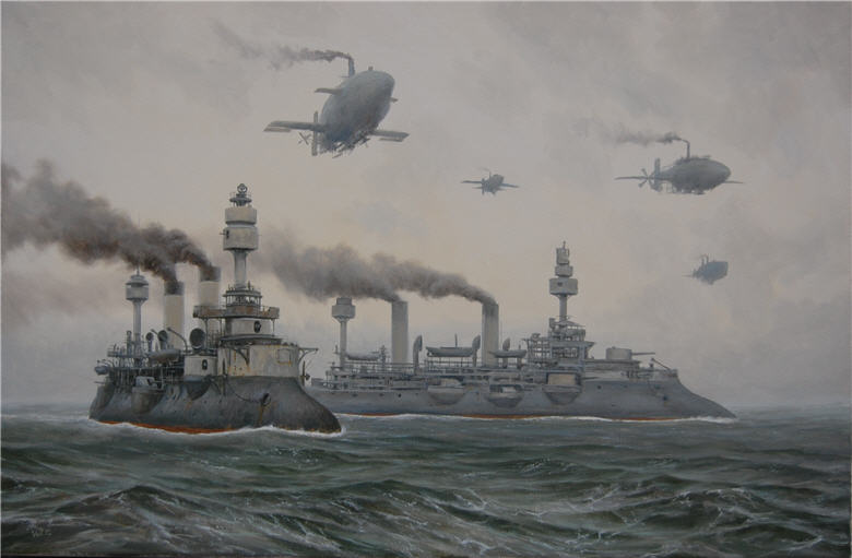
Fleet at Sea
The coal-fired warships are similar to 1890s French cuirassés designs such as the Masséna, featuring extreme tumble-home sides and ram bows. The airships also seem to have coal-fired steam engines: note the dark smoke from their stacks.

In a Distant Country
Harbor scene.  I like the rust on the battleship -- it makes the scene more believable.

No One Will Come Back
Setting off to war, though the people seem indifferent aside from the woman near the cannon and another with her young son near the stairway.

Old Harbour
Details include what might be a steam-powered omnibus and an airship "carrier."

Postal Dragon
Loading mail aboard from the rickety tower.

Stolen Sky

The Road to Babylon
Two scenes with airships, while the rest of the technology is pre-automobile.

Tide
The nearest airship is attached to a loading platform.

Gloomy Morning
Again, no cars.

Closeup of a Voitekhovitch airship.  Note the rust on the sides and what looks to be a royal or national crest on the rudder.  Clearly, his airships are impossible from an engineering standpoint.  The rust implies steel cladding -- very heavy.  They are powered by steam, often from coal-fired boilers.  Steam engines, boilers and filled coal bins are very heavy too.  Finally the size of the steel-clad "air bag" is much too small to house enough hydrogen to lift all that weight.  But I can easily ignore such matters because the world he has created is so enchanting for a history and design buff such as me.

More Philadelphia Suburban Rail Car Photos

$
0
0
Several years ago I posted regarding 1930s-vintage rolling stock used on suburban Philadelphia railcar lines. Since then, I scanned slides I took in April 1969 of some of those cars. They aren't very good portraits of the equipment, but perhaps they might nevertheless be of interest to some readers.

Most of the photos are of the Philadelphia & Western suburban line that ran from Norristown to Philadelphia's 69th Street Station where riders heading for the city center would have to change to a different transportation mode. I caught a car at Haverford and rode it to 69th on my photography expedition.

Gallery

P&W car near Haverford Station (cropped)

P&W car entering Haverford Station (cropped)

P&W car at Haverford Station

P&W car near Haverford Station (cropped)

P&W car at 69th Street Station

P&W car at 69th Street Station (cropped)

Philadelphia Suburban Transportation Company cars at 69th Street Station (cropped)

Red Arrow Liberty Liner at 69th Street Station (cropped)

Towards the End: Lawren Harris

$
0
0
Lawren Harris (1885-1970), who I wrote about here, was a key member of Canada's famous Group of Seven painters. His Wikipedia entry is here.

Unlike most noteworthy artists, Harris never experienced even moderately serious financial problems because his family was the Harris of Canada's Massey-Harris farm implement firm. And of course he had many of the right social connections that allowed him to gain influence in the Canadian art establishment of his time.

Due to his circumstances, besides his efforts to get the establishment to accept modernism, Harris'"struggles" in art largely had to do with improving his skills. And perhaps more importantly, seeking a kind of art that meshed with his strong interest in Theosophy, a spiritual belief system that had a burst of popularity during the late 19th and early 20th centuries.

Theosophy-related concerns seem to have strongly influenced Harris's drift from representational to abstract painting over the arc of his career. The turning point took place during the years he lived an Santa Fe, New Mexico, whose art colony included other budding abstractionists.

Gallery

The Corner Store - 1912
An example of Harris' representational works.

North Shore, Lake Superior - 1926
One of his best-known paintings from the mid-point of his career where real-world objects were simplified.

Abstract No. 7 - ca. 1939
Harris for a while had the habit of testing abstractions by viewing them with different orientations -- the idea being that the abstract design would hold up no matter which way the painting was displayed. I've seen at least two orientations of this on the internet. The one above is that used by the Vancouver Art Gallery, where the painting resides.

Composition No. 1 - 1940
One of his most strictly geometric works.

Abstract Painting No. 20 - ca. 1943
Drifting from Geometry.

LSH 134 - 1950
A more "organic" look is now in place.

Untitled - 1952

Abstraction - 1964
This was painted around the time Harris had a heart attack.  By the time he died, he had developed dementia and his final painting were of blobs built up with wispy strokes somewhat like is seen here.

Saturnino Herrán: A Mexican Brangwyn and Lambert

$
0
0
Saturnino Herrán (1887-1918) was a Mexican painter who died aged 31 after an operation for a gastric problem. His Wikipedia entry is here and a longer biography that includes an evaluation of his work is here. Charley Parker blogged about him here.

Herrán was an almost exact contemporary of Diego Rivera, a more famous -- but lesser, in my opinion -- painter. One wonders whether Herrán would have evolved his subjects and style in the direction of Rivera, Orozco, Siqueros and others whose careers spanned the 1930s and often dealt with political subjects.

As it was, his style apparently was influenced by Frank Brangwyn and, to my mind, is similar to many of George Washington Lambert's works. Herrán was an excellent draftsman and his paintings include lines that help define his subjects. In a word, it can be called muralistic.  But then, he also painted murals, so it all makes sense.

Gallery

El rebozo - 1916
A study for the paintings below.

La criolla del rebozo

El Ciego - blind man - 1914

La criolla del mantón - 1915

Girl with Calabaza - 1917

La dama del mantón - his wife

La criolla del mango

La cosecha - 1909

La ofrenda - 1913

Fernand Toussaint, Yet Another Interesting Belgian

$
0
0
Fernand Toussaint (1873-1956) was a Belgian painter who, like so many other competent artists from that country and elsewhere, failed to make a serious mark in the Paris-dominated art world of his time. Perhaps for that reason biographical information on the Internet is slim, the most detailed being here.

I just referred to Toussaint as "competent." There is nothing wrong with that, and it's surely better than being incompetent. His defect, to the extent he had one, was that his work didn't stand out strongly. To put it another way, there wasn't a large dose of individual style that proclaimed Toussaint!! to the world.

Gallery

Arranging Flowers

Le Sillon - poster
Around 1900 many Fine Arts painters also did commercial work such as this.

Bruxelles la vie moderne - c. 1905
Correct me if I'm wrong, but this looks like the Boulevard Anspach or thereabouts.

Jeune femme contemplant de croquis
She is looking at sketches, it seems. The style is also sketchy.

La collectioneuse - 1913
A more committed appreciator of art.

Portrait de femme
This looks unfinished, but Toussaint signed it, so it's done.

Three Strollers

Seductive Pose
I guess I forgot to mention that one of Toussaint's specialties was painting attractive women.

Woman with a Fan
I like this mural style painting, probably because it reminds me of the work of Frank Brangwyn (who spent time in Belgium).

George Washington Lambert, 1905-1910

$
0
0
George Washington Lambert (1873-1930), born in St. Petersburg, Russia, lived in Germany and England before migrating to Australia in 1887, went to Paris around 1900, to London the following year where he remained until returning to Australia in 1921, living there until his death from heart failure, age 57. He is generally regarded as Australian, as that was his citizenship.

His short Wikipedia entry is here. It mentions that he was the father of noted musician Constant Lambert (1905-51).

So far as I am concerned, the most distinctive period of Lambert's career was approximately 1905-1910, and the images below are from then. Lambert's style was strong, featuring solid, visible drawing. Faces are usually painted smoothly, but other parts of the same painting are often somewhat blocked in using disciplined, visible brush strokes.

Gallery

Equestrian Portrait of a Boy - 1905

Sybil Walker in a Red and Gold Dress - 1905

Lotty and a Lady - 1906

Portrait Group: The Mother - 1907

The Sonnet - 1907

Portrait Group - 1908

Miss Alison Preston and John Proctor on Mearbeck Moor - 1909

King Edward VII - 1910

Holiday in Essex - 1910

Ottomar Anton: Poster Artist for Travel ... and the SS

$
0
0
Ottomar Carl Joseph Anton (1895-1976) was a poster artist whose work was mostly in the clean, simplified, moderne style that was especially popular during the 1930s. His Wikipedia entry is here, but was only in German when this post was drafted. The translator on my computer did a fairly good English rendition, but a few details were given misleading meanings.

The bulk of Anton's production had to do with travel -- usually for steamship lines, but also for air travel by dirigible.

However, there was another side to Anton. He joined the National Socialist German Workers Party in 1933, about the time Hitler became Chancellor. Then in 1936 Anton joined the Schutzstaffel -- the SS -- and created many posters for that organization from then through World War 2. He was jailed after the war and released in March 1946. He was able to revive his career following that.

Below are examples of his work.

Gallery

Advertising special fares to London and Scotland.

Probably from autumn 1928, publicizing travel to the Mediterranean early the next year, getting away from winter in the north. The scene is on the African coast.

Again, the Mediterranean, but here are mentioned Portugal, Spain, Morocco, Mallorca, the Riviera and Egypt.

Under the image of a ship's captain the headline stresses cheap travel.

A poster with space at the bottom for placement of local contact information. In this case, two locations in or near downtown Vienna.

"To South America in 3 Days!" this proclaims. The Graf Zeppelin only takes one as far as Rio, so to reach Buenos Aires, you'd have to catch an airplane.

The claim here is crossing the ocean in two days.

A sailing week near Kiel, showplace of the 1936 Olympics sailing regatta.

Now to the SS. The caption says "Your Future," the German word for "your" being the familiar, not the formal, term.

The illustration here is used for multiple message variations. In this instance, it is in Dutch for a Flemish audience asserting that "like blooded" Germans, Flemings, Dutch, Danes and Norwegians can stride together in the Waffen-SS. A major appeal, which got some response, was to join the Germans in the fight against Communism.

Again using the familiar "you," an appeal to Frenchmen to join the SS military to fight Communism.

Now it's 1958, the war is over and Anton is back to travel poster work, this one featuring a Norwegian fjord.

In the Beginning: John La Gatta

$
0
0
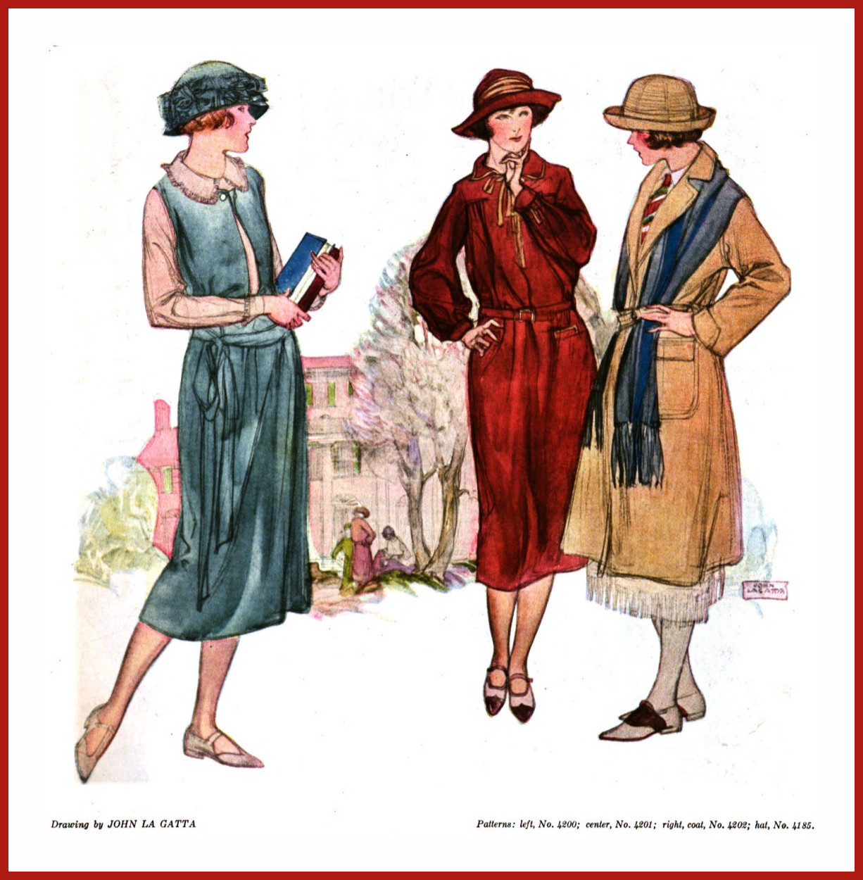
John La Gatta (1894-1977) was a very successful illustrator whose career peaked in the 1930s. I devoted this post to his Golden Years work.

There was more to his career than that, of course. So this post deals with some of his illustrations made before the late 1920s when his fame was taking hold.

La Gatta loved to depict women. Many of his illustrations included men, but they almost always played a supporting role to gorgeous females. However, when he was getting started in illustration, men were usually his subject matter, and it took much effort on his part to persuade art directors that his interest and talent were focused elsewhere.

Gallery

Life magazine cover - 5 August 1915
La Gatta did do some illustrations featuring women from the start. This poster-style art was painted when he was about 21 years old.

Soap advertisement - 1917
A conventional illustration here, no sign of La Gatta's characteristic style yet.

Soap advertisement - c. 1918
Many artists, La Gatta included, had trouble correctly drawing British-type "tin hat" helmets that Empire and American forces used.

Varnish advertisement - c. 1918
Another Great War related advertisement. La Gatta is using his "masculine" style necessary for industrial clients such as Pratt & Lambert.

Streetcar scene - about 1920 or before

Ivory Soap advertisement - 1920
Again, pre-classical La Gatta style.

Fashion art - 1922
By 1922 he was able to focus more on female subjects. La Gatta did a good deal of fashion-related illustration during the 1920s and early 30s.

Illustration from 1924
This is close to La Gatta's style with line work supplemented with washes. The subject's feet aren't quite positioned correctly, being a bit far to the left of her head for proper balance; in real life, she might fall down.

Photoplay magazine illustration - January 1925
Ten years after the Life cover shown above, La Gatta is hitting his stride.

Swimsuit ad art for A.G. Spalding & Bros. - 1926
He usually worked with models, but I have to suppose he managed this illustration using photographs or a lot of good imagination.

Stirling Silversmiths advertisement - 1926
He is still in a transition zone in 1926: these women aren't quite as La Gatta -like as the girl in the bathing suit a couple of images above.

Earl Mayan: Hard-Edge Illustrator

$
0
0
Earl Mayan (1916-2009) had a long life and a successful career in illustration and teaching. His Wikipedia entry is here and more biographical information here and here.

Even though he had success that included ten covers and a number of story illustrations in America's leading general-interest magazine of the day -- the Saturday Evening Post -- Mayan seems to be largely unknown today. Nothing unusual about that, actually. That's because there were more than a few illustrators who "hit the big-time" at the Post, but not consistently enough to develop a strong reputation in the readership and the public at large.

According to the second link above, Mayan painted portraits and landscapes, but I didn't notice any examples on the Internet. Too bad, because his style used for "slick" (paper quality) magazines was detailed and hard-edged -- not sketchy or painterly. So I am curious regarding his degree of versatility. His black & white story illustrations for "pulp" magazines in the 1930s are not painted and therefore aren't a basis for comparison.

Mayan's most elaborate illustrations are impressive in terms of the amount of work they required due to the large amount of detail depicted. He was a highly skilled illustration technician. I respect Mayan considerably, but due to quirks of personal taste, he doesn't rank with my favorites.

Gallery

Saturday Evening Post story illustration

Saturday Evening Post story illustration

Saturday Evening Post cover art (cropped at the top) - 23 April 1955

Saturday Evening Post cover - 20 April 1957
The subject is New York Yankees' legendary catcher Yogi Berra at work under a pop foul ball in Boston's Fenway Park.

Saturday Evening Post cover - 2 June 1956

Saturday Evening Post cover - 28 April 1956
For some reason (he might have been a fan), Mayan included a large number of English cars in this scene even though they were scarce on American streets in the 1950s.

In the Beginning: J.M.W. Turner

$
0
0
Some readers might be tempted to think that when I mention that I'm not fond of paintings by Joseph Mallord William (J.M.W.) Turner (1775-1851), it means that I'm striving too hard to maintain my Art Contrarian credentials.

Not so. Ten or so years ago I was in the Tate Britain, where there are ten rooms containing his works. This gave me plenty of opportunity to see his paintings "up close and personal" as they used to say. And I didn't like most of the later, archetypical Turners that Modernist apologists gush over because of their near-abstract qualities. So there: I really, truly didn't like what I saw.  During later visits to the Tate, I never set foot in those Turner rooms again.

Background information about Turner can be found here.

Turner's painting were not always the wispy things he is famous for. He evolved, as most artists do. Below are examples of his paintings made when he was in his late 20s and early 30s. They indicate his focus on landscapes and marine subjects along with a growing interest on the effects of light and atmosphere.

Included is one painting where people are the focus, and I consider it inferior to the others, some of which I find fairly likable. Also included is a late painting (he was 65) that is somewhat at odds with the atmospheric seascapes he is most noted for.

Gallery

Dutch Boat in a Gale - 1801

Holy Family - 1803

Bonneville Savoy - 1803

Windsor Castle from the Thames - c.1805

The Shipwreck - 1805

Cliveden on the Thames - 1807

The Battle of Trafalgar, as Seen from the Mizzen Shrouds of the Victory - 1806-08

Venice from the Giudecca - 1840

Frederick Varley and Vera Weatherbie

$
0
0
What follows is a greatly simplified, fascinating fragment of Canadian art world history.

It has to do with Frederick (Fred) Horsman Varley (1881-1969), a member of the Group of Seven who I wrote about here (Wikipedia entry here). Unlike most Group of Seven artists, he favored portraiture over landscape painting. And his character was erratic, being prone to stumbling from one personal relationship or financial crisis to another.

He spent 1926-36 in Vancouver, British Columbia teaching and painting. One of his students, Vera Olivia Weatherbie (1909 or 1910 - 1977), became both his lover and muse. There is not much about Weatherbie on the Internet, but here is one link. Varley painted Vera a number of times (see below), and one portrait is now considered iconic in Canadian art.

Weatherbie married photographer and art patron Harold Mortimer-Lamb (1872-1970) on 4 May 1942 when she was in her early 30s and he was about 70. It seems to have been a happy marriage. When she was in her mid-50s she developed dementia or insanity and was lobotomized late 1967 or in 1968. She died choking on a piece of steak on the occasion of her brother's visit from Seattle.

These details were gleaned from the book "Harold Mortimer-Lamb: the art lover" that is reviewed here.

Here are many of Varley's paintings of Vera plus a reference photo.

Gallery

Portrait of Vera by John Vanderpant

Vera - c. 1928

Vera

Dharana (probably Vera) - 1932

Vera

Vera - 1934

Vera

Vera - 1931
This is the Varley portrait of Vera Weatherbie that I and others call "iconic."

Jeremy Mann: Free and Tight on a Single Painting

$
0
0
Jeremy Mann (b. 1979) is a young (mid-30s) artist whose work disproves the modernist conceit of the 1950s that there was no point to realist or naturalist painting in the age of photography, and that abstraction was the viable Fine Arts alternative.

The link to a Fine Arts Connoisseur magazine piece featuring Mann is here, and a gallery web page regarding Mann is here. They contain snippets of biographical information.

Mann's style is a combination of sketchy, impressionistic backgrounds delivered using a variety of means for attacking a wood panel with paint along with tightly-painted details, especially in his depictions of beautiful women. He is also hugely prolific, as his own web site reveals. Click on the images below to enlarge.

Gallery

Bay Evening

Raised freeway

Hell's Kitchen

Rooftops in the Snow

Soho

The Muse

Undressing

Untitled (Grace)

The White Vanity

The Forgotten (Version Two - Neglect)
Viewing all 1103 articles
Browse latest View live


Latest Images