Quantcast
Channel: Art Contrarian
Viewing all 1103 articles
Browse latest View live

Bok's Singing Tower

$
0
0

It's a ways from the nearest freeway, but you can get there by mostly four-lane roads. So as far as I'm concerned, you have no excuse to miss it if you're anywhere near Orlando, Florida with its Disney World and other tourist attractions.

The "it" I refer to is the Bok Tower Gardens site just northeast of the town of Lake Wales. It interested me from the time I was in elementary school and saw it depicted in one of those cartoon maps featuring sights to see across the United States. But I never managed to visit it until recently.

The tower and its surrounding gardens were the creation of Edward W. Bok (October 9, 1863 – January 9, 1930) who died about a year after the site was dedicated. A short biographical item is here. Briefly, Bok was born in the Netherlands, but emigrated to the United States as a child. He married into the Curtis publishing family and was editor of the Ladies Home Journal magazine for decades. His grandson, Derek Bok, was president of Harvard University.

As this Wikipedia entry indicates, the tower and gardens project was begun in 1921 and dedicated February 1, 1929. Its site is atop one of the highest hills in nearly-flat peninsular Florida.

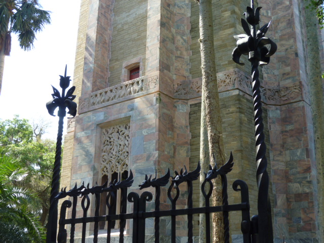
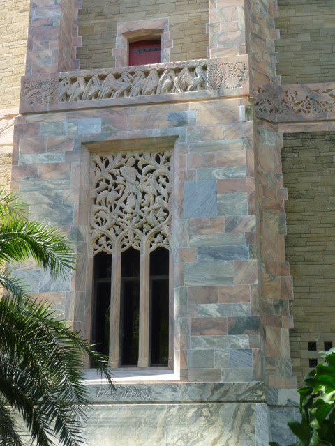
Landscaping was designed by Frederick Law Olmsted, Jr. of the famous family perhaps best known for New York City's Central Park. The tower's architect was Milton B. Medary, who is little known today. Integral sculpting is by Lee Lawrie, a prolific sculptor active in the first half of the twentieth century whose best-known works include the Atlas in New York City's Rockefeller Center. Ironwork and the tower door were by Samuel Yellin.

I think the tower is an excellent example of a high point in American architectural form and detailing, where gothic-inspired skyscraper shaping was combined with a non-traditional ornamentation style that was called Moderne and now called Art Deco.

Below are some photos I took during my visit.

Gallery

Visitor Center courtyard
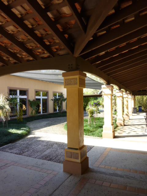
Note the exposed undersides of the roof tiles.

Display of construction photos

Looking up

General view

Top details by Lee Lawrie

Wrought iron gate by Samuel Yellin

Sundial
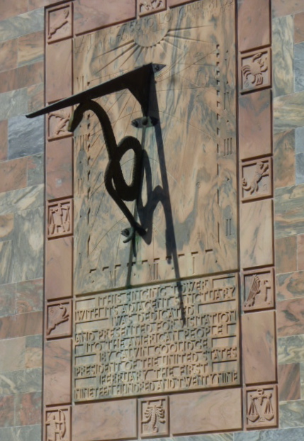
Note the inscription below. It mentions that President Calvin Coolidge dedicated the tower and gardens.

Lower level sculpting by Lee Lawrie


Arty views of the tower entrance
The white flowers and stone in front of the door mark Bok's grave.

Entry door by Samuel Yellin

A Fine Noel Sickles Illustration

$
0
0

Above is a slightly cropped image of a Noel Sickles (1910-1982) illustration intended for a Life magazine article during World War 2. Sickles was a hugely talented, largely self-taught draftsman who worked in the Associated Press bullpen, then drew the Scorchy Smith comic strip for three years before becoming a successful illustrator. His Wikipedia entry is here. Leif Peng discusses his military art here. David Apatoff comments on Sickles' drawing ability here. And here is one of my takes on Sickles.

The illustration at the top of this post was not used. What Life did publish is here:


I prefer the rejected image as an example of extremely well made illustration. The Life illustration might have been selected because it was a better teaching tool for soldiers encountering armor.

I like the unused illustration for several reasons. Perhaps its best attribute beyond Sickle's accuracy in depicting soldiers and the German Pkw IV is the economy of detail. For example, the tank is not so much a collection of lines as it is a study in darks, middle values and (comparative) lights. The American soldiers are also rendered in a sketchy, slightly impressionistic manner. Folds of the uniforms are highly simplified, yet convey the shapes of the individuals. Helmets are accurately shaped by line and shadow. This is important because many illustrators and painters seem unable to depict helmets convincingly (I'm thinking of you, Sir William Orpen!).

The soldier's poses are also convincingly shown. My one gripe is that, probably for reasons of pictorial composition, Sickles grouped the BAR gunner, Tommy gunner and Lieutenant with the carbine on his back too closely together for a real combat situation. A short machine gun burst or a single mortar shell could wipe out all three along with the rifleman to the right.

Viewing Nicolai Fechin

$
0
0
For those of you who can get to Seattle by 19 May, consider visiting the Frye Museum which has an exhibit of paintings and drawings by Nicolai Fechin (1881-1955).

Fechin's Wikipedia entry is here and I wrote about his Taos, New Mexico house and studio here. But if you have time to go to only one link, go here to Matthew Innis' blog for biographical information plus details concerning Fechin's palette and technique (the latter Innis regards with horror).

Fechin's basic style changed little from the time he completed his training, though individual works fell within a range of "painterlyness" (I made that word up, I think) from kinda finished to pretty sloppy, the more finished examples being commissioned portraits. While I can't say that I love Fechin's paintings, I find them interesting and instructive.

The archetypical Fechin painting featuring a human subject follows a formula. Skin, especially the female face, is depicted smoothly; Innis states that Fechin would wet his fingers with his tongue and finger-paint the smoothness. Subjects' hands were more likely to be done in a sketchy manner, while nude bodies fell somewhere between. Backgrounds are typically highly sketchy and painterly to the point that they often seem like the New York school of Abstract Expressionist art from the 1950s. Sometimes recognizable objects appear, other times not. Being somewhat lazy myself, I wonder if Fechin adopted this kind of background treatment to avoid having to get bogged down painting details.

The exhibit at the Frye was an excellent opportunity to examine a large number of Fechin paintings and draw some conclusions of my own. Below are a few examples of Fechin's work to set the scene; the lower two were on display.

Gallery

Konstantin Mihailovich Lepilov, artist - 1909

Portrait of My Father - 1912

Eya in Peasant Blouse - 1933

The upper two paintings are of men, so the faces are not smooth, in contrast to the lower portrait of Fechin's daughter. In many of his works, Fechin's application of paint ranges from thin to thick. In the portrait of his father, you can see thinly painted sketch lines and washes supplemented by built-up areas for the background and flesh. The Lepilov portrait is also fairly early and follows the same pattern, Eya's portrait was made more than 20 years after his father's, and is more typical,

Images of Fechin's paintings fail to convey the actual appearance more than in most cases because his work usually contains passages of heavy impasto than can be hard to discern. In the case of Eya, if you click on the image to enlarge, you might be able to notice extremes of thick and thin paint in the lower right quadrant of the painting. In some cases, Fechin painted thickly with a brush, and at other times, use of a palette knife is evident. Innis says that he would apply with a brush first and then swipe with the knife at an angle to the brushstroke.

Innis also asserts that Fechin's techiques resulted in his paintings being in bad shape even before they were finished. Whereas I do not doubt that, nearly all the works I saw at the Frye seemed to be in good condition. Given Fechin's use of both washes and impasto on completed paintings, such works would probably be a nightmare to restore, so I contend that many have aged well.

Helen Dryden: From Illustration to Industrial Design

$
0
0
Helen Dryden (1887-1981), according to her Wikipedia entry, spent most of her art school years working to become a landscape painter. And afterwards she shifted to commercial art, becoming a cover illustrator for Vogue magazine. (More biographical information is here.)

By 1914 she was doing costume and set design for theater, though Wikipedia does not provide information regarding how many productions she worked on.

Besides fashion-related illustration, by the late 1920s Dryden was practicing what was becoming known as industrial design. I could find no examples of this work to present below. She consulted for Studebaker in the later 1930s, probably mostly dealing with interiors. Studebaker advertising credited designs to her, though Raymond Loewy also began working with Studebaker in 1936. Since he had had previous experience styling Hupmobiles, he probably did exterior work, but the advertising featured her probably because she was better known at the time.

The Wikipedia entry indicates that she had fallen on hard times by the mid 1950s. If her year of death was 1981, I wonder how she managed to survive for another 25 years; the entry implies city welfare.

Gallery

Vogue - 15 July 1914

Fashion Fête program cover - November 1914

Vogue (UK) - April 1919

Vogue (UK) - 1 November 1920

Delineator - July 1929

Delineator - October 1929

1936 Studebaker Advertisement crediting Dryden

Everett Shinn, Who Would Rather Do Theatre

$
0
0
Edward Shinn (1876-1953) was the youngest of New York's famed Ashcan School of realist painters active early in the last century. Biographical information can be found here and here.

It seems that Shinn, like other Ashcan artists from Philadelphia, got his start as a newspaper illustrator. And he continued to illustrate long after he took up painting, this to help pay his bills when needed.

Besides painting and illustration he became deeply involved in theatrical activities. Later he extended this to professional work as an art director for movie studios.

A 1901 visit to Paris acquainted him with the works of Edgar Degas which strongly inspired him, as can be seen below, especially in his "The Orchestra Pit." Of course Shinn painted landscapes, city scenes and other subjects, but I thought it might be interesting to focus here are theater-inspired paintings. All shown here were made in the early 1900s with the exception of the one of the night club that was done around 30 years later.

Gallery

Spanish Music Hall - 1902

Girl on Stage - 1906

The Orchestra Pit (Old Proctor's Fifth Avenue Theatre) - 1906

Theatre Box - 1906

Review - 1908

Night Club Scene - 1934

Walt Kelly's Pogo Brushwork

$
0
0
The Pogo comic strip by Walt Kelly (1913-1973), whose life was cut short at age 60 by diabetes, was beloved by many.

I read it some when I was young, but had trouble following it. Plus, I suppose I wasn't intelligent enough or sophisticated enough to appreciate the politics Kelly injected into the strip. Even today, I think Pogo would have been better had it stuck to the foibles of life and personalities because injecting politics upsets or angers a good deal of one's potential audience.

That aside, Kelly's cartooning style was marvelously inventive. I show some examples below that I grabbed off the Web so that readers unfamiliar with Pogo can see what I mean. For instance, note Kelly's use of a variety of typescripts in the second image. Also observe the outlines of the panel boxes; hand-drawn and bold. Most of all, consider Kelly's combination of strong brushwork and body action for his subjects -- this probably thanks to his days working for Walt Disney.

Gallery

Self-portrait

Kelly's use of type

Albert and bird


Original art with non-reproducing blueline workup

Bits of Fancy Florida Hotels

$
0
0
It can be fun to visit fancy hotels even if you don't (or can't) pay the fancy fare to stay. We were in Florida the first half of February and did some hotel-crawling while there. Although we didn't rent rooms, we did dine at each of those shown below.

So far as I'm concerned, the grandest of the lot is The Breakers in Palm Beach. Its Web site is here and the Wikipedia entry here.

Not so grand, but about as old and still pretty nice is the Don Cesar on St. Pete Beach in the Tampa Bay area. The Wikipedia entry is here.

In Coral Gables, near Miami, is another 1920s grand hotel, the Biltmore, whose Wikipedia write-up can be found here.

Below are some photos I took. No thorough studies here, just snippets to provide a taste.

Gallery

The Breakers main lobby

The Breakers, at one end of the lobby hall

The Breakers HMF bar
Originally this room was the main dining area, but has been a bar for years. It was recently redecorated, perhaps with too large a dash of contemporary feeling.

The Breakers HMF bar
A close-up of the bar itself. The illustration is mid 1950s, but I don't know who did it. Nor do I know if it dates back to then or is a retro piece.

Don Cesar from the beach

Don Cesar, poolside

Don Cesar interior

Biltmore Coral Gables pool
The Biltmore has a huge pool. This was taken from the bar area.

Biltmore Coral Gables
Another view of the pool and main hotel structure from not far from where the previous photo was taken.

Pietro Piccoli's Vaguely Cubist Mediterranean

$
0
0
Paintings by Pietro Piccoli (b. 1954) are usually found in galleries in wealthy, but non-big city places such as Carmel-by-the Sea and Palm Desert in California. That's because his paintings are bright, stylized, reality-based works with none of the snark and irony found in the art scenes of New York or San Francisco.

I think they're pretty nice even though some of the effects he uses to set his work apart can interfere. And of course, viewing a bunch of them together makes them seem stereotypical. Actually, seeing a collection of works by almost any artist reveals a sameness. That might be because it's simply due to a painter's personality or perhaps because economic survival requires producing work in a distinctive manner. In any case, Piccoli's style has evolved slightly over time, perhaps because his stuff seems to sell well and he can now trade on his name rather than the exact kind of paintings that launched his career in the American galley scene.

I haven't been able to find much biographical information on the Internet; this at least goes on for a couple of hundred words.

Gallery

Alghero - Sardegna

Barconi a Riposo
The square, lens-like shape in the middle is typical of the Picolli works that I first noticed eight or nine years ago in Carmel. He seems to have abandoned this career-launching quirk, generally a good move on his part.

Harbor scene

Warm Harbor

Still life

Paese sui Colle Romani

Mystery Painting

$
0
0

Above is a reference photo I took in December, 2011 at a gallery in Honolulu's Royal Hawaiian hotel. The photo doesn't show it, but the handling of the paint was nicely, skillfully done. It looks like it was made after about 1910-1915.

Problem is, I don't know who painted it.

I might have jotted down the artist's name, but if I did, the scrap of paper became lost and I'm left to grind my teeth in frustration.

What I remember is that the artist was Austrian, and for a time was something like a court painter during the dying years of the Chinese Empire. A while ago I tried Googling using various search phrases based on those scraps of information, but nothing turned up.

Can anyone out there help me?

Packards Everywhere

$
0
0
They call it the Antique Car Museum, but it's really mostly about Packards.

My wife was getting in a tennis session plus some poolside sunning, and I was at loose ends because those activities aren't for me. A dive into the guidebook entry for Fort Lauderdale, Florida mentioned a car museum, something up my alley. So off I went. The museum lies a mile or so south of the city's downtown on a sidestreet so, like me, you might have to grope around a little to find it. But the price of admission is very reasonable, and the collection is interesting.

What the museum's not is glitzy or over-curated. No shiny black floors and spotlights like the Blackhawk museum in California. No faux street scenes as in the ex-Harrah museum in Reno, the Petersen museum in Los Angeles or the Henry Ford museum near Detroit. Just all kinds of stuff everywhere. That stuff includes custom car designer renderings from the 1930s, framed car ads for many brands, cases containing shelves of hood ornaments, gasoline station and car dealer service signs, and much more potentially fascinating clutter. There's even a small room in homage of Franklin D. Roosevelt who for some reason didn't seem to favor Packards. Nobody's perfect.

Here are some of my photos. The quality varies because the museum walls are pierced by many small windows that let in the intense south Florida daylight that contrasts with the otherwise fairly dark interior.

Gallery

Touring car - 1931
This is one of the more elegant Packards from the marque's heyday as America's top luxury automobile.

Runabout - 1928
The golf bag in the rumble seat is a nice touch. Note the huge spotlight mounted aft of the front fender. 23-skidoo!

Convertible - 1939
Seen 74 years later, this Packard seems very impressive. But at the time, its styling lagged behind its Cadillac and Lincoln competition which were featuring more streamlined shapes.

Caribbean - 1955
One of the last of the "real" Packards. After the 1956 model year, Packards were built, but their bodies were facelifted Studebakers. That's called dying with a whimper.

Station wagon - 1948
The greenhouse rear treatment makes it sort of a "woodie," but nearly all the body was metal. The photo doesn't show how narrow the woodie part was; this wagon wasn't all that functional.

Convertible - 1950
This car and the wagon in the previous photo represent facelifts of the attractive 1941-47 Clipper body. The facelift included clumsy flow-through fenders that enhanced the awkward, bulky appearance of the cars. The convertible shown here was the top-of-the-line model and somehow seems slightly impressive nowadays.

Light Eight - 1932
Luxury car makers were hit especially hard by the Great Depression. For 1932, Packard added the Light Eight line in an attempt to offer lower prices without tarnishing the Packard mystique. From what I read, the Light Eight was still expensive to produce, and it did little to stanch declining sales. The line was abandoned for the 1933 model year.

Light Eight grille
The styling feature I like best on the Light Eight is its grill, popularly called "shovel nose." To me, it combines the traditional Packard iconography at the top with a gesture to streamlining at the bottom.

Glackens Beyond the Ashcan

$
0
0
William Glackens (1870-1938) was a newspaper artist and painter usually associated with the Ashcan School of artists active in New York City in the early 1900s. His Wikipedia entry has more than the usual detail, and stresses that he was most heavily influenced by French Impressionist Auguste Renoir. Another useful biographical site is here.

In any case, Glackens' style evolved over his career, passing through the rough, realist Ashcan look through a Renoir-inspired era and ending with a dash of 1930s simplified solidity.

Unlike some of the other Ashcan artists such as John Sloan, Glackens did not strongly focus on the life and times of the lower elements of society, but seems to have preferred associating with and depicting the upper-middle class and those even higher such as art collector Albert Barnes.

Here are examples of his work dealing with people as opposed to landscapes and cityscapes, which he also painted at times.

Gallery

Figures in a Park, Paris - 1895

Seated Actress with Mirror - 1903

Chez Mouquin - 1905
Perhaps his most famous painting.

The Shoppers - 1907
That's Glackens' wife in the center.

Cafe Lafayette - Kay Laurel - 1914
She was a Ziegfeld Follies performer also known as Kay Laurell.

Kay Laurel - 1915

Nude, unfinished - 1920s
Very Renoir-like.

The Soda Fountain - 1935
Glackens slides slightly from Renoir to 1930s simplified-solids style not long before his death.

Anglada-Camarasa, Colorful Catalonian

$
0
0
Since the time of Goya, Spanish painters who spent much of their careers in Spain have been usually neglected by art historians and the art public. I think this is unfortunate. (Picasso and Dalí made their names in France, though Sorolla's reputation is on the rise.) One of several noteworthy Spanish painters active in the early twentieth century was Hermenegildo Anglada Camarasa (Hermenegild Anglada i Camarasa in Catalan) whose first name is often rendered Hermen (1871-1958). Although he was born in Barcalona, Anglada spent years in France, first as a student, later as an exile. And for a large share of his life he lived and painted landscapes in Majorca.

His English language Wikipedia entry is here, and a more detailed entry in Spanish is here.

Spanish artists have the reputation of being especially fond of the color black, and Anglada used his share. But he also made good use of bright colors to the point where some of his work has been associated with Fauvism, a movement he was well aware of. He also has been mentioned as a kind of Catalonian Gustav Klimt with respect to his treatment of women in some of his paintings.

I find Anglada something of a mixed bag. Much is rather heavily painted and, due to influence by the modernist styles that abounded in his day, there is inconsistency in his approach and little in the way of artistic progression. Nevertheless, several of his paintings are arrestingly interesting, particularly those featuring women and some of his later landscapes.

Here are examples of his work. Titles are in French, Spanish and Catalan, depending on the source. They are arranged in chronological order, though some are undated and their timing is speculative.

Gallery

Paisatge amb pont - 1890

El casino de Paris

Estudi de retrat de Mme. Berthe - c.1900

La morfinomana - 1902

La paon blanc - 1904

À la cafeteria - 1904

Champs Elysées - 1904

Granadina

Sonia de Klamery, Comtessa de Pradere - 1913

La Sibila - c.1913

La gata rosa

Calle mallorquina - 1935

Seen in Florida

$
0
0
Compared to places I've lived such as Korea and Upstate New York, Seattle has a pretty mild winter. My wife, who lived for many years in California, begs to differ. Seattle's winters feature short days, plenty of overcast and even rain. Although it isn't frigid, it can be pretty gloomy. So we head off to sunnier places for much of November through March. For the last two years this has included Florida, at the opposite corner of the contiguous United States.

It turns out that the airline distance from Seattle to Orlando or Miami is about the same as to Honolulu. Plus, the route is over land, unlike the Hawaii run that is seriously lacking in emergency landing fields. Better yet, with a rental car, one can range over a lot of Florida to visit a variety of sites, unlike the islands where you are pretty much stuck once you arrive.

Even though many readers, especially those living in the Midwest and Northeast, have visited Florida, I thought I'd post some photos I took so that others might become aware of what can be found there.

Vizcaya

A few miles down the shoreline road from downtown Miami is the Vizcaya estate, built by the bachelor scion of a farm equipment manufacturer who, like other rich Americans, brought many objects of art and architecture from Europe to the New World. The Wikipedia entry on Vizcaya is here. Photography of the interior is forbidden, so I can offer only some exterior views.


South Beach

The South Beach portion of Miami Beach is perhaps best known these days for its collection of Art Deco style hotels that were built in the 1930s and very early 1940s. Aside from the buildings, I have to say I'm not fond of South Beach, lively though it can be. Many of those buildings along Ocean Drive have restaurants by or even on the sidewalks, and there are so many and competition is so fierce that a number of them hire pretty girls to entice you to a meal.


New River, Fort Lauderdale

The southeast coast of Florida is home to thousands of fancy boats and yachts that somehow weather the occasional hurricane. The photo below was taken from the Riverwalk in downtown Fort Lauderdale.


Tarpon Springs

A short ways north of St. Petersburg on Florida's west coast is Tarpon Springs, a small city with a large Greek population. One can eat lots of Greek food, enjoy watching the boats and even take a tour out to an island on the edge of the Gulf of Mexico.


Universal Studios, Harry Potter Area
The Big Deal for tourists in the Orlando area is Walt Disney World. But once that becomes old hat, there are other attractions, one of which is the east coast version of the Universal Studios theme park. So far as I'm concerned, it's okay, but doesn't measure up to Disney. The area I liked best was devoted to Harry Potter. Below are a few street scenes. Yes, it was actually raining that day.


Hard Rock Cafe

You have to eat someplace. So my wife chose the Hard Rock Cafe, a venue we normally avoid. The most striking thing for me was the pink Cadillac rotating above the bar.

Teresa Saia, Best at La Quinta

$
0
0
I don't often go to art shows. From my point of view, most of what I see at them in the way of paintings (my main interest) is mediocre. Plus, the shows I do visit have evolved to become largely arts-and-crafts shows with a lot of photography thrown in and comparatively few paintings. When I was a lad, such shows seemed to have lots of paintings. Sic transit something or other.

A show I now visit fairly regularly is the La Quinta Arts Festival, held in the city of La Quinta in the Palm Springs area of California early in March each year. I visit it because my wife spends two weeks watching the Indian Wells tennis tournament and, when I'm not in the taxi driver role, I try to occupy my time as best I can. So the art show takes up part of a morning and keeps me away from coffee shops.

The show management cites magazines that claim it to be one of the top such shows in the country, though I'm not sure how such findings are made. Like other such shows these days, most of it deals with sculpture, photography, clothing, jewelry, furniture and perhaps a few other things I can't recall. In any case, I don't consider myself qualified to evaluate the quality of such items. For the most part the paintings fall into what I consider the "pretty good" range from a technical standpoint. Subject matter tends to be skewed to what the artist has found to be salable. That's because, so far as I can tell, the artists exhibiting at La Quinta do art as a full-time job.

Along with the matter of artists selling their wares, prizes are awarded. This year's winners are mentioned here. Leading the pack is Teresa Saia, who is a fellow Seattle dweller. I wandered by her tent, spotted the blue ribbon and noted that quite a few of her paintings had already sold (this was the morning of the second day of the four-day show). She was busy talking to other people, perhaps potential buyers, so I moved on to view other displays.

I remembered Saia's works from last year because they were richly colored landscape and cityscape pastels that at first glance seemed like oil paintings. But this year she had some nice thinly-painted oil landscapes on view that in some respects reminded me of Bernie Fuchs' landscapes (here are some examples of his work). Unfortunately, I could find no Web images of Saia's oils of the kind I saw.

For once, I agreed with the judges, because I thought Saia's works were the best on view at La Quinta. Here are examples of her work. The first three are pastels, a fragile medium in my opinion. Of the final two, one is definitely an oil, the other looks as though it might be. Note that she tends to show scenes from a viewpoint looking towards the sun.

Gallery

The Light Within - pastel

Landscape pastel

Reflecting pool pastel

Morning Pasture - oil?

Evening Light - oil

Leon Kroll at the Edge of Modernism

$
0
0
Although Abraham Leon Kroll (1884-1974) studied art in Paris when Cubism was about to burst on the scene and many other art isms were in place, he never delved very far into modernism. Art gallery biographical notes are here, here and here (the Wikipedia entry is skimpy).

If Kroll was never much of a modernist, his work is clearly not in the traditional vein either. Generally speaking, he tended to simplify his subjects to the point where viewers would see that this was a stylistic intent. To this degree he was a modernist. I discuss in detail the problems artists of his generation faced in my e-book "Art Adrift."

Kroll's style varied somewhat over his career, so it can be a little hard to spot his work aside from paintings of nudes in urban settings (see the photo at the bottom).

Gallery

Eastern Point Lighthouse, Gloucester - 1912

Queensborough Bridge - 1912

Broadway and 42nd Street - 1916

Central Park scene

Manhattan Rythms

Santa Fe Hills - 1917

Four Maids Combing Their Hair - 1919

Dorshka - 1929

Woman in red beret

Kroll working on the painting "Summer, New York"


Hard-Edge Fantasy Artists

$
0
0
Nineteenth century academic painting usually took the form of what can be called "hard-edge" art, where subject matter is portrayed in sharp detail. Back in those days, the term used to indicate it was "finish," meaning the state of completion. Paintings by the French Impressionists were considered lacking in finish.

Nowadays, the degree of hard-edge treatment can be a matter of an artist's personal preference or perhaps is demanded by an important class of viewers. For instance, some fans of aviation or railroad art might prefer to find rivets and sheet metal joins crisply and correctly shown and there are artists temperamentally inclined to produce such illustrations who will do the job. I'd say that it's the artist's wishes that usually prevail, because the greatest part of his work falls in an identifiable zone on the hard-edge to painterly continuum.

I tend to favor painterly art, but thought it might be worthwhile to present some examples of detail-oriented artists who specialize in science-fiction and fantasy art.

Gallery

John Carter Mars scene - by Boris Vallejo and Julie Bell
Vallejo and Bell are married and sometimes work together, as for the painting above, or make illustrations on their own. Biographical information on Vallejo is here and for Bell here.

Through a Dark Red Veil - by David Palumbo
Palumbo is Julie Bell's son from a previous marriage, as mentioned here.

Demon Hunter - by Gerald Brom
As this indicates, he has been called Brom most of his life, and it does make for a nice, easily-remembered brand name.

Tarzan scene - by Joe Jusko
Biographical information on Jusko is here.

By John Jude Palencar
I don't have a title for this Palencar work.

Guardians - by Raoul Vitale
No Wikipedia entry as yet, but this is what Vitale has to say about himself on his Web site.

Celebrant of Peace - by Volkan Baga
The same applies for Baga. He mentions that for a while he was studio assistant to Donato Giancola, an established fantasy artist.

Illustration for fantasy and science fiction should be given more than casual consideration because it represents one of the few remnants of illustration art as it was practiced before 1970. Incidently, much SFF illustration is make using digital media these days, but the artists mentioned above prefer traditional painting.

Up Close: Harvey Dunn

$
0
0
Harvey Dunn (1884-1952) was an influential illustrator and teacher perhaps best known for illustrations of action stories, scenes from the Great War and paintings of rural life on the upper plains. His Wikipedia entry is here and further biographical information along with images is here.

Dunn is known for his vigorous brushwork and focus on the emotional content of his subject matter. That's why I decided to introduce this "Up Close" occasional series with his work.

The Kelly Collection has what is probably the outstanding holding of American illustration art by private individuals (not organizations). I was able to view part of it at The Frederick R. Weisman Museum of Art at Pepperdine University in Malibu, California towards the end of a January 12 - March 31, 2013 exhibition run. The collection concentrates on illustration art created roughly 1890-1935 and one of its purposes is to further knowledge and appreciation of illustration from that era.

Non-flash photography was allowed, so I took a large number of high-resolution photos of segments of those original works. This was to reference the artists' techniques in a manner not always easy to obtain from printed reproductions. (However, the exhibition catalog does feature a few large-scale detail reproductions.)

I thought that readers of this blog might also be interested in seeing the brushwork of master illustrators up close to increase their understanding of how the artists worked and perhaps to serve as inspiration for their own painting if they too are artists.

Below is an image of the entire illustration coupled with my work. Click on the latter to enlarge.

Night Raid - c.1927
Cover illustration for American Legion Monthly, January 1928 issue. This mage is from the Kelly Collection web site. It is copyrighted, as are all such images from that site appearing in this series.


This image segment is of the doughboy seen at the lower left. Note the variation in color between the two images; the latter seems closer to the original as seen at the exhibition, where lighting was warm rather than the cool of the Kelly site image. These difference will be apparent in many other posts of this series.

Dunn used plenty of oil paint and relied to a large degree on discrete brush strokes rather than smoothed color transitions. I find it interesting that he chose to paint the face of the doughboy using green. Other artists might well have mixed blue into skin color to create a nighttime effect. But Frederic Remington also found green useful for nigh scenes, and perhaps Dunn picked up the concept from him.

In the Beginning: Claude Monet

$
0
0
The early paintings of Claude Monet (1840-1926) are no deep, dark secret hidden by protectors to preserve his reputation as an early modernist. They can be found in important museums in France and America and not stashed away in storage areas. When in Paris, all you have to do is suffer standing in line for entry to the Musée d'Orsay before rambling around to spot one or two examples. And if the d'Orsay waiting line is too daunting, you can wander into the 16th Arrondissement and over by the Bois du Boulogne and visit the Musée Marmottan, which has a nice collection of Monet's work. In fact, years ago I was at the Marmottan and struck by the fact that Monet wasn't always haystacks and water lilies, even though his paintings were seldom entirely conventional for the times.

Here is a sampling of pre-Impressioninst (in style) paintings.

Gallery

Camille Doncieux (his future wife) - 1866

Garden at Sainte-Adresse - 1867

Women in a Garden - 1866-67

Mme. Gaudibert - 1868

Self-Portrait - 1886
Although he was well into Impressionism by this time, Monet chose to portray himself fairly conventionally.

Stape's Practical Painting Blog

$
0
0
For all I know, there must be a mega-gazillion art blogs lurking out there on the Internet. I trip across some when I'm trolling for images to post here. But for better or worse, I usually don't bother following them.

Once in a while I do spot a blog I find really interesting or otherwise useful, and when I do, I add it to the Links list over in the right column. Such is the case for Stapleton Kearns' blog which has been around for about four years in its present form. Kearns is a full-time painter specializing in landscapes that are solidly crafted and worthy of your attention. Here is detailed biographical information on Kearns.

Kearns' blog deals largely with practical information and advice about painting, probably an outgrowth of his experience teaching at workshops. His post tally is now more than one thousand, the bulk appearing 2009-11. I think it's worthwhile to sift through the earlier posts because they deal most thoroughly with issues than matter most to him.

To give you a taste, here is a post from 2009 dealing with art education.

* * * * *

NOW LISTEN TO ME CAREFULLY, THE PURPOSE OF AN ART SCHOOL IS TO PROVIDE EMPLOYMENT FOR ITS INSTRUCTORS.

I am aware that the situation is improving and there are a few places that do produce better trained young painters. I also know there are some fine teachers out there who do lead their young charges through a fine course of instruction. Now I know that over in the graphics department students learn useful skills. But I feel these fine instructers are still very much the exception, if you take a walk through the studios of most art schools, colleges and Universities the work is appalling. Most of the art schools out there are foisting a deceit on their pupils. By making their students believe that all they need to know is already within them, if they just have the self awareness to find it, the student is taught, its all about them. That, for many young scholars today is an attractive idea, they do like being told how special and individual they are. In many art schools today the teachers will tell a student that there is no way to even teach art, and they will be contaminated by studying works by another artist with the end of improving their own. The contemporary art school changes the educational event from really wicked difficult, to one of self admiring introspection that any student can do. Now they can fill those classrooms! The art schools of America graduate more students in a year than there have been artists in the history of our nation. If the hairdressing schools of America produced as few hairdressers they would be shut down for robbing their students. It can be argued that art is subjective and shouldnt be measured for its results the same way as say, engineering, but isnt hairstyling kind of subjective as well?

Often enough in the fine arts department the students are coddled for four or more years, and then released into the real world where the are served a harsh awakening that it's not just about them out there. I have often seen young would be artists confronted with this reality go back for a masters degree, to get more of the training that didn't make artists out of them in the first place. If you really unpack this with them, you find out they intend to teach. The best of them will, and the best of their students will be teachers as well . There are plenty of teachers out there who have never made a living as artists and their teachers and their teachers' teachers didn't either. They have in fact only contempt for those of us out here who actually do it as a vocation. The sudden rise of popularity of the new ateliers across the country and in Italy is a response to a small but growing number of students who would like to make a living painting and have figured out they will need to know a lot about painting in order to do it. I believe that small but growing atelier movement probably holds the promise of a new American art.

* * * * *

I notice that Kearns has cut back on posting frequency, but you might consider checking for new material from time to time once you've digested those first 400 or so posts that contain the most meat.

Up Close: Mead Schaeffer (1)

$
0
0
This is part of an occasional series dealing with detail images of paintings featuring the brushwork of the artist. Previous posts can be found via the "Up close" topic label link on the sidebar.

The present post deals with Mead Schaeffer (1898-1980) when he was following the style that gained him success as an illustrator. Additional information on Schaeffer is here.

Featured here is an illustration for Stephen Meader's book "The Black Buccaneer" of 1929.

The source of the detail images is explained below:

* * * * *

The Kelly Collection has what is probably the outstanding holding of American illustration art by private individuals (not organizations). I was able to view part of it at The Frederick R. Weisman Museum of Art at Pepperdine University in Malibu, California towards the end of a January 12 - March 31, 2013 exhibition run. The collection concentrates on illustration art created roughly 1890-1935 and one of its purposes is to further knowledge and appreciation of illustration from that era.

Non-flash photography was allowed, so I took a large number of high-resolution photos of segments of those original works. This was to reference the artists' techniques in a manner not always easy to obtain from printed reproductions. (However, the exhibition catalog does feature a few large-scale detail reproductions.)

I thought that readers of this blog might also be interested in seeing the brushwork of master illustrators up close to increase their understanding of how the artists worked and perhaps to serve as inspiration for their own painting if they too are artists.

Below is an image of the entire illustration coupled with my work. Click on the latter to enlarge.

* * * * *

This image is from the Kelly Collection website.

From the lower right corner.

This is from near the center.

Early in his career, Schaeffer illustrated adventurous, swashbuckling subjects using brushwork with a boldness to match. The detail image in the middle could easily be a 1950s New York Abstract Expressionist work. Note that Schaeffer used his initials to sign the painting. The lower image features the "square brush" heavy impasto style he favored at the time.
Viewing all 1103 articles
Browse latest View live


Latest Images