Quantcast
Channel: Art Contrarian
Viewing all 1103 articles
Browse latest View live

Violet, the Artist Duchess

$
0
0
Marion Margaret Violet Manners (née Lindsay), Duchess of Rutland (1856-1937) was a famed Victorian beauty who was portrayed by the likes of George Frederic Watts and James Jebusa Shannon.

But Violet (as she was generally known) was able to turn the tables, so to speak, because she made many pencil portraits of people in her social circle as well as some other noteworthy Britons. Her Wikipedia entry mentions that she had no formal art training. But, given her circumstances (her paternal grandfather was the 24th Earl of Crawford), she surely was instructed in drawing and perhaps painting as part of her education. Sources indicate that she painted portraits, but I could turn up no usable examples during one of my habitually slapdash Google searches. What I did find were plenty of images of her drawings, some of which are displayed below.

Another thing I'm not sure about is whether or not she used photographs as the basis for her drawings. Regardless, she did have a knack for capturing expressions, provided the subject displayed a demeanor other than Victorian sobriety.

Gallery

Sir Rennell Rodd, C.B., Afterwards Lord Rennel of Rodd

Lady Rodd

Lord Charles Beresford, C.B.

Marquess of Salibury, K.G.

Mrs E. Tennant, Afterwards Lady Glenconnor

Princess Trubetzkoy, neé Amelie Rives

The Duchess of Portland

Mr Rudyard Kipling

Wilfrid de Glehn: John Singer Sargent Associate

$
0
0
Wilfrid Gabriel de Glehn (1870-1951) was a British painter with German roots (he changed the spelling of his family name from von Glehn during the Great War), who worked with John Singer Sargent and Edwin Austin Abbey (details on this are sketchy, however). He remained friends with Sargent and was depicted by him on a few occasions.

De Glehn's Wikipedia entry is here, but it is brief. Much more information can be found on this site, including some information regarding himself and Sargent (here). More information on de Glehn and his wife Jane is here.

While de Glehn can be considered an impressionist, he made many portraits that were traditional in style. His series on female nudes tended to be more sketchy, but not impressionist.

J.S. Sargent Depicts the de Glehns

Jane de Glehn (in a Corfu garden)

The Fountain, Villa Torlonia, Frascati, Italy - 1907

Sketchers - 1913
The woman is thought to be Jane, but could be someone else.


Gallery: de Glehn's Works

Self-Portrait

Fishing
A website has this dated 1932, but I'd say it would be more like 1912, to judge by the clothing.

Shadows on the Wall, Cannes, France

Lynn Fontanne - 1912
Fontanne was British, but best-known on the American stage, often appearing with her husband, Alfred Lunt.

Sisters - 1923

Mrs Neville Chamberlain - 1924

Clare Collins - 1927

Jane Emmett - 1931
This is the niece of Jane Emmett, de Glehn's wife.

Louise in Stripped Dress

Resting
De Glehn painted many nudes.

Val d'Aosta scene
An example of de Glehn's landscape work.

"Brownie" Mostly Worked in Black & White

$
0
0
I exaggerated when writing the title of this post, but not very much. Arthur William Brown (1881-1966) spent much of his career not making color oil paintings for magazine covers, but instead did interior illustrations that were usually printed in black and white in those days when color printing was expensive.

Currently, there is little biographical information about Brown on the Internet, though you might consider linking here and here. There's more about him in books dealing with illustrators such as Fred Taraba's fairly recent Masters of American Illustration.

It seems that Brownie (as he was known by his illustrator and other friends) was an early adopter of reference photographs. This was influenced by his slow, careful approach to creating what look to be quickly-done illustrations. (They appear quickly-done because he mostly worked in crayon, pencil and washes that seem less substantial than illustrations done using oil paints.)

What interests me is that he was good at capturing facial expressions and character. How much of this was the product of the photos he took and how much was conscious deviations from the photographic images? I am not aware of any surviving reference photos from the 1920s and 30s that can be compared to the finished works they were used for, so perhaps that matter can't be resolved. Given that Brownie was highly skilled, I'll assume he used his photos as the starting point and didn't copy them slavishly.

Brownie was good, successful, and popular socially. Still, I place him a fraction of a notch below the likes of F.R. Gruger and Henry Patrick Raleigh who used similar media in their illustration work.

Gallery

Brownie with his fancy new 1927 Packard. He made a lot of money in the 1920s, but was badly hit in the 1929 stock market crash.

A publicity photo of Brownie at work in the mid-1940s.

Another publicity shot. Here he and Russell Patterson are sketching Florence Kallender in tony Palm Beach Florida, 1947. Brownie was perfectly capable of sketching, but as was mentioned above, he normally used reference photos.

Greta Garbo, done in 1937.

Note Brownie's skill in depicting facial expressions.

A 1920s story illustration.

Illustration for a 1930 Saturday Evening Post story.

1937 story illustration.

A Post illustration from 1935.

By the 1940s, two-color magazine interior printing was common, so Brownie adjusted.  Some other two-color illustrations are seen above.  The first also is from the early 1940s and the next was done in 1937, as noted.


Dale Chihuly's Portable Radios With Plastic Cases, and More

$
0
0

This is actually one of my occasional industrial design posts, but I thought it wouldn't hurt to begin using a link to an artist.

That artist is Dale Chihuly (1941 - ), master of glass installations (Wikipedia entry here). A couple of years ago, a museum devoted to Chihuly was opened in Seattle right next to the well-known Space Needle. Attached to the museum is a restaurant called Collections Café. Its Web site is here, and a Seattle Magazine article about it is here.

That article notes that the name "Collections" refers to the cafe's decor, which is dominated by objects Chihuly collected over the years. The link includes some photos that help give you the flavor of the place.

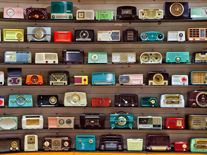
The photo at the top of this post is from Seattle Met magazine and shows a wall display in the cafe consisting of dozens of pre-transistor portable radios from the 1940s and 50s for the most part. The variety of styles grafted onto fairly similar electronic boards is astonishing.

A little context for that era of small (for the time) plastic-cased radios is offered below.

Gallery

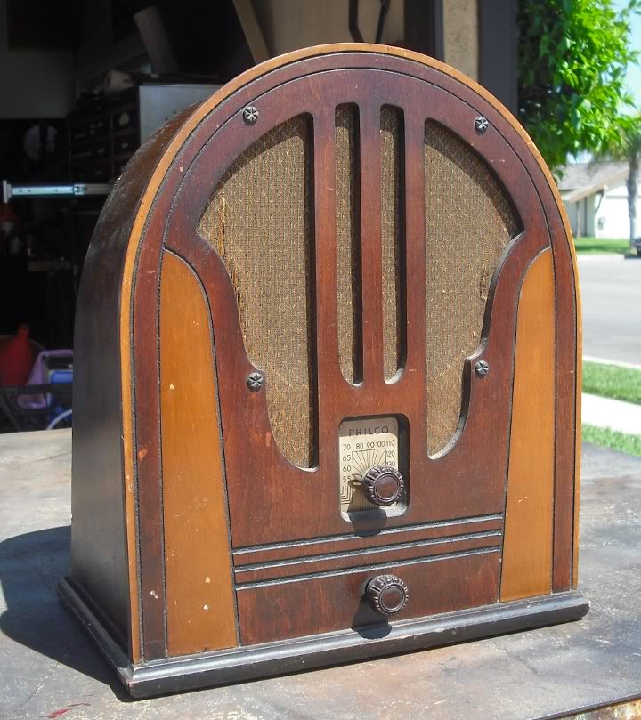
Philco 40-180 - 1940
Many households of the 1930s had a large radio such as the one shown here.  Such a device was normally located in the living room and served as the focus for evening entertainment for a family.

Philco 84B - 1935
Not all radios were large back then.  That's because the chassis with its vacuum tubes (valves, in Britain) could be pretty much the same size for all AM radios since the electronic functionality was the same.  What usually varied was the size of the cabinet and perhaps the size of the speakers.  The radio shown here is a table-top type that could be placed in a living room, bedroom, home office or somesuch place.

The Philco model illustrated here is the same type as our family radio when I was a wee tyke; it was used until television came along.  I still have that radio.  It looks almost the same as the one above except that the dial has sort of an orange hue.

Philco 38-15T - 1938
By the late 1930s engineers were able to create more compact layouts allowing for even smaller sets.

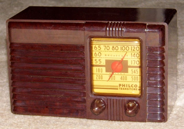
Philco PT-25 - 1940
Philco cased its radios using wood through most of the 1930s, but added plastic by 1940.

Westinghouse H-127 Little Jewell - 1945-47
An early post- World War 2 portable radio, this from Westinghouse.  I include it because I had such a radio in my bedroom when I was young.  Unlike the old Philco, I no longer have it.

Henri-Joseph Harpignies: At the Far Edge of Impressionism

$
0
0
Henri-Joseph Harpignies (1819-1916) lived for nearly a century. In his youth, Academic painting was riding high and, by the time of his death, some artists were painting purely abstract works. Harpignies, however, stuck to a narrow stylistic range -- largely Barbizon, but sometimes with a touch of the Macchiaioli, a group of Italian proto-Impressionists. A biographical note is here.

Harpignies was primarily a landscape painter; Google Images-search of his works turn up only incidental people in the landscapes shown. His style varied from clearly Barbizon-like detailing to somewhat more simplified paintings featuring obvious brush strokes. Some of these latter paintings are pretty small, though I did recently notice one on display at the Seattle Art Museum that was large and featured bolder brushwork.

Perhaps I'm wrong, but I get the feeling that he was one of those artists who liked to use geometry as the basis for some of his compositions. I note a couple of instances below, but some of the other images seem to have the same feature.

Gallery

Le vieux chêne - 1895
This was painted when Harpignies was about 75 years old, yet it looks more Barbizon-like than some of his painting made years before, when Barbizon was more fashionable.

Cliffs Near Crémieu - 1847
An early work.  Solid, though I wonder about the  composition where the foreground zone is about as high as the sky above the butte.  Crazy me, I would have had less sky, because that's my usual choice when composing photos.

River and Hills - 1850s
I don't have dimensions for this painting, though it doesn't strike me a being very large.  Has a Macchiaioli feel to it.

Washing the Laundry - 1875
This is a small painting, about 13x16 inches (32x40cm), so visible brushwork can be expected.

The Village Church
Sorry about the slightly blurred image, but that was all I found of this painting.  Here the sky and remainder each take up about half the vertical distance.

Le pont canal à Briare - 1888
A nice, clean painting with very little fussy detail.  But note that the focal bridge support on the left side of the canal is approximately one-third of the vertical canvas dimension, the sky and foreground at that point each measuring close to another third each.  Were geometrical relationships (slightly disguised or fudged though they might have been) intentional or simply the way he intuitively painted?

The Big Tree

Shifty School Colors

$
0
0
I can only write with confidence about certain parts of the United States that I'm especially familiar with. But I wouldn't be surprised if the same sort of thing I'm about to discuss isn't fairly common elsewhere.

The subject here is school colors at the college and university level. (For overseas readers, "colleges" in America are post-secondary schools. Setting aside two-year "community colleges," technical schools and such, a college is typically a four-year undergraduate institution of the liberal arts variety that lacks additional schools a university will have such as law, medicine, business, engineering, etc.)

Schools at almost any level here in the States have associated colors. Often when a school is established, its students will vote on a color scheme -- typically a two-color combination. For schools established many years ago such as in the Ivy League, colors might have been set by other means; I don't know details. As for my personal experience, as best I remember, my elementary school had no colors. My junior high was something like violet and white, and the high school had green and gold (actually more like a yellow in practice).

Where it gets interesting enough to blog about is when one begins to notice that school colors don't necessarily remain exactly the same over time or setting.

Let's start with the Ivy League, and focus on Harvard and Penn. Harvard's color is crimson, a bright red that edges slightly in the blue direction. Around Harvard Yard one can actually see some crimson here and there such as in the banner shown above.


But as to what students wear when it comes to school colors, the hue used is more like a maroon. I suspect that's because a strong red such as crimson usually doesn't work well on apparel.


Nowadays, schools can earn tidy amounts of extra money via products licensed to display coats of arms, colors and so forth. As seen above, Penn lays out in detail just what the expected colors are.


Penn's colors are red and blue. The banner pictured here shows a different set of those colors than the official specification indicates. When I was at Penn, I would see banners, pennants and such with the brighter hues shown above as well as the darker, slightly toned down official shades. To put it roughly, the bright Penn colors are associated with athletic settings (though not on team uniforms) and the darker colors are for clothing, uniforms and most other purposes. This is much like Harvard, where bright, rather "pure" colors aren't for everyday wearing, especially by 20th and 21st century American males.


I have a BA and a MA from the University of Washington. Its school colors are purple and gold, voted by the students in 1892 who were inspired by the first stanza of Lord Byron's The Destruction of Sennacherib. The colors shown above were those I experienced when I was there. As this indicates, those are the colors to be used for Web applications.


On the other hand for "branding" purposes, this color palette is now official, and is about what you see on the hoodie above, with the purple a bit lighter. This washed-out purple and gold color set is comparatively recent and is tied, I think, to the marketing of clothing for students and sports fans. I prefer the stronger colors aesthetically, but don't buy UW color clothing because (1) I don't think I look right in purple, and (2) I earned my right to be an Ivy League snob, and so prefer Penn colors.


Down the road at the University of Oregon, the colors are green and gold, like those of my high school in Seattle. Oregon sports teams are called the Ducks, so many years ago Disney artists created a fighting Donald Duck in Oregon colors as a kind of team mascot.


Even an angry Donald Duck is not very terrifying. So as Oregon grew to become a national football power over the last 15 years or so, the Donald was de-emphasized and the colors shifted, at least for athletic and logo clothing purposes. Shown above is what seems to be current. The green has been blackened and the gold turned into a yellow. The gray items (not an official color) represent duck feathers.


Farther down the coast is UCLA. It seems that all University of California branches use forms of blue and gold, but these vary from campus to campus, with UCLA favoring something like a horizon blue, sometimes even a little lighter than on the hoodie seen here.


Yet darker blues are also seen around UCLA, blues suspiciously near those found up north in Berkeley. Apparently that's legit, as this color guide states. The paler blue is favored, but a darker shade is considered okay as a "secondary" version. Both color set variations are wearable, so unlike Harvard and Penn and, to perhaps a lesser degree at Washington and Oregon, the avoidance of strong colors did not seem to be a consideration at UCLA.

Molti Ritratti: Lady Diana Cooper

$
0
0

Diana Olivia Winifred Maud Cooper, Viscountess Norwich, née Lady Diana Manners (1892-1986) was one of those society beauties who was too attractive to capture with oil or any other kind of paints. Not that a few artists didn't try, and some of their efforts are shown below.

On the other hand, cameras love certain kinds of beauty (and vice-versa, I assume). So the best images of Lady Diana Cooper seem to come via photography, as also can be seen below. The photo at the top of this post is by Emil Otto Hoppé (1878-1972), and is perhaps the iconic image of Diana.

Her Wikipedia entry is here, and views of how she lived can be found here.

Photo Gallery

Also by Hoppé - 1916

Photo showing left profile

By Cecil Beaton

Time magazine cover - 15 February, 1926

Artist Gallery

By James Jebusa Shannon when Diana was young

By James Jebusa Shannon at the time of her marriage to Duff Cooper (1919)

By John Lavery - Lady Diana Cooper with Hazel Lavery and Viscountess de Janze - 1919

By Ambrose McEvoy

Drawing by John Singer Sargent

Albert Dorne: Crowd-Scene Illustrator

$
0
0
Albert Dorne (1906-1965) was an important and very busy man during the final flowering of traditional illustration in America. His brief Wikipedia entry is here, and a link with many examples of his work is here. David Apatoff, who wrote an illustrated biography of Dorne, blogged about him here and here. Leif Peng's take on the book is here.

In brief, Dorne started life at the bottom, further burdened by ill health. Nevertheless, he was driven to succeed, a task made easier by his ability to draw.

Dorne had the capability to be versatile, and was so at times when that was called for. Still, it seems to me that what he really liked to illustrate were scenes featuring crowds of people or, failing that, a detailed setting. To accomplish this, he made many preliminary studies, the final one being as detailed as the finished illustration but usually lacking color. He was hugely productive in terms of completed assignments, yet found the time and energy to do all this preparatory work. I find it astonishing that he could manage that while being involved with other projects such as the Famous Artists School.

Another characteristic of Dorne's illustration is his tendency to exaggerate body poses and gestures, something in the spirit of Thomas Hart Benton. I will deal with another of his stylistic traits below in the Gallery section.

For a reason I can't define, I'm not generally fond of Dorne's illustrations even though I greatly respect his talent and productivity.

Gallery
Fight scene
Big crowd here.  Note the V composition motif that helps holds the image together.

Bedside scene
Now for some exaggerated poses in the form of craning necks.

Wurlitzer juke box advertisement art
The crowd lurks around the edges here.

Maxwell House Coffee advertisement
Lots of detail plus a crowd of kids in the dining room.

Preliminary drawing, crowd scene

Preliminary drawing
Observe that the gentlemen at the left and right have very short legs.  Ideally, a person's crotch is about one half of a person's height, though of course people deviate from this measure.  For some reason, Dorne's casts of characters have legs that almost always range from normal (as just defined) to shorter than that.  Sometimes, a lot shorter, as seen here.

Paperback book cover art
The shorter corporals (why so many corporals? was that in the book?) have short legs, which is how things tend to be in reality.

Detail from Saturday Evening Post story illustration
Perhaps for reasons of composition, Dorne drew a number of people here with noticeably short legs.  Examples include the woman in the red skirt, the policeman, and the soldier towards the left side of the image.

Tom Roberts: Versatile, With a Nice Touch

$
0
0
Thomas William (Tom) Roberts (1856-1931) was born in England and migrated to Australia in his early teens. Thereafter, he spent time in both countries. His initial art training was informal, but in 1881-84 he studied at the Royal Academy Schools in London. This information and more can be found in his Wikipedia entry. Charley Parker recently dealt with Roberts here.

Roberts painted landscapes, genre scenes and portraits with a nice, clean touch most of the time. To me, the archetypical Roberts painting combines fairly thinly painted backgrounds and more heavily painted subjects with areas done using a broad, flat brush. It seems that around 1910 he began using a more simplified palette. Unfortunately, I can't readily locate many of examples of this new direction. In any case, I find Roberts' body of work from the late 1880s and through the 1890s quite satisfying.

Gallery

A Spanish Beauty - 1883-84
Painted during his student days.

Bourke Street, West - c. 1885-86

Coming South - 1886
Sailing to Australia.

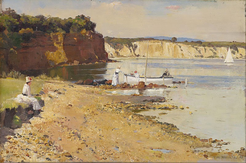
Slumbering Sea, Mentone - 1887

An Autumn Morning, Milson's Point, Sydney - 1888

Eileen - 1892

study of Lena Brach - 1893
This is the largest image I could find. I include it for readers interested in how artists work up paintings.

Grey Lady

Miss Isobel McDonald - 1895

Miss Florence Greaves - 1898

Alfred Howitt - 1900
Yes, Roberts also portrayed men.

Madame Hartl - 1909-10
This was painted when Roberts was simplifying his palette.

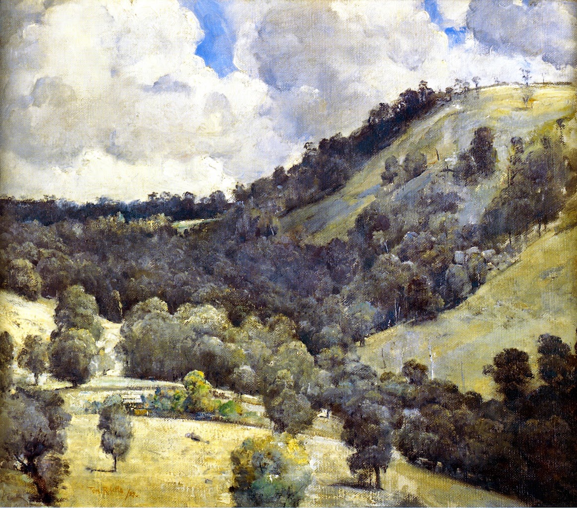
Hillside - 1927
The latest Roberts painting I turned up during a none-too-rigorous search.

Amoeba Patterns, 1950s

$
0
0
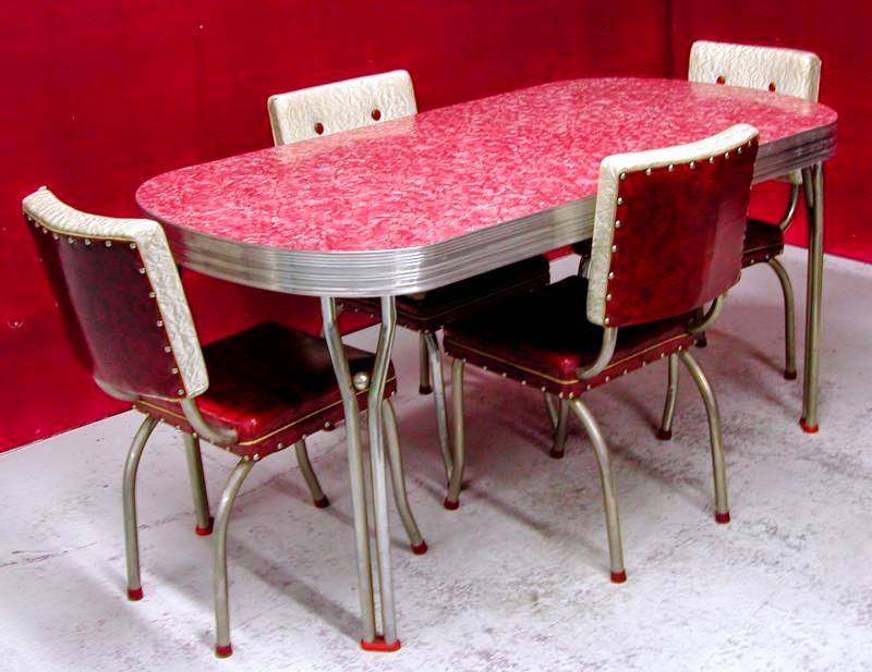
I use the word "amoeba" in the title, but for commercial usage by the company making Formica products, the names "Skylark" and "Boomerang" were used to describe a type of decorative pattern. Some background can be found here and here.

For some reason, blobs with bent shapes were considered the height of modernity in the late 1940s and into the 1950s. One possibility is that Surrealist paintings of the 1930s served as inspiration. Other possibilities exist, and I'm not yet prepared to research the origin of their use.

What we do have is yet another example of fashion, a collective set of appearance preferences that can fairly easily be associated with a given period of time. This is true for clothing, architecture, furniture, illustration and fine-art painting. Which is why it is often easy to identify something as being "very 1920s" or whatever. And why current preferences are doomed to become quaint artifacts of past times.

Below are images related to the circa-1950 amoeba fashion that I gathered here and there on the Internet. Any copyrighted material is duly acknowledged.

Gallery

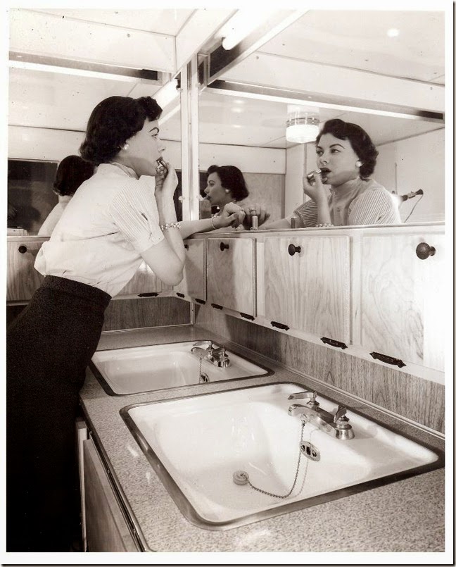
Interior of travel trailer - 1955
A publicity photo. The surface of the counter top is probably in Formica or a similar product, but not in a Boomerang pattern.

Advertisement for Formica
This is probably from the early-to-mid 1950s; the Boomerang name wasn't introduced until mid-decade, though there was overlap in name usage, as is indicated in the image below.

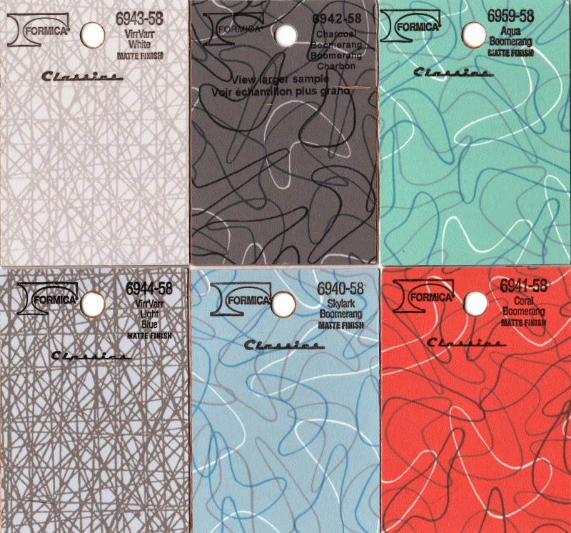
Some Formica patterns

Boomerang-type patterns

Formica-topped kitchen table - 1950s
The top surface has a Boomerang pattern or something pretty similar.

Container Corporation of America advertisement - 1949
The artist is Ben Cunningham of Nevada. Note especially the ochre blob at the bottom.

Interior - 1950s
The coffee table has a rounded-off, non-rectangular top shape. Typical of 1950s furniture design are the thin legs of chairs, tables, and such. The idea was to achieve the appearance of lightness -- a reaction to heavy furniture of Victorian times and ensuing decades.

Julius LeBlanc Stewart: Society Painter

$
0
0

Julius LeBlanc Stewart (1855-1919) was born to wealth, which made the artistic life easier than most others found it. Wealth also provided social connections leading to the subject matter for many of his paintings. He was whisked off to Paris with his family at about age 10, and spent the rest of his life in Europe, as best I can tell.

A big problem for me is that I can find little regarding Stewart on the Internet or in my library of art-related books. His skimpy Wikipedia entry seems to have the most information.

Stewart can perhaps best be compared artistically to James Tissot, who also favored high society scenes for much of his career. Tissot was born 19 years earlier, but both died in their mid-60s. As best I can tell from small, Web-based images, Stewart's paintings seem more pleasing than those by Tissot, which generally have a brittle, hard-edged character.

Gallery

After the Ball - 1877

Lady on a Pink Divan - 1877
Stewart was just getting started when these two images were painted. He seems to have used the same model and costume for both.

The Letter - 1882
Women reading or reacting to letters was a popular late-19th century subject for many artists.

A Hunt Ball - 1885
One of Stewart's better-known paintings.

On the Yacht "Namouna," Venice - 1890
The yacht was owned by James Gordon Bennett. And that's Lillie Langtry towards the right.

Rédemption - 1895

A Supper Party - 1903

Rio della Maddalena - 1908
Stewart made cityscapes in the Venice area over the years.

Un nu sur la pelouse
He painted quite a few scenes of nude nymphs in grassy and woodsy settings.

Some Liberty Magazine Covers

$
0
0
According to its Wikipedia entry, Liberty magazine in its original form was published 1924-1950, apparently under three ownerships.

Despite what Wikipedia claims, Liberty was seldom (never?) a serious rival to the Saturday Evening Post in the realm of American general-interest magazines. That is indirectly indicated by the fact that Liberty's cover artists, while entirely competent, were seldom in the absolute front rank of their day. Below are some Liberty covers in chronological order.

Gallery

By Ruth Eastman - 7 February 1925

By Walter Beach Humphrey - 14 March 1925
The title of this cover is "Back from Palm Beach" (tee hee, that's a pun, folks).

By Leslie Thrasher - 2 March 1929
Havana was a popular place to visit in winter for affluent Americans.  Cuba Libre is also an alcoholic drink.

By Georgia Warren - 19 November 1932
I didn't find any useful biographical information on Warren, who was active in the 1930s.  This illustration is surprisingly era-free; it almost could have been painted yesterday.  That might have been because 1932 was during a transition from short to longer hair styles for women.  Another factor is that the clothing is hardly shown, so can't be pinned to a fashion era.

By Lumen Winter - 7 September 1935
There was a Lumen Winter who was best known (according to Wikipedia) as a muralist.  His signature was different than that on this cover.  But it's likely that we're dealing with the same Lumen Winter.

By unknown illustrator - 31 October 1936
Snazzy Hallowe'en witch we have here.  I wonder who the illustrator was.

By Walter Baumhofer - 4 April 1936
Here Baumhofer was beginning his transition from "pulp" to "slick" magazines.

By Scott Evans - 21 November 1936
Zippy car, attractive gal.  Unfortunately, I have no information about Scott Evans, a common name.

By Herbert Paus - 15 April 1944
I suppose Paus set this scene in a war-damaged Italian church, because Italy was where American troops were in action a few months before the D-Day invasion of France.

Vernon Grant: Cartoonist-Illustrator of the 1930s and 40s

$
0
0
Vernon Simeon Plemion Grant (1902-1990), or simply Vernon Grant, as he signed his works, had a long, active career illustrating magazines, books and advertising. Here is his Wikipedia entry and here is a website dedicated to him.

Grant featured a cartoon-like style in his work that was lively and attractive. It was also highly in tune with the times. Yes, there was a Depression and then a war going on during his peak years. But many Americans were happy to seek relief from unpleasant times by viewing escapist movies and gentle cartoon humor, so Grant did well in difficult times.

As for me, I have no problem with his artistic style, given his objectives and assignments. My problem is, ... well, let's take a look.

Gallery

Judge magazine cover - 19 March 1932
Grant had a sense of humor that must have appealed to some magazine editors and readers, but it largely eludes me. For most of the images in this post including this one, I can think of possible situational jokes; however, none is smashingly obvious.

Judge magazine cover - December 1935

Rice Krispies breakfast cereal characters - c. 1939
Snap, Crackle and Pop grew out of Grant's frequent usage of gnomes in his other illustration work, as in the Judge cover above.

Collier's magazine cover - 21 September 1940
The cowgirl is carrying a tennis racket and shoes. I have no definite notion what that signifies here.

Collier's magazine cover - 4 October 1941
Okay, I think I get the humor here. It contrasts traditional, dress-up type dancing with the Jitterbug dancing whose popularity was peaking around the time Grant painted this cover. His twist, of course, is cross-pairing the dancing couples -- perhaps parents and teen-age children.

Collier's magazine cover - 10 January 1942
The illustration was surely completed before the Japanese attack on Pearl Harbor, 7 December 1941. It shows a sailor returning from duty in a warm climate. Not exactly war-related, but Collier's editors must have decided that the cover wasn't worth pulling at the last minute, production times being what they were.

Collier's magazine cover - 19 December 1942
Another sailor, another somewhat opaque joke. For once, it's the girl who has to wait for the date. But why is the sailor sleeping? It would be better if Grant provided a reason.

Collier's magazine cover - 5 August 1944
Grant often used sailors in his wartime illustrations. Here he deigns to feature a couple of Army corporals. But the humor? Are they writing each other? Someone else? Who besides Grant and his editor knows.

Collier's magazine cover - 9 June 1945
I have no clear idea who the head in the crystal ball might be.

Grant in his Rock Hill, South Carolina studio

James Tissot: Painting the Elegant Life

$
0
0
Jacques Joseph (James) Tissot (1836-1902) was an anglophile French painter whose best-known works were done while living in England from 1871 to 1882 or shortly thereafter. Biographical information on him can be found here.

Before leaving for England, Tissot was a painter of Paris society, a practice he continued with English society until the death of his beloved Irish mistress who was the mother of his son. During the 1870-71 Franco-Prussian War and its Paris Commune aftermath, he was in Paris and helped fight in its defense. The Wikipedia biography linked above is unclear as to why he left France. One explanation is that it was because he fought on the Communard side, and the Commune was, of course, violently crushed by French forces. The entry offers the suggestion that Tissot joined the Commune side as a means of protecting his assets. This makes some sense because he almost universally featured well-to-do people and their haunts in his paintings, something unlikely for a committed revolutionary. Plus, towards the end of his career, he switched to making watercolors of religious subjects, something favored by conservative and Royalist groups in late 19th century France.

Tissot's mature oil painting style can be described as generally hard-edged so far as his subjects are concerned; background objects were often treated less distinctly. Perhaps because of his sharp rendering, his London-era paintings are a useful resource regarding aspects of England in the 1870s and early 80s.

Gallery

The Thames - 1867
Tissot visited London years before he moved there.

Too Early - 1873

The Gallery of HMS Calcutta (Portsmouth) - 1877
According to its Wikipedia entry, the Calcutta was an 84-gun second rate (in terms of broadside) Royal Navy vessel. Being thoroughly obsolete years earlier, it became a gunnery training ship at Devonport in 1865. Devonport is a ways west of Portsmouth, so either the painting's caption is wrong or it's Wikipedia at fault. Regardless, it seems that the stern of the ship was still serving as a site for social functions when Tissot depicted it.

Mavourneen - 1877
The word is from the Irish, and means "my darling." The women pictured is Kathleen Newton, Tissot's mistress.

Croquet - c. 1878

On the Thames - 1882

Le bal - 1880

The Reception - 1885
Note the similarity of the subjects in these two paintings.

The Traveler - 1882-85

Robert O. Reid, Shooting Star Illustrator

$
0
0
For a very brief time -- about three years -- amusing, cartoonish illustrations by Robert O. Reid appeared on Collier's magazine covers and internal story illustrations as well as some advertisements.

Before and after that blaze of professional glory, little of Reid can be readily found on the Internet. There are images aplenty on Google, but those are the sort of items just mentioned. As for reliable biographical information -- there seems to be none. My go-to hardcopy reference, Walt Reed's "The Illustrator in America, 1860-2000" has nothing on Reid. One of The Norman Rockwell Museum's recent emails mentioned a "Robert O'Reid," but illustration credits for some of the Reid images I downloaded have it "O." and not "O'". One Web site suggested that Reid was more interested in theatre than illustration, so he abandoned art. Another had his years as 1921-2009, but this implies that his work was appearing in a major publication when he was about 17 years old; possible, but not likely.

As for Collier's, it was probably the number two general-interest magazine in America in the 1930s, 40s and in the 50s until its 1957 demise. For illustrators, appearing in Collier's was the next-best professional thing short of having work published in the Saturday Evening Post. So Reid came out of nowhere, was published a lot in Collier's, especially 1938-1940, and then disappeared.

Gallery

Collier's cover - 1 October 1938

Collier's cover - 17 December 1938

Collier's cover - 4 March 1939

Collier's cover - 29 July 1939

Collier's cover - 25 March 1940

Collier's cover - 1 June 1940

Collier's story illustration - 6 May 1939

Collier's story illustration - 17 June 1939

Collier's story illustration

Collier's story illustration

General Tire advertisement illustration ca. 1941

Pre-posting update:


Aha! While researching content for another post, I stumbled across this 27 October 1934 Collier's cover by Reid. So he was nibbling at the Big Time at least four years before his 1938-40 surge. And for sure he wasn't born in 1921. Any solid biographical information on him would be greatly appreciated. Please post as a comment.

Some Judge Magazine Covers

$
0
0
This post is part of an occasional series dealing with magazine cover illustration. Here we feature Judge, an American humor magazine published 1881-1947 (Wikipedia entry here). To me, its most interesting covers appeared in the late 1920s and early 1930s.

Judge was not a major magazine; circulation was well under that of Saturday Evening Post, Collier's and other general-interest magazine. Nevertheless, Judge did feature cover art by some talented illustrators and cartoonists -- and others who were less so. Here are some examples.

Gallery

By Lou May - 17 May, 1924
I think that's the artist's name; the signature is a little hard to read.

By John Held, Jr. - 3 January 1925
Held is considered the archetypical 1920s cartoonist. His highly stylized flappers and friends helped to define that era for many Americans then and later, including me.

By David Robinson - 16 October 1926
A lesser effort.

By an unknown artist
Well, I'd know the artist's name if I could decipher that squiggly little signature. Reader suggestions are appreciated, because it's a cute cartoon, though a bad pun.

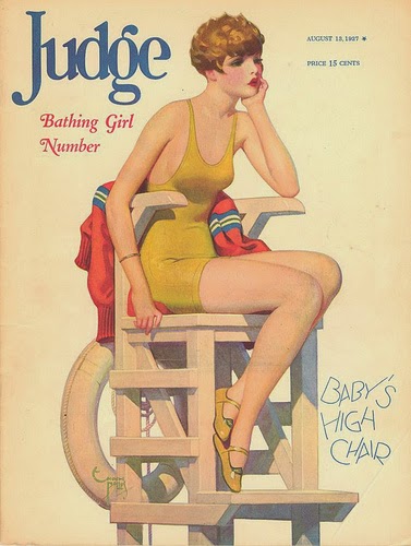
By Enoch Bolles - 13 August 1927
Bolles did a lot of cover illustrations in those days. Most of them don't appeal to me, but this is better than most.

By George Eggleston - 28 September 1929
What would cartoonists do without desert islands?

By Ruth Eastman - 21 December 1929

By John Holmgren - 24 January 1931
Nice drawing. I wrote about Holmgren here.

By Gilbert Bundy - August 1933
Bundy's career peaked from the late 1930s into the early 50s, before his suicide.

By Gregor Duncan - June 1937
Could this over-stretched analogy cover be symbolic of Judge's decline?

Edwin Dickinson: In His Own Catergory

$
0
0
Edwin Walter Dickinson (1891-1978) was a modernist of sorts.

That is, he wasn't really a traditionalist painter even though many of his images included realistic details.

By the feel of some of his images, he might have been considered a Symbolist. Except it can be difficult to point out what was being symbolized.

Given some odd juxtapositions and choices of subjects, he might be considered a Surrealist. But only in a vague kind of way.

It seems Dickinson is hard to pin down when it comes to the evidence of his paintings.

Even verbally, he could be vague or impenetrable. At one point, he gave a lecture at Yale that left many in the audience puzzled. And then there's this interview regarding William Merritt Chase and Charles W. Hawthorne as his teachers, which contains bits that I found difficult to follow during a quick read.

Many of the links to Wikipedia dealing with obscure artists are brief, lacking the amount of detail I prefer to have. In Dickinson's case, his entry is huge. Then there's a fairly new online Dickinson Catalogue Raisonné that can be found here. If you want to read even more, there's John Perreault's take on Dickinson here and some observations by Mary Ellen Abell here.

Perhaps because he doesn't fit easily into the Modernist Establishment Art History Timeline handed down to me at university, and also because of the difficulty categorizing his work, I was totally unaware of Dickinson until very recently. So far as I know, I've never seen any of his paintings. But given what I found on the Internet, I would really like to, because many of them seem fascinating.

Gallery

Elizabeth Finney - 1915
A fairly early work.

An Anniversary - 1920-21
This seems to symbolize something ... but what?

Biala, Née Janice Tworkov - 1924

The Cello Player - 1924-26

Frances Foley - 1927

Frances Foley, Second Portrait - 1928
Foley became his wife in 1928.

The Fossil Hunters - 1928
When this was first exhibited, it was hung sideways. That's understandable, given the odd perspective Dickinson gave his subjects here.

Woodland Scene - 1929-1935

Composition with Still Life - 1933-37
These two paintings seem vaguely Surrealist ... or maybe vaguely Symbolist ... or something else.

Elsbeth Miller - no date

Self-Portrait in Uniform - 1942
Hmm. I had a great-grandfather who was a musician-stretcher-bearer in the American Civil War.

The Ruin at Daphne - 1943-1953
Yes, it took Dickinson about a decade to complete this painting.

View of Great Island - 1940
Dickinson did many landscapes in premier coup mode starting as a student under Hawthorne.

Walter Beach Humphrey: Murals and Magazine Covers

$
0
0
Useful though the Internet is, sometimes it can be frustrating trying to locate information about artists and illustrators I wish to write about. And so it is with Walter Beach Humphrey (1892-1966). A brief Wikipedia entry is here, and a few more details can be found here.

It seems that Humphrey was an Ivy League guy, being a member of Dartmouth College's class of 1914. He then was at New York's Art Students League to complete his training under Frank DuMond. After that, he had a successful career as an illustrator and mural painter for the next quarter century or so. However, his career after the early 1940s is essentially a mystery to me for now, though he is known to have taught.

Humphrey's style was hard-edge, something of a necessity for mural work. Yet he was able to ease off ever so slightly, resulting in works that are not overly stark and held together well.

Gallery

"It's the thieving federals again" - story illustration
I'm guessing this was made around 1920, but can't be sure because the subject is historical, not contemporary, so I can't use dress for estimation purposes.

Saturday Evening Post cover 13 January 1923
A blurred image, but I include it to show that Humphrey did hit the illustration Big Time.

Liberty cover - 16 August 1924
Humphrey was one of the early cover artists for Liberty magazine.

Liberty cover - 17 October 1925

Liberty cover - 7 November 1925
Ever loyal, Humphrey hints that this scene has to do with a Dartmouth College football game (note the Dartmouth green uniform and the letter "D" on the girl's pennant).

Reflection - 1929

Memories

Scaring Mother

The Elks Magazine cover - July, 1931

Section of Dartmouth College mural
A useful background link to a Dartmouth Review article on the mural (controversial, especially for those practicing political correctness) is here.

Patriotic Montage mural - ca. 1943

The "Lifestyle Illustration" Books

$
0
0
Besides the occasional biography of an important illustrator, illustration fans each year can find new books containing collections of illustration art. Some deal with an individual artist (usually one specializing in science fiction and fantasy book covers, it seems), others feature multiple artists dealing in a common genre -- again, often science fiction and fantasy.

Over the past few years Taschen has published many art books, including a series titled "Illustration Now." I don't own any copies because I don't like most of their content, being more a fan of 1895-1965 vintage illustration.

Speaking of which, there are now two books edited by Rian Hughes full of works by British and American illustrators:


Lifestyle Illustration of the 60s appeared in 2011 and Lifestyle Illustration of the 50s came out in 2013.

I find the titles puzzling. What the books contain are mostly full-color romance story illustrations that appeared in British magazines for women. Page after page is filled with beautiful women paired with handsome men in various situations related in one way or another to romance. This is pretty limiting, yet the illustrators were somehow able to introduce enough variety that I didn't notice any two pictures being identical. Along with this, a few fashion and even furniture/decor illustrations can be found; I suppose this tiny intrusion was taken to justify the "Lifestyle" part of the titles. I think a more descriptive title might have been "Romance Story Illustrations of the XXs," but maybe there were good reasons for not using something like that.

American illustrators' work is included because publication rights were sold following publication in American magazines. In that way, British readers got to see the likes of Coby Whitmore, Jon Whitcomb, Joe DeMers, Edwin Georgi and Lynn Buckham (who actually worked in England for a while).

David Roach, in his introduction to the 1950s collection, notes that early in that decade British illustrators' work lagged behind what the Americans were doing in terms of style and pizazz. He contends that the Brits had pretty well caught up with the Yanks by 1960. I agree that the cream of American illustrators noticeably outclassed the British for much of the 50s, and disagree that they had caught up by the end. The gap had considerably narrowed in my judgment, but hadn't quite closed.

The 1960s book is interesting in that, despite the romance story focus, the shift in illustration fashion to modernist designs where representationalism was degraded is clearly documented. By 1970 the silly succession to classical illustration was now (and remains) dominant.

Towards the End: Juan Gris

$
0
0
Juan Gris (1887-1927) died young, not long after his 40th birthday. I wrote a "In the Beginning"post about him, but found too few images to illustrate it properly.

Biographical information on Gris -- born José Victoriano (Carmelo Carlos) González-Pérez -- is here.

It seems that Gris never quite abandoned Cubism once he was converted to that branch of modernist painting. The images below that concentrate on the last year or two of his life are mostly in the so-called Synthetic Cubism vein, though there are dashes of other influences such as the "return to order," a post- Great War introduction of classical themes by modernist painters such as Picasso.

Gallery

Portrait of Pablo Picasso - 1912
An example of Gris' early cubist art. Gris had some technical education and preferred a tidier form of Cubism than Picasso himself used. Gris would establish a geometry-based structure for many of his works. In this painting, note the parallel lines flanking the buttons on Picasso's garment. At right-angles to these are some background lines in the upper-right part of the painting. Also note the vertical and horizontal motifs in that area.

Harlequin with Guitar - 1919
Painted towards the end of Synthetic Cubism's stylistic run. Gris included guitars in many of his paintings.

Bananas - 1926

The Painter's Window - 1925

Guitar and Sheet Music - 1926-27
Three late paintings featuring a guitar along with various objects defined by straight lines.

The Goblet - 1927

Bunch of Grapes and Fish - 1927
I found this in the Athenaeum site in its Juan Gris grouping. It has plenty of geometric character, but doesn't look like other Gris paintings. Is it truly a Gris?

The Reader - 1926
A human subject with a cubist touch in terms of the shading pattern on her face. Plenty of Gris-type geometrized (is that a real word? ...well, you ought to get its meaning) background material.

Woman with Basket - 1927
A women painted the next year, but entirely different in spirit. She looks classical like other modernists had been painting in the early 1920s. Comparatively few straight lines here, mostly found on the basket and in its vicinity.
Viewing all 1103 articles
Browse latest View live


Latest Images