Quantcast
Channel: Art Contrarian
Viewing all 1103 articles
Browse latest View live

When Kees van Dongen Almost Played It Straight

$
0
0
An artist can get boxed in commercially if his style is distinctive and he is successful. Clients or buyers can be willing to pay good money for a portrait or any other sort of painting by a famous artist provided that it has the characteristic look of that artist's work. This can be a good thing for the artist because it keeps starvation away. But if he is itching to try out some different styles, he either has to do it in the form of "personal" paintings or else expect a long period of training buyers to accept a new style.

I have no idea what Kees van Dongen (1877-1968) had on his mind once he attained commercial success with stylized paintings of women featuring exaggeratedly large eyes outlined in dark paint. He was perfectly capable of painting in a traditional manner and probably could have gone even further in a modernist direction than he already had, so there were creative options. On the other hand, he enjoyed having money and loved to entertain fellow artists and others, so he continued to paint in the van Dongen style, but within a range of variations. Examples of his paintings that edged in the representational direction are shown below.

I wrote about van Dongen here, and here is a biographical sketch.

Gallery

Le Coquelicot
This is one of van Dongen's most famous paintings in his classic style.

Arletty - c. 1931
Arletty was a singer and movie star.
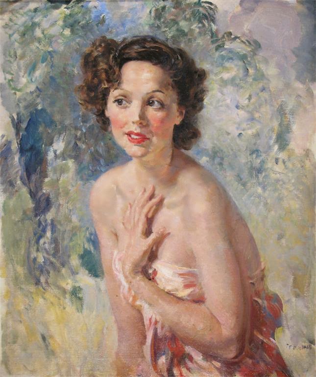
Jean McKelvie Sclater-Booth
No van Dongen dark eye outlines here, but the general treatment is clearly from his brush.

La femme au canapé - 1930
Even further removed from his style; only the handling of the dress suggests van Dongen.

Le sphinx - 1925
Again the dress is the stylistic tip-off, the face and visible body bits being rendered quite tightly (for van Dongen).

LouLou - c. 1924
More in the van Dongen vein, especially the large eyes.

Mme Marie-Thérèse Raulet
A bit of his old Fauve color treatment, but otherwise largely conventional.

Mme T
More crisply done than usual, but T's arms seem too large.

portrait of woman with long hair
Unlike the previous paintings, this was probably done after the 1930s and has few van Dongen traces.

Robert Motherwell: Abstract Messages

$
0
0
For better or worse, Aberdeen, Washington, a small, (somewhat former) timber industry city on the Grays Harbor inlet off the Pacific Ocean, claims (definitely late) musician Kurt Cobain as its best-known son. Before the late 1980s, that honor might have gone to Abstract Expressionist artist Robert Motherwell (1915-1991) who left the place at a young age.

Motherwell's lengthy Wikipedia entry is here, and further information on the Museum of Modern Art web site is here.

If Motherwell ever made representational paintings, I couldn't find any while poking around the Internet. Everything I saw was abstract, which might be explained in part by the fact that he was amongst the youngest of the New York School crowd, not spending the 1930s painting Social Realist scenes like Jackson Pollock and some of the others.

Much of Motherwell's art was political. I think political art is the dregs of art, but in Motherwell's case this didn't really matter. That's because most of those political paintings could have been given entirely unrelated titles and viewers would not have known the difference because nothing representational could be seen.

Below are a few early Motherwells along with some later works.

Gallery

The Little Spanish Prison - 1941-44

Pancho Villa, Dead and Alive - 1943
Part painting and part collage.

Mallarmé's Swan - 1944

Three Figures Shot - 1944
Done in colored inks. This is about as close to a figurative work as I could find. Not sure if this has to do with Motherwell's obsession with the 1936-39 Spanish Civil War or some aspect of World War 2, which was raging at the time he did this.

Personage, with Yellow Ochre and White - 1947

Elegy to the Spanish Republic XXXIV - 1953-54

Je t'aime - 1955-57
Part of a series related to the breakup of one of his marriages.

Beside the Sea No. 22 - 1962

The Hollow Men - 1983

Lower Manhattan Skyscraper Evolution

$
0
0
Architectural Modernism as a secular religion was somewhere near its peak of influence when I took a yearlong course in architectural design as an undergraduate. It roughly had something to do with "honesty to building materials" along with a shunning of ornamentation. As a result, tall office buildings (and many other structures) looked like products from a Bauhaus/van der Rohe 3-D printer (if you will pardon the anachronistic metaphor).

Time does march on, though architectural styles are more prone to crawling. The present post looks at skyscraper architecture in the form of six office building projectss located in Lower Manhattan. Five of the projects were the tallest in New York City when they were built.

Gallery

Singer Building
The Singer Building, 186.57 m (612.1 ft) was completed in 1908, the tallest office building in the world at the time. It was demolished 60 years later, but not before I had plenty of chances to view it. It had an odd shape, being slightly bulged at the top of the tower. Dark red brick cladding (if I remember correctly) coupled with the ornamentation gave it a distinctly old-fashioned appearance. It seems that some architects were still trying to figure out what a skyscraper should look like.

Woolworth Building
Still standing is the Woolworth Building, completed in 1913 and the world's tallest at 241.4 m (792 ft) for 17 years. Gothic cathedrals were vertically oriented, so became a useful inspiration for skyscraper style. The Woolworth Building is dignified, and of-a-piece, unlike the awkward Singer Building. The silhouette of the Singer can be seen near the left of the photo.

40 Wall Street
40 Wall Street, completed 1930, reigned as the world's tallest (at its peak, 927 ft, 283 m) for less than two months, when it was surpassed by the spire atop the Chrysler Building. It has passed through a number of hands and was given several names, starting with Bank of Manhattan Building and currently as the Trump Building. Architecturally, it is a nice composition topped by an attractive pyramidal form. While it's not necessarily my absolute favorite skyscraper design, I think it's the best of the group shown here.

One Chase Manhattan Plaza
One Chase Manhattan Plaza was never a "tallest," (813 ft, 248 m when completed in 1961), but it was massive, disrupting the ensemble of tall, lean towers elsewhere in New York City's financial district. It is in the International Style that was at the height of its influence when it was designed and built. The New York Times image above shows it as a simple slab, chopped off at the top with only a slight transition offered by by cladding over the utility zone. The rest is basically fenestration and some vertical structural accents. I would not shed tears if it suffered the Singer Building's fate.

World Trade Center Twin Towers
This Wikipedia entry covers the World Trade Center Twin Towers destroyed in 2001. The Twin Towers where the tallest in the world at 1,368 ft (417.0 m) when Tower 1 was completed near the end of 1970. Tower 2 was about six feet (two meters) shorter at the roofline. Again, the structures are simple with minimal adornment (mostly near ground level). Not very interesting as a pair, but a single such tower would have been even more sleep-provoking visually. The 1975 New York Daily News image above includes the Woolworth Building towards the left side and 40 Wall at the extreme right.

One World Trade Center
This is the replacement for the twin towers. Not the tallest in the world, but the tallest in the USA at the time of its recent completion (roof: 1,368 ft, 417.0 m) -- the same as Tower 1. Styling is in line with current postmodern practice whereby an office or apartment tower is treated as a kind of sculpture whose interest lies in its overall shape and perhaps its surface texture. This is more interesting than the simple forms seen on the original towers and Chase, but still too sterile for my taste.

Over-Designed Flatware

$
0
0
Flatware (or silverware, as perhaps most people call it) presents an interesting challenge for designers. The basic pieces -- knife, fork and spoon -- have specific tasks in the eating process. Moreover, they must be held by human hands of various sizes (though the range for adults is fairly limited), and therefore cannot be too large or too small. In fact, flatware items of a given type (table knife, butter knife, soupspoon, teaspoon, etc.) are usually pretty much the same size across sets.

The design challenge largely lies in creating a distinctive appearance for a flatware set when there are already many hundreds of patterns having appeared over the years. Usually the distinction-creation focus is on ornamentation and detailing, the general shapes being largely traditional.

But the ethos of Modernism in its classical form holds that ornamentation is to be shunned. Therefore, a modernist designer must concentrate on shape alone to create a distinctive flatware set for the marketplace. The task is difficult thanks to this additional design constraint, and it isn't surprising that some designers seem to try too hard. In this case, the result often is a visually interesting design that is marred by ergonomic (human factors) defects.

Let's look at some examples of flatware designs that suffer from that problem.

Gallery

Josef Hoffmann for Wiener Werkstätte - c. 1903-04
Hoffman (biographical links here and here) thought of himself primarily as an architect, but he also devoted considerable effort to domestic design, such as for the silver flatware set shown here.  The tips of the handles contain tiny bits of what can be called decoration,  The round opening between the tines of the center fork also is pure decoration.  Potential ergonomic problems include the arbitrary round spoon bowls and the broad, flat handles on most of the other pieces.

Josef Hoffman - Hugo Pott 86 - 1955
Half a century later, not long before his death, Hoffmann created this design.  The little round knobs at the ends of the handles serve to help balance while holding the piece, though they are basically decorative.  To me, the problem is that the handles seem too thin to grasp comfortably.

Arne Jacobsen - 1957
As Wikipedia indicates, Jacobsen also was basically an architect who practiced industrial design on the side.  The (partial) set shown here is interesting to look at, but probably not easy to use.  For example, the fork tines seem too few, too short and perhaps too sharp.  The flat handles might be a little uncomfortable to hold.  The knives and spoons could be better balanced.

Sasaki Aria Asani
This set is from a Japanese firm, but I don't have a date for it.  Again, wide, flat, poorly balanced handles.

Yamazaki Haiku
Another set from Japan, designer and date unknown (to me, anyway).  The design is interesting and creative: note the split handles (a decoration, not being functional) and uneven fork tine lengths.  But yet again, I doubt that the pieces would be comfortable to use.  And the split handles might be hard to clean.

The Cadillac Tailfins Legend, Updated

$
0
0
The most successful styling gimmick for American cars was probably the tailfins that appeared on 1948 Cadillacs. They were controversial at Cadillac before the 1948s reached dealer showrooms, but the fins proved to be wildly popular. For a few years, cheap copies could be purchased at auto accessory stores and screwed onto fenders of other makes of cars. Cadillac continued use of tailfins of various sizes and shapes through the 1964 model year. And Chrysler famously added fins to its entire automobile line for 1956 and made them the strongest styling element on its redesigned 1957 models.

A legend of sorts deals with the origin of the 1948 Cadillac tailfins; here is one version, and I have read other accounts over the years. The story goes that GM styling chief Harley Earl learned of the then-futuristic Lockheed P-38 Lightning fighter and took some members of his styling staff to see an example. Most accounts mention that the P-38 was top-secret at the time. That last item is not true, which is the point of this post.

Edson Armi's book on automobile design (Amazon link here) has the following account on page 76 of the hardcopy edition:
* * * * *
At GM the wartime preoccupation with the monocoque fuselage had been reinforced by Earl's personal fascination with the P-38 Lockheed Fighter.... In 1941 Earl and a group led by [Bill] Mitchell visited the still-secret fighter.  As Mitchell tells it: 'We absorbed all details of [its] lines. Every facet of the twin tails and booms stretching out behind the engine enclosure was recorded mentally. After returning to the studios, Mr. Earl immediately put designers to work adopting the ideas to automobiles.  Small models of automobiles embodying the P-38's characteristics were made.' Earl impressed upon his men the significance of the bulky pontoon shape of the P-38 and encouraged them, as he later wrote, to 'soak up the lines of the twin booms and twin tails.' The fishtail, he said, 'helped give some graceful bulk to the automobile.'
* * * * *
The Wikipedia entry on the P-38 is here, mentioning that the prototype P-38 first flew early in 1939 and that the first production models entered service in September of 1941. A service-test batch of YP-38s appeared between September of 1940 and June of 1941.  The aircraft that Earl and his crew examined was surely at the Selfridge Field Army Air Corps base located not far northeast of Detroit.  Selfridge hosted P-38s in 1941, and Earl knew about them, not because he had special connections with the Army Air Corps, but instead because the P-38 was not in itself "top secret" and examples were flying around the Detroit area.

Furthermore, images of the P-38 had been publicly seen for at least two years previously, so the plane's appearance would have been known to Earl and the stylists before they made their Selfridge Field visit. That visit probably served to create a greater visual impact for team members than photos would have yielded.

Gallery

XP-38 prototype - early 1939

Model Airplane News magazine cover - May, 1939

1948 Cadillac brochure page

Cross-posted at the Car Style Critic blog.

Towards the End: Georges Braque

$
0
0
Georges Braque (1882-1963) is famous for having invented Cubism along with Pablo Picasso, as his Wikipedia entry indicates. I posted about Braque's early painting here, and the present post presents some of his late works.

According to the biography by Alex Danchev, Braque was pretty much the opposite of Picasso when it came to personality and approach to art. Braque was a quiet Zen-like soul, stayed married to the same woman, and painted like a careful craftsman rather than a too-wildly "creative" native of Málaga by way of Barcelona.

As best I can tell, Braque was always a Modernist of one kind or another. If he ever drew or painted in a strictly representational manner, evidence of that seems to have been lost or destroyed. However, once his Cubist phase ended and his recovery from a serious Great War wound was completed, Braque did introduce recognizable objects to his paintings, albeit in distorted fashion.

A few paintings from the last ten years of his life are presented below.

Gallery

La guitare (Mandore, La Mandore) - 1909-10
This Cubist painting is to remind viewers of what Braque is famous for.

Studio VIII - 1954-55
This item from a series was snapped up by modernist art collector Douglas Cooper.

Les oiseaux - Louvre, Salle Henri II - 1953
Braque was the first Modernist invited to tart up a Louvre ceiling. Not quite as inappropriate as Chagall's re-do of the Opera Garnier ceiling, but still....

L'oiseau noir et l'oiseau blanc - 1960
He make many paintings featuring birds in this last years. This was after a series featuring (usually black) fish.

The Weeding Machine - 1961-63
Perhaps his final painting.

Thomas Dugdale: Wars and Portraits

$
0
0
I seem to post a lot about 20th century British artists who are little known today, yet seem to have carved out respectable careers for themselves. Today I do it again, this time about Thomas Cantrell Dugdale (1880-1952).

I could find little in the way of biographical information about him after a half-hearted Web search. London's National Portrait Gallery has only this: "Thomas Cantrell Dugdale was a painter and book illustrator. During the First World War he served as a Staff Sergeant in the Middlesex Yeomanry." The Tate offers only a little more here.

As a result, we are left to fall upon the device of examining Dugdale's art. Which is a sensible thing to do, because that's what really counts.

Gallery

Charge of the Royal Buckinghamshire Hussars at El Mughar, Palestine, 13 Nov. 1917 - 1920

Wellington and crew, Pilot and Navigator Confer - c. 1940
Dugdale served in Allenby's Palestine campaign, though apparently not with the Buckinghamshire Hussars. As for the World War 2 scene, I have no information as to whether or not he had any sort of official war artist status.

Night - 1926
This image might be an illustration, rather than strictly a painting.

Life
An interesting, naturalistic pose. I wouldn't be surprised to learn that it was based on photography.

La Bella Andaluza
Stylistically different from Dugdale's other works, but another natural pose.

Jessie Matthews - (actress)

Dame Wendy Margaret Hiller - c. 1935

Vivien Leigh - c. 1936
Dugdale seems to have painted quite a few portraits of British actresses during the 1930s, though I have no information regarding why.

Portrait of a lady

Princess Margaret, Colonel-in-Chief, Royal Highland Fusiliers

I think Dugdale at his best was a good artist, yet not top-notch. I like the paintings of the mother-and-child and Andaluza best of this lot. The rest display a touch of Modernism that is manifested in a sort of dabby style that lacks punch and individuality. That might be why he is little remembered even though representational art is regaining popularity.

Molti Ritratti: Lina Cavalieri

$
0
0
Natalina "Lina" Cavalieri (1874-1944) was orphaned as a teenager and ended her life in a bombing raid. Between those events she appeared in a movie and in operas while having her image on postcards and other popular media. That was because she was regarded as perhaps the most beautiful woman in the world.

Her Wikipedia entry is here, and a slightly snarky take regarding her singing ability from London's Telegraph is here.

Usually I populate Molti Ritratti posts with paintings. Oddly, even though Cavalieri's career was at its height when painted portraits were commonly made, very few were actually created.

Gallery


Cavalieri was mostly depicted by photography.

Here she appears in an illustration for a Palmolive soap advertisement.

Portrait painting by Cesare Tallone, early 1900s.  The contrast between the face and the rest of the painting is jarring.

Photo of portrait painting by Antonio de la Gandara, 1912. This is the only image of the painting I could locate on the Internet. Let me know if a better one exists.


Two portraits by Giovanni Boldini painted in 1901.  He caught her in police mug shot fashion -- profile and full-face -- but neither try seems satisfactory to me.

Is it possible that a woman can be so beautiful that artists are incapable of conveying that beauty? Possibly.

William Aylward, Illustrator of Nautical Scenes

$
0
0
William James Aylward (1875-1956) came from a Great Lakes shipping family, was a student of Howard Pyle, and usually illustrated stories with nautical themes.

Biographical information about Aylward is skimpy. Two sources are here and here. The Kelly Collection site deals with him here.

Having been accepted by Pyle as a student signifies Aylward's potential as an illustrator, which was fulfilled in most cases. I do include one poorly-done example below from late in his career.

Some of the titles of the illustrations shown below are truncated. Those lacking capital letters are conjectural titles.

Gallery

Coming to America

Contrasts - 1905

future airships? - McClure's Magazine - 1905

storm scene - Harper's - 1909

Surrender of the Guerriere - Harper's - March, 1912

Perry Transferes His Flag - 1913

Mystic, Connecticut - 1916

battleship - c. 1943
This looks like a North Carolina class battleship, though a number of things seems "off" to me. For instance, the ship is too foreshortened for the viewing angle. The North Carolina and Washington had long bows, so it's possible that Aylward used some artistic license to better fit the ship into a compositional scheme. In any case, the top of the hull is too low at the front (there's much more of an upwards curve on the actual ships) and the main turrets are more distant from the prow than is shown here. The foremast structure and, indeed, all the superstructure elements shown are seemingly too high and definitely too large compared to the main turrets. The problem here is that the perspective is a mess. The anti-aircraft guns mounted high on the superstructure appeared late in the war on the North Carolina, but by that time the foremast was much more cluttered than pictured here in its 1941state. I really have no idea why an artist as experienced as Aylward would let all this happen.

SS America Bringing Troops Home - c. 1945

Men's Suits: Drapery Extremes

$
0
0
Many things seem to swing between extremes. Not all extremes reach absolute limits, but they can come close to something like limits imposed by practicality. That is the case for the subject of this post: the amount of cloth used in men's suits.

It turns out that two extremes were reached about 20 years apart. Around 1940, fad apparel for some young men was in the form of the Zoot Suit, an exaggeration of current men's suit styles that already were rather baggy. By 1960 fashionable men's suits were snug and used minimal material. Lapels were narrow, as were neckties. The archetypical suit had three buttons and the two upper ones were buttoned down. On college campuses, this was sometimes called Ivy style, after the prestigious group of colleges and universities in the Northeastern USA (Harvard, Yale, Princeton, Penn, Columbia, Dartmouth, Brown and Cornell) where the mode of dress was supposedly popular.

Gallery

Here is a Zoot Suit. Its characteristics include: Baggy, high waisted trousers "pegged" (narrowed) toward the cuffs. A loose-fitting suit jacket with wide lapels, heavily padded shoulders and a hem down toward knee level. An extremely long key chain was a usual accessory. Neckties might be long or (as in this case) bow, in both instances using plenty of material.

Two Zoot-suiters with a young Army sergeant (who himself might have worn a Zoot Suit a year or two earlier).

The great Cab Calloway in 1942 wearing an exaggerated (yes, it must have been possible) Zoot Suit for a performance.

Now it's 1961 and we find Audrey Hepburn and George Peppard on New York's Park Avenue during the filming of Breakfast at Tiffany's.  Peppard is wearing an Ivy style suit, but for comfort's sake has it unbuttoned.

"Miscellaneous - C" Images

$
0
0
I like to download art images from the Internet to my computer. Some are intentional grist for a post that I'm working up. Others are collected because I really like them. And then there are those serving as aides-memoirs of paintings that catch my eye for potential future collecting of images. At some point, when I have a lot of images by an artist, I'll create a directory ("folder" seems to be the term of art these days) for that artist, moving those images from a "Miscellaneous" directory to the new artist-based one.

Today's post contains images from my Miscellaneous directory for painters, and I'm selecting from those artists whose last names start with the letter C.

The original paintings were made during the 70-year period between 1870 and 1940, a time when Modernism was on the rise from ignorable quirkiness to near-domination in fine-arts painting. By the time I was being brainwashed in college, many or even perhaps all of the images shown below would have been greeted by a sniff and a condescending remark by modernist cognoscenti.

Yet I now find that same 1870-1940 period endlessly fascinating for both mainstream Modernism and art that ignored Modernism entirely or selectively nibbled at it. Of course, I am not alone nowadays, because the previously ignored non-Modernist art is regaining the respect it was denied in the 1950s.

The images shown below are in alphabetical order of the artist's name and reflect no particular theme. Have fun looking at them.

Gallery

Cabanel, Alexandre - Samson and Delilah - 1878

Cadorin, Guido - Decorazioni del salone all'Hotel Ambasciatori (detail) - 1926

Caputo, Ulisse - Lavoro di sera

Citroën, Paul - Corry Mohlenfeldt - 1939

Clark, Alson - Portal, Mission San Gabriel - 1919

Constant, Benjamin - Afternoon Languor

Cortès, Edouard-Léon - Champs Élysées scene

Cucuel, Edward - The Bather

Cursiter, Stanley - The Fair Isle Jumper - 1923

Czachorski, Wladislaw - The Proposal - 1891

John Falter: Major Post Cover Illustrator

$
0
0
If doing paintings for Saturday Evening Post covers marked the zenith of an illustrator's professional career, then John Falter (1910–1982) was near the top of that elite group during Ben Hibbs' time as editor from the early 1940s to the early '60s. That's because he painted more than 100 covers over a 20-year period. (The count varies. One source says 129, others claim upwards of 200. Regardless, he was liked by the Post and prolific.)

More information about Falter can be found here and here. A gallery of his Post covers can be accessed here.

Falter was one of those illustrators whose work was highly competent, yet lacked a strong personal style -- a trait that seems to be necessary for lasting recognition and, especially, fame.

Gallery

Early pulp magazine cover art. It shows more style than his later works.


Two World War 2 U.S. Navy recruiting posters. The one showing the aircraft carrier has factual errors that might have raised the hackles of a sailor, but probably went unnoticed by most potential recruits. (The carrier is a Lexington class ship, probably the Saratoga. The Sara lost those big 8-inch guns early in 1942, but the F4F fighter shown has insignia that didn't appear until mid-year. The Lexington was sunk in May of that year.)

Wartime art for a Pall Mall cigarette advertisement.

Falter could do abstract art, too.

This has the look of Post cover art, but a quick look at Google Images didn't turn up a cover. Maybe it's buried in the cover images link above.


Two representative Falter covers for the Post.

A 1960 Post fold-out cover showing New York's Grand Army Plaza at Fifth Avenue (at the the left) and 59th Street (foreground).

Santiago Michalek, Painter of Rusty VWs

$
0
0
I recently noticed Santiago Michalek's paintings at the Bellevue Arts Festival, which evolved from a show of paintings by the better Seattle area artists back in the 1950s to what's now pretty much a crafts street market. As implied, a few painters do exhibit there, and Michalek struck me as the one with the most talent.

His Web site is here, the linked page containing some biographical information. Michalek lives in Utah, but was born in Argentina and claims to be self-taught. His passion is old Volkswagens -- usually Microbuses. But he paints locomotives and other transportation objects -- and even does people.

Below are images of his paintings that I grabbed mostly from his Web site.

Gallery

Early VW in garage

Murphy's Wholesale
A Derelict VW Microbus.

Silver Plane

15328 Engine

Switching Yard
I remember this from the show. It's fairly large, giving Michalek room to paint both tightly (the Baltimore & Ohio diesel locomotive) and freely (the background).

Color Study

Motion Figure

Jean Metzinger and His Variously Styled Women

$
0
0
Jean Dominique Antony Metzinger (1883-1956) is usually associated with Cubism, though seldom ranked as highly as Pablo Picasso, Georges Braque and Juan Gris in that aspect of modernism. However, Metzinger, along with Albert Gleizes, attempted to codify cubist practices and generate a theory of Cubism in their book Du "Cubisme" that appeared in 1912.

There are lengthy biographical articles on Metzinger on the Internet. His Wikipedia entry is here. Another long essay that is richly illustrated can be found in two places: here and here.

I must confess that I was unaware of Metzinger until very recently when I began searching for cubist portraits. Although he is hardly unknown to art history, it seems that he has been somewhat bypassed in the Modernist Establishment timeline that culminated in Abstract Expressionism of the 1950s. Perhaps this was because he reverted to a restrained version of modernism by the 1920s, failing to take up Surrealism or full-blown abstraction.

Metzinger seemed to enjoy portraying women. With that in mind, I summarize his career in the series of paintings featuring women in the Gallery section below.

Gallery

Femme assise au bouquet de feuillage - 1905

Femme au chapeau c. 1906
Metzinger was in his early 20s and trying out modernist styles. In these two paintings he is experimenting with Divisionism, a Postimpressionist approach.

Le goûter - 1911
Some sources credit this as Metzinger's breakthrough Cubist painting. Braque and Picasso had been painting in the Cubist style for two or three years at this point.

La femme au cheval - 1911-12
The title says this is a woman with a horse -- but I'm sure you could tell that already by simply looking at the image.

Danseuse au café - 1912
Note Metzinger's use of light in this painting and the two previous ones. These are in the spirit of Analytic Cubism, but the bland colors favored by Picasso and Braque in this cubist phase are ignored. Instead, we see the effect of light sources on the cubistically reassembled objects. One result is a feeling of depth, rather than the flattened picture plane favored by other cubist painters. I find this very interesting.

Les Baigneuses - 1912-13
A cubist landscape with bathing women that also features light shining on subjects.

Femme à la dentelle - 1916

La tricoteuse - 1919
These two paintings reflect the late-style Synthetic rather than earlier Analytic Cubism. Metzinger soon abandoned Cubism for many years.

Jeune femme pensive aux roses rouges - 1923
After the Great War many modernists recoiled from the "isms" that had been created in the years leading up to the conflict. Some, like Picasso, returned to more hard-core modernism. Others retained some representation of subjects, but included modernist affectations such a a flattened picture plane, simplification of shapes and so forth. Here Metzinger relies mostly on simplification.

Salomé - 1924
And here he uses both simplification and distortion as modernistic effects.

Femme debout - 1935
In the mid-1930s Metzinger continued to paint women in the then-fashionable simplified, solid-appearing manner.

Nu au hortensias - 1935
A touch of Cubism possibly returns here in the form of the unusual light-shade pattern.

La baigneuse (nu) - 1936-37
Here Metzinger flattens the picture plane somewhat.

Yachting - 1937
Hints of Cubism in the background, but the interesting treatment of the woman is non-cubist.

Portrait de femme en vert - c. 1940
A highly designed composition with a flattened picture plane, simplifications, some color distortion. Yet the drawing of the woman's head is so strong that those details are ignorable.

Nu couché - 1946
This postwar painting continues Metzinger's Cubism-lite that was seen in Femme en vert above.

Lily Elsie: Too Beautiful to Paint?

$
0
0
This is one of several posts featuring show business stars active from the 1880s to around 1920. It was a period when photography and portrait painting uneasily coexisted where notable people were being depicted. On my mind is the thought that really beautiful women are better pictured in photographs than in portrait paintings.

Today's subject is Lily Elsie (1886-1962), a popular star of London musicals whose personal life ended badly, as her Wikipedia entry indicates. A website devoted to Elsie is here.

So far as I can find, there is only one portrait of Elsie painted by a leading artist, that by American expatriate James Jebusa Shannon in 1916. On the other hand, many photographic portraits were taken of Elsie, most of which seem to be publicity-related (as might be expected).

Gallery


Some photos of Elsie; yes, she really was a beauty. The final photo was taken when she was about 40 years old and still looking very good.

An illustration publicizing the 1911 show "The Count of Luxembourg." The resolution is poor, but all the versions of usable size I could find were like this.

A postcard image by Talbot Hughes.

Lily Elsie by James Jebusa Shannon, 1916.

Ted Rand: Local Illustrator Who Made Good

$
0
0
Eons ago, when I was majoring in commercial art at the University of Washington, the Big Man in the Seattle illustration scene was Ted Rand (1915-2005).

There were other competent illustrators working in Seattle back in the days when the Seattle area was far from the world-class place it is now. The same can probably be accurately said for many mid-size metropolitan areas back when the nationally-known illustrators worked out of the New York City area (mostly), Chicago (to a lesser extent) and San Francisco (somewhat). Today's example features Seattle, because that's the place I knew about at the time.

Rand was the top illustrator locally in part because his work was featured in Pendleton ads that appeared in national publications. The other local guy with national cred was cartoonist Irwin Kaplan, who I wrote about here. As I mentioned in that post, Kaplan taught a fashion illustration class, and Rand appeared there once as a guest lecturer. Later on, Rand taught at Washington; too bad I missed out on that.

A biographical note on Rand is here, and a two-page obituary is here. As best I can tell, he had little or no art training beyond high school, so he must have been a "natural." Also noteworthy is that, at around age 65, he shifted professional gears to become a prolific writer and illustrator of children's books.

Gallery


The images above look like they might be two segments from a horizontal spread (note the Frederick & Nelson logotype split). Frederick's was the leading Seattle department store into the 1960s.


Rand's work appeared nationwide during the 1950s when he illustrated ads for Portland, Oregon's Pendleton.


Here are two of his book covers.

Towards the End: Picasso

$
0
0
In January 2011, I wrote an "In the Beginning" post (here) featuring Pablo Picasso (1881-1973), who the general public still seems to regard as the genius master of Modern Art.

Recently, I've added a complementary series, "Towards the End," dealing with an artist's late, rather than early work. So now seems to be as good a time as any to add the remaining bookend to Picasso's career.

Considering that he died aged 91, it's a little unfair to select a start-point ten or even 15 years before his death. So what I did was rummage through images of paintings made after 1950, when he was nearly 70. Below are some examples from what I found.

Gallery

Dora Maar au chat - 1941
I include this painting Picasso made when he was about 60 to serve as a benchmark for the later ones. "Dora Maar with Cat" sold at auction for one of the highest prices ever.

Villa in Vallauris - 1951

Goat's Skull, Bottle and Candle - 1952

The Studio - 1955

Woman in Turkish Costume Sitting in a Chair - 1955

Les pigeons, Cannes - 1957

The Rape of the Sabine Women - c. 1963

Le peintre et son modele - 1963

Grandes têtes - 1969

Tête d'homme - 1972

True to his form, Picasso never went purely abstract; each painting includes a subject or subjects potentially identifiable via the captions.

To my eye, there was no real stylistic progression or sense of direction over the 20 years covered by the example images above. This ties into the thesis of my e-book "Art Adrift" that once the elements of modernist painting had been established by around 1920, aspiring modernists and even established ones such as Picasso had no real sense of what to do next.

Molti Ritratti: Ellen Terry

$
0
0
Dame Ellen Terry (1847-1928), one of England's more important actresses in her day, had portraits painted of her by some lesser-known artists and by two famous ones. One of the famous ones, George Frederic Watts, was her first husband, marrying her shortly before her 17th birthday. They lived together less than a year. These and other details can be found in her lengthy Wikipedia entry.

The two most famous portraits of Terry are Watts'"Choosing" and Sargent's "Lady Macbeth." They are probably the best, as well. The two others by Watts strike me as a bit too smudged.

I include some photographs of Terry at various ages for comparison.

Gallery

Photo at age 16

Photo at age 33

Photo at age 43

By G.F. Watts - "Choosing"

By G.F. Watts

By G.F. Watts - "Watchman, What of the Night?"
The three paintings by Watts were made around 1864 while they were living together.

By Johnston Forbes-Robertson - 1876

By Edward Matthew Hale - Sketch of Ellen Terry at Halliford - 1881

By John Singer Sargent - sketch of Ellen Terry as Lady Macbeth - 1889
Note Sargent's dedication to Terry at the lower right corner.

By John Singer Sargent - Ellen Terry as Lady Macbeth - 1889

By Douglas F. Robinson - 1905

By Clare Atwood - Dame Ellen Terry Aged 79 - c.1926
Atwood was a companion of Terry's daughter.

How Well Could Cézanne Draw?

$
0
0
Paul Cézanne (1839-1906), who received little general recognition until the last decade of his life, is now credited as being the "bridge" to modernist "isms" of the early 1900s from Impressionism and various Postimpressionist styles. His career is summarized here.

His image to casual art fans is that of a reclusive, provincial bumpkin who somehow made good in terms of Modernist Establishment art history. There is some truth in this, but there was more to Cézanne than that. In the first place, he had a good pre-university classical education, being able to translate from the Latin, for instance. He was a close boyhood friend of Émile Zola, later the famous journalist and novelist. His artistic potential caught the eye of Camille Pissarro, a leading French Impressionist, who joined him on plein air painting expeditions.

At his core, Cézanne can be considered a theorist, especially where art was concerned. He theorized about color, perspective, brushwork, the basic nature of forms and other matters that became important to the likes of Pablo Picasso, Georges Braque, Henri Matisse and other modernists who claimed that he had opened their eyes in various ways.

One thing Cézanne didn't much bother with was accurate drawing, especially of people -- something he must have considered incidental to his theory-based artistic goals. Or perhaps he didn't much bother with accurate drawing because he has limited ability in that task. Let's examine some evidence.

House of the Hanged Man, Auvers-sur-Oise - 1873
Cézanne painted many landscapes and still lifes. This is one of his best and most famous plein air efforts from the early part of his career. One would have to see the original scene to properly evaluate how Cézanne interpreted it. But what we can see here is something solid and reasonably believable.

The Barque of Dante (after Delacroix) c. 1870-73
He spent a fair amount of time in the Louvre when in Paris. Here is his copy of a Delacroix. Details are mostly omitted, but the colors and shapes of the subjects in the original are fairly well captured.

Hortense Breast Feeding Paul - c. 1873
Cézanne didn't marry Hortense until 1886 when their relationship was on the skids. But he was devoted to his son, young Paul. For this painting, he did a better job of depicting people than usual.

Couple in a Garden (The Conversation) - 1872-73
At about the same time, he made this painting where the people are badly done. It is likely that Cézanne did them from imagination, because he seldom paid for models.

Jeune garçon au gilet rouge - 1888-89
Fifteen years later he still gets anatomy wrong. Note how elongated the boy's upper right arm is. Also, just where is the left arm's elbow? The ear seems too large or the face is too small. Cézanne was noted for spending much of his time observing rather than painting -- taking long intervals between brush strokes. But if he was observing so closely, how could he have messed up so badly what was right before his eyes?

Les joueurs de carte (The Card Players) - 1892-95
Cézanne gets anatomy wrong in this, one of his most famous paintings. A charitable explanation is that he had his attention focused on other aspects of the scene, and that the men are mere props or fodder for his theoretical explorations.

So it seems that Cézanne was almost incapable of painting people properly proportioned. Now let's see what happens where painting and all his theories are stripped away and the focus is on depicting human form.

Studies - 1871-76
A page of sketches. The upper female figure is convincingly done from around the waist down, and the Arab in the foreground seems solidly done. The other figures are too sketchy to evaluate.

Self-Portrait - c. 1875
Another decently done job. Not a great drawing, but a good one. However, I do wonder a little regarding the size and placement of his ear.

Madame Cézanne with Hortensias - 1885
I think this treatment of Hortense is the best Cézanne drawing I've ever encountered. It shows that, on occasion, he could do a good job of depicting people. All that he needed was a pencil instead of a paintbrush.

Jefferson Machamer: Gals, Gals, Gals Cartoonist

$
0
0
Thomas Jefferson Machamer (1901-1960) was a popular cartoonist from the mid-1920s through the 1940s. A brief Wikipedia entry is here, and a detailed career outline and evaluation of his work is here.

Machamer had a breezy, sketchy, distinctive style of drawing in ink that served him well. The second link above opines that the humor in the situations he depicted and the wit of his captions wasn't first-rate. I'm inclined to agree; his strong suit was his drawing style. He featured attractive young women ("gals") throughout his career, and even married one (movie actress Pauline Moore). A problem I have with this is that the gals he drew tended to look very similar if one ignores their clothing and hair style/hair color. Apparently this didn't bother his many fans.

The bottom line for me is that while I have some reservations, I basically enjoy Machamer's work. Click on those images with lots of details to enlarge.

Gallery

Judge cover - 6 August 1927
Satire on 1920s fashions for guys 'n' gals.

Judge cover - 10 March 1928
Here we get closer to Machamer's signature style.

Judge interior art

Katherine Hepburn
After Hepburn burst onto the Hollywood scene, Machamer's gals' faces underwent a change.

A representative post-Hepburn cartoon by Machamer

Gags and Gals panel - late 1930s
The fellow in the top hat in the next-to-bottom strip is a self-caricature that Machamer often included in his cartoons.

Some advice on drawing cartoon gals

Workups of gals' heads

Workups of full-figure gals

Example of Machamer landscape drawing - 1949
Look carefully and you will see a gal.
Viewing all 1103 articles
Browse latest View live


Latest Images