Quantcast
Channel: Art Contrarian
Viewing all 1103 articles
Browse latest View live

Book Review: John Harris, Beyond the Horizon

$
0
0

Not long ago I posted on English SciFi illustrator John Harris. A week or so later, I received an email from someone at Titan Books, publisher of a new book about Harris' art (some book links are here and here). If I was interested, they would send me a review copy. I decided the price (free) was right, so I was interested, the book arrived, and the review starts here:

The book is not thick, but the pages are large -- good for looking at some of the images that range in size from near-thumbnails to two-page spreads. My best guess is that its intended audience is science fiction fans who appreciate cover art on the books they buy. Illustration artists and those interested in artist personalities and technical information have little written material to chew on. There is text by Harris explaining some of his inspirations and decisions regarding his cover art, but he almost never mentions how his paintings were done. Not mentioned at all is anything biographical (though in Acknowledgements, he states he is married with children).

I would have liked to know about his art training and how his work evolved before he hit the book cover trade big-time. He is known to have evolved to painting in oils (see my post, link above), and picture captions in the book note that some preliminary color studies used pastel. I would have liked an explanation of how he goes about creating a cover painting from start to finish. But I am not really part of the intended readership, so these complaints of mine are really peripheral, and now I'll now consider the book on its own terms.

As noted, most of the images are related to book cover art. But there is one section dealing with an imaginary world that Harris created and has been illustrating for his own pleasure for something like 30 years in his spare time. Apparently he also has written a narrative relating to this, and some snippets or paraphrases are included so that readers might better understand what that set of images is about.

Harris' cover art mostly lacks hard-edges and sheen that one finds in technical illustration. Straight lines can be present, depending on the subject matter, but his works tend to be of the richly-painted colorist kind. This is where the full-page and two-page images are useful: you can see the color layering he makes good use of.

His subjects, the imaginary space ships and such, that he includes remind be a lot of John Berkey's cover illustrations, but with a more impressionistic touch in their execution. Harris also chooses to depart from scientific accuracy in order to achieve an artistic or emotional effect. That is, his outer space is not starkly black, but often blends of colors and cloudy shapes.

The cover art almost always lacks people as main subjects. Instead, they are present in the form of tiny shapes adding scale to the huge buildings, landscapes or space ships that are the main subjects. However, Harris does include human subjects in the personal set of illustrations mentioned above. So he is quite capable of painting people, but either he, his art directors or the SciFi public prefer scenes where humans are barely opera spear-carriers.

In sum, Since Harris' work is imaginative and painted in interesting ways, this work is worth adding to collections of illustration art fans and those of painters in general. The price is reasonable, which makes it even more easy to justify.

Maurice Greiffenhagen: Painter and Illustrator

$
0
0
Maurice Greiffenhagen (1862-1931) was a Royal Academician, an instructor at the Glasgow School of Art, and an illustrator. His Wikipedia entry is here, and a link containing some of his illustrations is here.

Greiffenhagen was highly competent as well as versatile. I tend to prefer his illustrations to his portraits (he did many), many of which tend to be rather dark with (as best I can tell from digital images) slightly fussy brushwork.

Gallery

Poster Art for London Midland & Scottish Railway

Carlisle, Gateway to Scotland - 1924

A Visit to Town

Piccadilly - 1926


Classical and Literary Scenes

Laertes and Ophelia - 1885

An Idyl - 1891

Cophetua - 1920-25

The Message - 1923


Portraits

Sir Henry Rider Haggard - 1897
Greiffenhagen was an illustrator of Haggard's books.

Lady with coral necklace - c. 1910

Sons of William Parkinson - 1915

Lady Emma J. Biles - 1917


Nude

Nude with a Wrap - 1924

Mosè Bianchi: An Almost-Macchiaiolo

$
0
0
Mosè Bianchi (1840-1904) could paint traditionally, but usually worked in a non-academic manner. A short biography is here (it has links to longer biographies in Italian and French).

Bianchi was a contemporary of Il Macchiaioli, a proto-impressionist movement centered around Florence. Bianchi seems to have spent his career in the Milan and Venice areas, so while he was surely aware of the Macchiaioli, he wasn't active in the group. But his style of painting strikes me as being in the same spirit.

I don't consider Bianchi to be a great painter. However, he was very good at times, so I find it a shame that he is not well known outside Italy.

Gallery

Dopo il duello - c. 1867
"After the Duel," an early painting; one source has it 1866, another as 1868.

Paris, Place de Clichy - 1884
Bianchi briefly visited Paris around 1869 and might have returned later, because this rainy scene was done 15 years afterward.

Vecchia Milano - 1890
An old part of Milan.

Flora
A source has this as from around 1890, but the style suggests that it might be earlier.

Laguna sul tramonto - 1893
Chioggia scene?
Note that in both paintings, the horizon line is tilted down towards the right for some reason.

Ritorno dalla pesca a Venezia
But here Bianchi gets the horizon as horizontal.

Sul molo di Chioggia
More Macchiaioli than impressionist. Chioggia, by the way, is an interesting port town at the south end of Venice's lagoon.

Popolana lombarda
A casually impressionist portrait sketch.

Woman before a Mirror - c. 1890
I like this painting. Freely done, yet tighter where it matters.

Gonzalo Mayo's Intricate Comics Pages

$
0
0
I don't follow the comic book / graphic novel field very closely. But I do have a rough idea regarding how long it can take to draw and ink a page. Simply put, the more detail in the artwork, the longer it takes to complete. Then there's the matter of a project's budget. If plenty of money were available, highly detailed drawing is possible. But a small budget implies that artwork will be pretty simplified -- unless the artist is willing to work for starvation wages (in terms of piecework).

When I sometimes flip open a graphic novel and get beyond the elaborate, carefully done cover, what's inside can be sketchily done digital art. Disappointing, but understandable.

Which is why I marvel when I happen to encounter the detail and quality of drawing by practitioners such as the Peruvian, Gonzolo Mayo (his web site containing a sketchy biography is here). How did that happen? (Comics mavens, feel free to fill us in in Comments.)

Mayo is perhaps best known for his work dealing with a character called Vampirella. She has a body that, as the saying goes, won't quit. And her clothing barely covers what is expected to be covered. I consider her ridiculous, so I don't think I'll post any Vampirella images (you can make the effort to Google on her and feast your eyes, if you must). Below are page images of Mayo's work, at least one of which contains a Vampirella surrogate. Click on the images to enlarge.

Gallery

Okay, so I changed my mind. Here is an image of original art for Vampirella #79, page 10, from 1979. Miss V is depicted in a fairly restrained mode here.

Semi-splash page for Merlin.

Two pages from Creepy # 62, May 1974.

From El Cid in Eerie, c. 1975.

Stan Galli; Unobstrusive Illustrator

$
0
0

The image above shows the dirigible Graf Zeppelin over San Francisco Bay while on its 1929 around-the-world flight. Appropriately, the illustrator was Stan Galli (1912-2009), who was born in San Francisco and spent most of his long career there rather than in New York or Chicago where most American illustrators plied their trade in his day.

Some biographical information on Galli can be found here. Reminiscences by his son are here, and extracts from an interview of Galli are here.

Galli was a highly competent, versatile illustrator. On the other hand, his work was not distinctive; shuffling through a stack of illustrations, one doesn't easily cry out "There's a Galli! That's one too!").

Gallery

Illustration for True magazine story "The Poisoner who Couldn't Spell" - March, 1955.


Galli painted the cars as well as the settings (often specialist illustrators for each were hired).

He did a series of illustrations for Weyerhaeuser advertisements that ran in the Saturday Evening Post and other slick magazines for years.


Travel posters for United Airlines - from around 1960.

Galli also did fine-art painting.

Richard E. Miller's Models in That Skirt

$
0
0
That Skirt probably was one Richard E. Miller's wife eventually cast off, and he thought it would be suitable for dressing models. Or not. I'm only guessing, and so will have to wait (for a long time, I suspect) for a good biography to appear that might clear up that detail. For now, there's this Wikipedia entry that covers the basics regarding his life and career.

Below is a collection of his images that I found here and there on the Internet where the model is wearing what appears to be the same skirt. Where the images were dated, the range is from around 1912 when Miller was living in the American artist colony in Giverny (near Claude Monet's house) or elsewhere in France, through the 1920s into the 1930s, a time when he lived in Provincetown on Cape Cod. I am not sure dates for paintings that I found on the Web are all accurate, but suspect they are not far off. The models' coiffeurs are usually based on long hair, something not fashionable during much of the 1920s, so most of the undated images are most likely from the previous decade. And the titles of the paintings? I'll use title format in the captions if that is what the source had; otherwise, I'll write a title as a sentence.

Moreover, I don't know who Miller used as models. One might well have been his wife, but I can't seem to find a photo of her, so that can't be confirmed. Perhaps some of the women in the early paintings were Giverny locals or wives of other artists. The same might be the case for Provincetown.

Setting aside that patchy background, let's take a look at some of the many appearances of That Skirt.

Gallery

The Miliner - 1909
The date might be a few years early.

Meditation - c. 1912-13
This was painted in the same room as the first picture.

Reverie - 1913
Ditto. Note the sewing (?) box with the open top is the same as in the previous painting.

Sunlight - 1913
Same window blinds, same table, same box, same chair, same foot rest and, of course, same skirt. I even suspect that both women in the painting were posed by the same person.

The Necklace - c. 1924
I notice that the model for all the paintings shown thus far seems to be the same person. The hair-do matches, as does the shape of the nose, for instance. Probably Miller's wife, because she'd be available to pose and wouldn't likely charge a modeling fee. I question the 1924 date; most like done ten years earlier.

Contemplation
Same model, skirt. Also the same french door framing.

Seated Lady with Red Hair
Big change, other than that persistent skirt. The subject is a different woman, but the room and some of its contents seem the same as before.

Red Haired Woman Seated at Vanity
The usual setting, although this mirror on the table has a square frame. The model might not be the same as the redhead in the last image, because her hair seems a little longer than the other's would have been had it been let down. But I could easily be wrong.

Woman in green chair
The mirror and skirt look the same as in the last image, but somehow the room seems different. Elsewhere in France, perhaps? Or maybe even Provincetown.

Girl reading
This might be Miller's daughter. The hair style suggests the 1920s. The skirt is similar to the others, but has a different hem.

Sunny Morning - c. 1930
Provincetown here, almost certainly. Different model, but the usual skirt.

Young woman holding necklace
This looks like that same model used for the painting above. French doors and venetian blinds return. I suspect these two final paintings were done later than 1930.

Walter Gotschke, Automobile Impressionist

$
0
0

Seen above are an Auto Union and a Mercedes dueling in a pre-World War 2 race. The illustrator is Walter Gotschke (1912-2000) who reconstructed many such scenes after the war using a distinctive impressionist style of gouache painting. His art is well known to automobile buffs.

A short biography on a web site dedicated to Gotschke is here. The German Wikipedia entry that provides family information as well as Gotschke's World War 2 service is here. Charley Parker deals with his art here.

It seems that Gotschke was self-taught, but had little trouble understanding how to portray machines and settings accurately with strong doses of atmosphere and emotion. When necessary, he could change his style to tight rendering. Sadly, he started losing eyesight around 1985 and was blind by 1990, some ten years before his death.

Gallery

Rudi Caracciola driving a Mercedes SSK at the Semmering Bergrennen (hill climb), 1928.

Rudi Caracciola winning the 1931 Mille Miglia.

2 Litre Mercedes at 1924 Targa Florio race.

W154 Mercedes at 1938 Italian Grand Prix, Leghorn.

Bernd Rosemeyer in Auto Union speed record car, 28 January 1938.

Gotschke illustration doodles, 1968.

Volkswagen Works, Wolfsburg, 1946. Wolfsburg was in the British occupation zone, and production was re-started to provide a few vehicles for the occupation forces. Little did the Brits know what would come to pass.

Berlin street scene, 1930.

Brochure cover for Mercedes Type 170S - 1949.

Illustration for Ford Taunus P3 - c. 1961. This, and the three illustrations above, are crisply done, unlike his racing art.

Félix Mas: Stylized Women in Decorative Settings

$
0
0
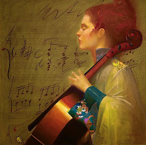
What was there about Spain in, say, the 1950s? The water? The Rioja? Anyway, the country produced some really talented comics artists who were trained around that time. One example is Félix Mas (1935 - ) who was active in that field as well as illustration before moving on to painting in oils. His brief Wikipedia entry is here, and a link dealing with his comics work is here.

All of his painting images that I could find on the Internet featured slender, beautiful young women. Clothing and settings were usually stylized and decorative. After a little thought, I decided that Mas was inspired by Gustav Klimt, in that decorative patterns or other elements such as peacock feathers form part of the background or setting. The decorative elements are not as extreme as Klimt's. And as noted below, often the women are wearing kimonos, and those kimonos feature floral and other patterns.

I keep repeating the word decorative, because that's what Mas' paintings essentially are. Viewers who prefer to find a story, psychological tension, or other dramatic content might be disappointed by Mas.

Gallery

Panel from Vampirella #16, April, 1972. This shows Mas' style as a comics artist.

Now for some of his oil paintings...


These two paintings feature vaguely 1900-style hair and high collar.


Mas has women dressed in kimonos in many of his paintings. I don't recall having seen a strapless kimono, however.


Up Close: Boldini's Giuseppe Verdi

$
0
0
Fans of late nineteenth century painting who are planning a trip that includes Rome should try to find time to visit the Galleria nazionale d'arte moderna. It's on the grounds of the Villa Borghese, a park located a short ways northeast of the Spanish Steps area, which puts it slightly away from the main Rome tourist track. Also on the grounds is the more famous Galleria Borghese, which contains masterpiece paintings and -- especially -- sculptures by the likes of Bernini and Canova. The two museums are not close to one another, but the walk between them is not too far for most people. Once visited, the Moderna is a fairly short walk from the Piazza del Popolo that, in turn, leads to streets where Rome's fanciest shops are found.

One of the best-known works in the Arte Moderna is the 1888 pastel portrait of Giuseppe Verdi (1813-1901) by Giovanni Boldini (1841-1931). Below are two photos I took of it on my last visit.

Gallery

Ritratto di Giuseppe Verdi - 1888
This is an image found on the Internet.

This is my photo showing the portrait and its frame.

A close-in photo I took. Click on the image to enlarge.

Peregrine Heathcote's 1930s Pseudo-Nostalgia

$
0
0
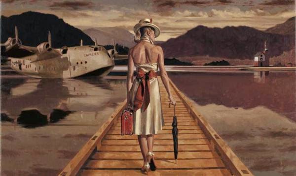
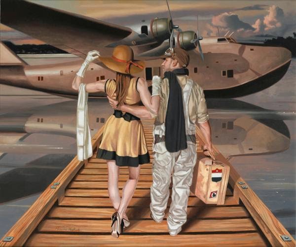
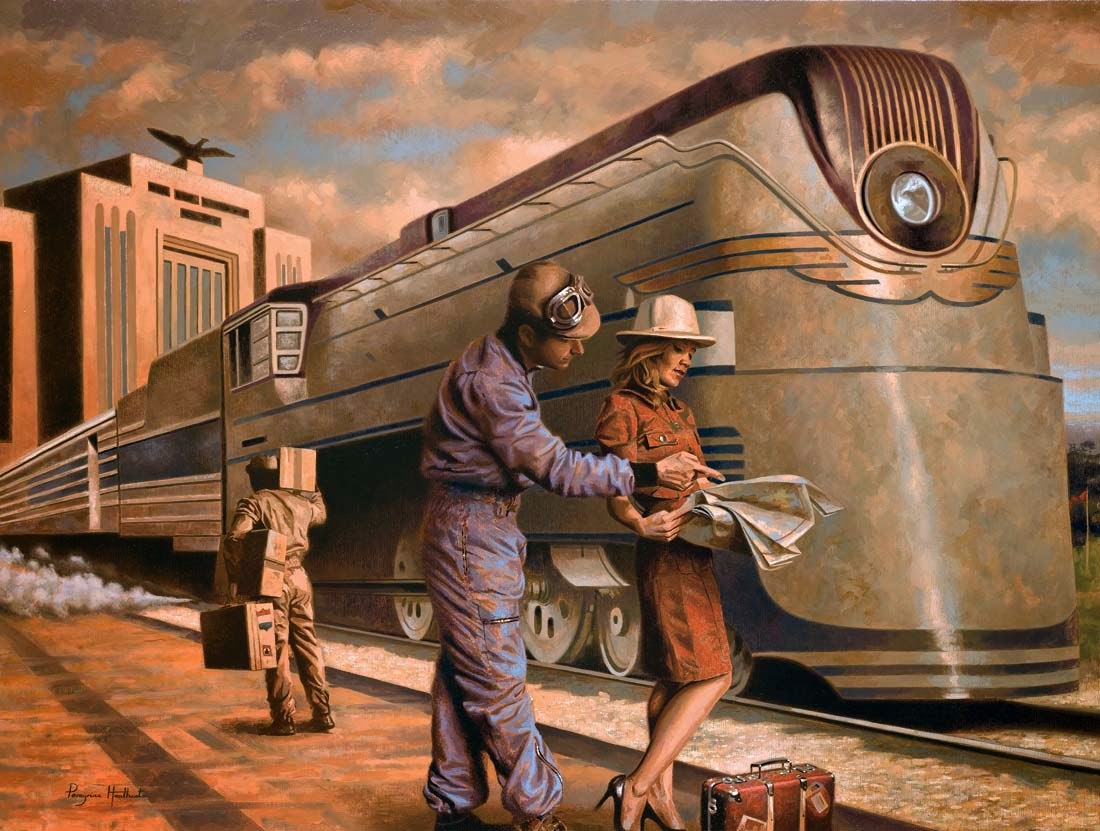
I'm puzzling over how to classify the art of Peregrine Heathcote (1973 - ). On the one hand, he makes part of his living painting portraits, but few of these turn up in Google Images searches. What one does find in proliferation are images of paintings with 1930s settings populated by people dressed fairly recent attire. I deal with the latter in this post.

For some reason, there is little biographical information regarding Heathcote on the Web. Sources with sketchy information are here and here. One site I stumbled across hinted in passing that he attended Harrow, and a partly blocked Times of London piece dealt with Heathcote's renovation of his house in the tony Chelsea (in London) neighborhood. So I must assume that he is doing fine financially, unlike many artists.

Heathcote has a Web site that's worth viewing. This page and subsequent pages feature his paintings, the titles of which are cryptic and that I ignore in the presentation below.

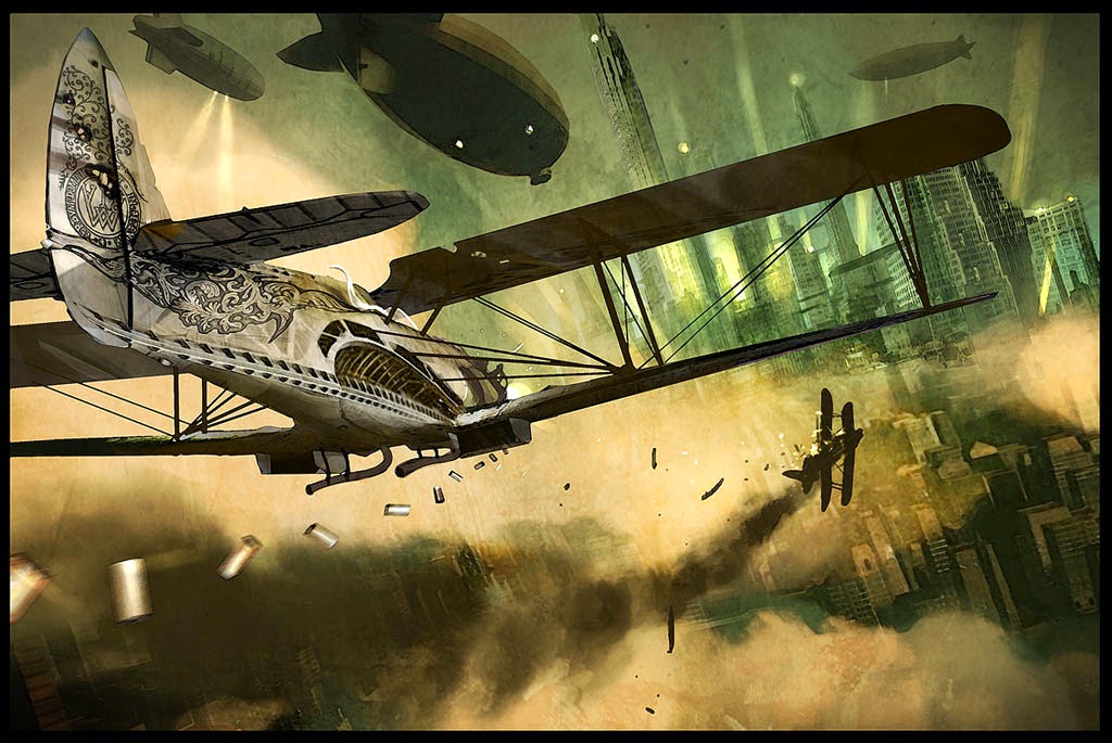
Are his paintings Dieselpunk? Maybe, according to this post on a Dieselpunk site. I'm inclined to think not. That's because most Dieselpunk art alters actual 1920s and 30s objects as if they were in a parallel universe. Heathcote instead takes objects as they were and does his time-warping by the inclusion of non-period (in terms of dress) people.

Like Retro artist Robert LaDuke (see my post here), Heathcote recycles themes, settings and objects. See the images below for examples.

Gallery


The top painting includes an American 1935 Auburn 851 and a British De Havilland 89 Rapide, the lower one features a De Havilland 86 Express.

The aircraft is a German Junkers G.38.

I'm not sure which tri-motor airliner is included here, though it's most likely a Ford.


Three walking the dock scenes. The flying boat in the middle image is a Short S-23, the one immediately above is a Boeing 314.


Deco train travel. The license plate on the race car in the upper image includes Heathcote's initials.

In case you haven't noticed, Heathcote includes 1930s luggage in many of his paintings. Here the traveler faces an ocean liner.


Phone-call images with New York City at dusk out the window.

For some reason, the sports car in this painting is post-World War 2 and not from the 1930s.

Booking a journey.


These paintings seem to be a take-off on Jack Vettriano, but lack the tension and sense of potential menace often present in his work.

I've never seen a Heathcote painting in person, though I'll be on the lookout when I'm near a gallery that carries his work. This means I must evaluate on the basis of images such as those displayed above.

Despite what I noted in the various comments above, I rather like his painting. Yes, it's more hard-edge than I usually prefer, but the point is to portray 1930s stuff clearly, unambiguously. The people in his paintings are pretty repetitious in terms of pose and costume details, but that's something one notices on a Google Images spread or assembled on a blog page. In isolation, a Heathcote might be quite interesting, especially if juxtaposed to different kinds of paintings or else perhaps placed near a group of Art Deco objects.

I'm not prepared to claim Heathcote's work great any more than I am Vettriano's, though I find both strangely appealing due to their subject matter. In Heathcote's case, I pretty sure it's because I'm a sucker for the elegant aspect of the 1930s, wisps of which persisted into my childhood years.

Anders Zorn Watercolor Paintings

$
0
0
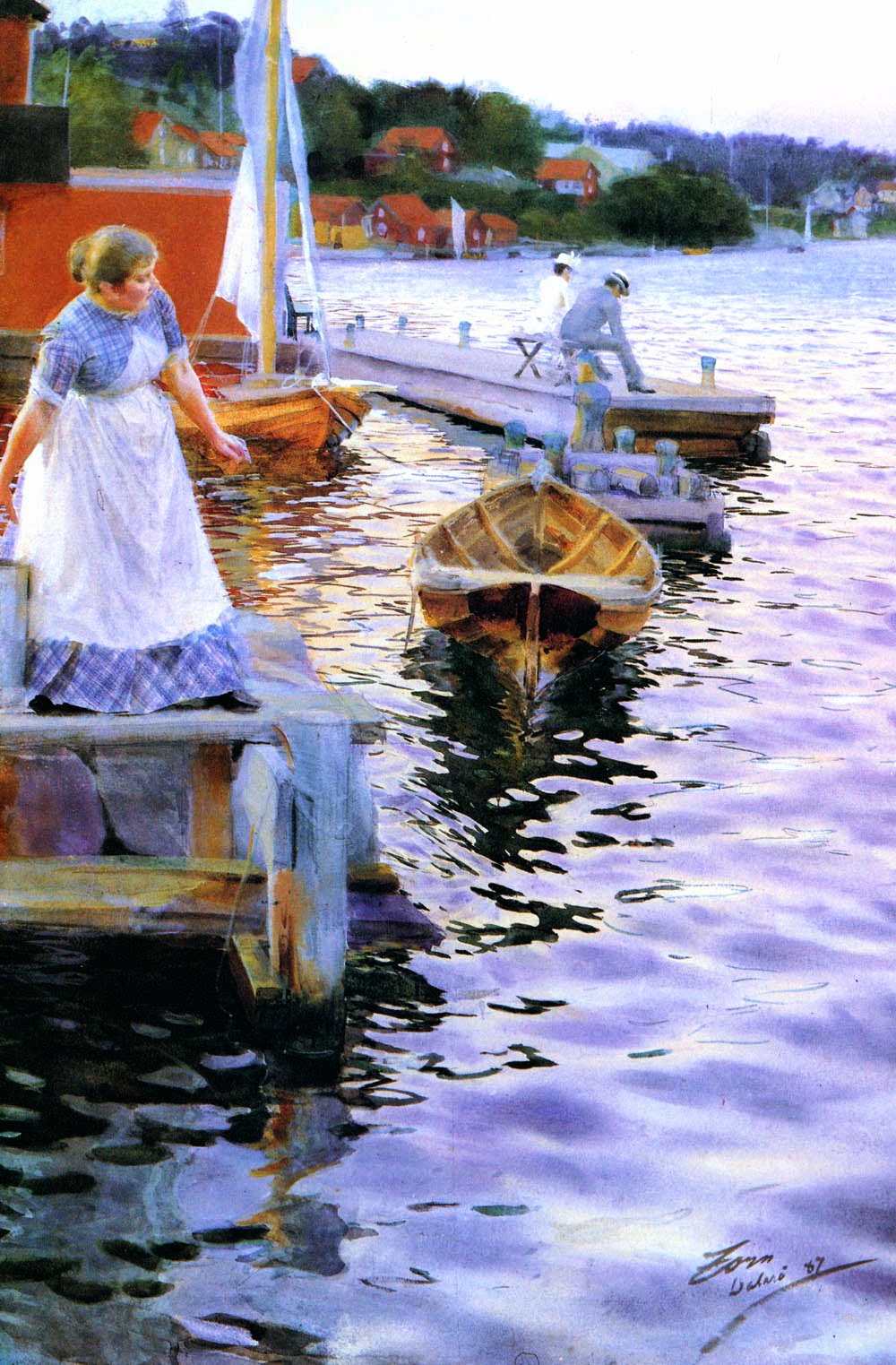
I already wrote about Anders Zorn (1860-1920) twice (here and here). But there's seldom enough of a good thing, so I'm posting once more on the Swedish master (Wikipedia entry here and a site with many of his works here).

This time, I focus on his watercolors. Even though I took a watercolor class in art school, I maintain a phobia regarding that medium. Not for decently done watercolor paintings, mind you, but for actually having to paint one of the things. There is little else in art that I find so terrifying.

As it happened, Zorn began his career as a watercolorist, and naturally was excellent at it. Viewing some of his watercolors -- especially in reproduction -- they often look more like oil paintings. Perhaps one reason for this is that he sometimes painted thickly (not using much water) or perhaps did some areas in gouache, a different water-based paint. Other works were entirely in gouache, which handles more like oil paint than ordinary watercolors.

Below are examples of Zorn's water-based work.

Gallery

Castles in the Air - 1885

Kaijroddare - 1886

The Thorn Bush - 1886

Man and Boy in Algiers - 1887

Vogskvalp (Lapping Waves) - 1887

Reveil, boulevard Clichy - 1892

Up Close: Morelli's Temptation of St. Anthony

$
0
0
A couple of years ago I committed an error in this post when I inserted a photo version of Domenico Morelli's "Temptation of St. Anthony" instead of an image of the actual painting. Now I wish to atone for my sin by posting some photos of the painting that I recently took at Rome's Galleria Nazionale d'Arte Moderna (Web site here).

As his Wikipedia entry) indicates, Morelli (1823-1901) spent most of his career in his native Naples, concentrating on religious subjects. Le Tentazioni di Sant'Antonio (1878) is one of the best known of these. He also painted portraits. As a bonus, I include photos of his Teresa Maglione Oneto (1879) which was also on display at the Arte Moderna. Click on the images to enlarge.

Gallery

"Establishment shot" of Temptation.


Ritratto di Teresa Maglione Oneto in its setting.


Digital Art: Benjamin Carré

$
0
0
Benjamin Carré (1973 - ) is one of a surprisingly large number of French digital artists who are doing well in the science fiction - fantasy field. (Is there something in the vin ordinaire?)

Charley Parker's January 8th post of this year tipped me off to Carré's work, and I think it's worthwhile to show you what interests us. As Charley mentions, information about Carré is sparse. A French Wikipedia entry is here, but it is brief. Then there's this short interview, also in French. On my computer I see that "translations" are available, but the quality of such mechanical procedures isn't always good.

It seems that, besides SFF book covers, Carré does concept art and comic strip / graphic novel work. From what I can tell according to a Google Images display, a noticeable portion of his work relates to Star Wars, a subject that lost my interest many years ago. For that reason, the Carré images I present below are Star Wars-free.

Gallery


Bradshaw Crandell's Glamour-Face Niche

$
0
0
The time was -- and maybe still is -- that a fairly safe way to build a successful career in art involved being able to paint faces of beautiful women. For illustrators the marketing sweet-spot was magazine covers, be they movie fan magazines, women's magazines or even general-interest magazines.

There were several illustrators whose careers were devoted to that subject, perhaps most notably Harrison Fisher, whose works dominated the covers of Cosmopolitan Magazine for the first three decades of the 20th century.

The present post deals with Bradshaw Crandell (1896-1966), who followed Fisher's footsteps to some degree, including creating cover art for Cosmopolitan. Crandell's Wikipedia entry is here. But artists might find this post on Leif Peng's blog of more interest. The writer, Kent Steine, describes Crandell's pastel layering technique used for much of his work up until the 1940s when he transitioned to oil paints. Pastel was popular for rendering women's faces because it could create a smooth appearance more easily than oil paints and without the fuss and potential for the artificiality of airbrush.

Crandell could and did create full-length illustrations of women and even could paint a man. But his fame was centered on depictions of women, some of which are shown below.

Gallery

Photo of Crandell and actress Bette Davis and the resulting Cosmopolitan cover
In the photo foreground are what appear to be boxes of pastel sticks.

Blonde

Brunette

Ingrid Bergman cover art

Redhead

Art, perhaps for a Cosmo cover

Saturday Evening Post Cover - 13 April 1935

Saturday Evening Post Cover - 2 June 1934
This actually includes a man.

Full-length drawing - from around 1933
Again, just to show that Crandell could do more than women's faces.

Up Close: Boldini's Casati with Peacock Feathers

$
0
0
I was in Rome recently and made sure to revisit the Galleria Nazionale d'Arte Moderna (Web site here). It's on the grounds of the Villa Borghese, which puts it slightly off the usual tourist track. Nevertheless, it's worth a visit for those interested in 19th and early 20th century Italian painting.

One of the Galleria's noteworthy items is a portrait of the colorful Marchesa Luisa Casati (1881-1957) who inherited great wealth and spent it away by the 1930s. She was portrayed by many artists, including Giovanni Boldini (1842-1931) who depicted her at least twice.

One of these portraits can be seen in the Galleria, as the images below attest.

Gallery

La marchesa Luisa Casati con penne di pavone - 1911-13
This is a public domain image of the painting from the Internet.

And this is what my camera captured in the gallery. Outside light was coming from the left, which affects what you see here and below compared to the Internet-sourced image at the top. This supposed defect is actually beneficial, because it captures Boldini's impasto and other brushwork better.

A closer view of the subject.  A bit of the frame was included to allow the camera to get a better focus (many paintings lack crisp edges, and can confuse a camera).

An even tighter shot featuring La Casati's face. Click on images to enlarge.

Hans Liska: Equally Good Drawing People and Machines

$
0
0
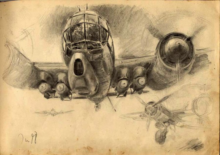
Some artists are good at people, but seem clueless when it comes to man-make artifacts -- sometimes buildings, but more usually cars, airplanes, ships and such. Others are all-rounders who seem to be able to draw almost anything convincingly. One such artist was the illustrator Hans Liska (1908-1983).

Internet biographical information is sparse. A Wikipedia entry in German is here. You can click on the translation button for an English version, but the result isn't very pretty and might even be misleading in places. And there is a website devoted to Liska that has this biographical page; its English also isn't the best, but it presents the basic facts. This site also includes plenty of samples of Liska's works that, unfortunately, have the website watermark on them.

In  a nutshell, Liska was born in Vienna, received early art training in Austria, and then moved to Germany for further training and to establish his career. During World War 2 he was in the army, attached to a public relations unit. In that role, he produced sketchbooks that served as wartime publications which are highly valued nowadays. Postwar, he moved to a town near Bamberg (my favorite small German city) and did a good deal of work for Mercedes and other auto industry firms.

Here are examples of Liska's work.

Gallery

Sketches of cameramen in a public relation unit

Junkers Ju 88 overflying destroyed Russian aircraft - probably 1941

Junkers Ju 88

Junkers Ju 87 Stukas being serviced

Machine gun crew

Nebelwerfer ("fog-weapon") rocket salvo

Paris casino showgirls as seen two months after France fell

Mercedes-Benz brochure cover art - 1951

Mercedes 180D competing in the 1955 Mille Miglia race

Really Large War Paintings in the Arte Moderna

$
0
0
There is a gallery in Paris' Louvre that, if memory serves, has nothing but huge easel paintings.  Painting huge was not unusual during the 19th century.  However, that largely fell out of fashion during the 20th, aside from murals (exceptions include Robert Rauschenberg's "F-111" and Chuck Close's monster portraits).

Following the Risorgimento, when Italy was transformed from a geographical place to a political entity, a degree of nationalism was generated. Not to be outdone by the French, some huge paintings were commissioned that commemorated battles of the Italian unification effort and subsequent conflicts. A few of these can be seen in Rome's Galleria Nazionale d'Arte Moderna (Web site here).

I visited the Arte Moderna recently and took some photos of huge war paintings by Giovanni Fattori (1825-1908) and Michele Cammarano (1835-1920). I included a bit of the surroundings so that you might get a sense of the scale of these works. Click on the images to enlarge.

Gallery

La battaglia di Custoza [fought 1848] - Fattori, 1880

La battaglia di San Martino [better known as Solferino, fought 1859] - Cammarino, 1880-83

La battaglia di Dogali [fought 1887 in Abyssinia] - Cammarano, 1896

Flapper New York: Etchings by Martin Lewis

$
0
0
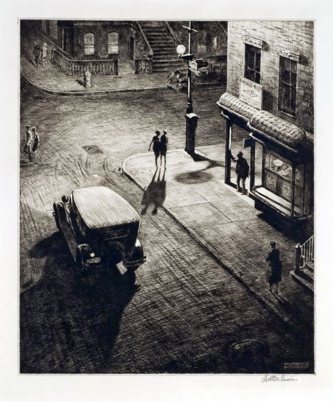
Shadow Dance - 1930
[Images copyrighted by Martin Lewis estate: click to enlarge]

The etching above astonished me when I first saw it. Yes, the backlighting and shadows cast towards us make the scene dramatic, and must have been even more dramatic to viewers 85 years ago when such a lighting scheme was a rarity in illustration and fine arts.

What impressed 1920s buff me was the depiction of the young women in flapper dress and how alive they seem. In fact, they seem more alive than people in almost every black-and-white 1920-1930 vintage still photograph I've seen, and I have seen plenty of such images. (The score: artist 1, camera zero.)

I do wonder about the setting. Unless Lewis was using a lot of artistic license, the summertime sun angle shown is impossible for Manhattan's avenues that run roughly north-south (north northeast to south southwest, actually). However, sunshine comes directly down the cross-town streets late in the day around the time of the summer solstice. So what we seem to have is a late June afternoon or early evening view of a major Midtown street -- 34th, 42nd or 57th. I'll guess it's 42nd Street, though it's quite possible that Lewis simply invented the background.

For some reason, I'm somewhat indifferent to etchings, which might be why I had never heard of Martin Lewis (1881-1962). Lewis was an Australian who eventually came to America, worked in illustration at first, then shifted to etchings and would up his career as an art instructor. He is known to have helped his friend Edward Hopper in learning the craft of etching. His Wikipedia entry is here, and more detailed biographical information here.

I find it hard to comment on artistic properties in Lewis' work. That's because his depiction of late 1920s - very early 1930s Midtown Manhattan and the young women there strikes me as be so true to life or perhaps to my imagination, and that overrides artistic considerations for now.

My first brush with New York City came 26 years after Lewis made that etching Yet aside from the dismantling of Midtown elevated lines, the cityscape hadn't changed very much since 1930 due to the Depression and World War 2 putting a near-halt to construction. Perhaps that is another reason his images resonate with me.

Whereas Lewis was a master of outdoors flapper New York, he didn't seem to venture inside. The artist who perhaps best captured Jazz Age glamour at parties and other social occasions was his almost exact contemporary, illustrator Henry Raleigh, whose life and art are discussed by David Apatoff here.

Gallery

Street Scene, Evening, New York City

New York Harbor, Under the Manhattan Bridge
I include these two images to show Lewis' painting style.

American Battleship - 1916
United States Navy battleships built around 1910-1920 were equipped with cage masts, as seen in Lewis' etching. Those masts were replaced by sturdier structures when the battleships were given their first major refit. This is one of the earliest known Lewis etchings.

Bay Windows - 1929
Now for a set of New York City scenes.

Glow of the City - 1929
Must be a Monday laundry day. The illuminated skyscraper in the distance is the Chanin Building on the corner of 42nd Street and Lexington Avenue that opened in 1929. I'm a little puzzled by the view because we seem to be looking to the southwest from someplace in the East 50s, yet the foreground neighborhood is more what I would expect to find if the site was in the East 20s and we were looking northwest. I suspect Lewis actually was depicting the latter view on the copperplate, but it got flipped when printed.

But that reasoning might be wrong. The orientation of the Chanin building indicates that the foreground would be on a wide north-south avenue rather than a more-likely east-west street. So perhaps Lewis simply invented the scene from bits of New York, figuring viewers would be none the wiser.

Relics (Speakeasy Corner) - 1928
Another scene with backlit shadows. Lewis did a convincing image of the car, something that many artists cannot do for some reason.

Snow on the "El" - 1931

Subway Steps - 1930
I like this image a lot because that's what New York subway station entrances were (and are) like. It seems windy on the street, but the billowing skirt of the young woman descending the steps could be from an updraft caused by a train entering the station below.  Also closely observed is the woman at the right trudging up the steps.  Ditto the discarded newspapers on the steps.

Windy Day - 1931
Lewis has people leaning to our left, into the strong wind. But a few of his windless etchings show people leaning in the same direction. For some reason, many of us slant our drawings, the very professional Lewis being no exception.

Chance Meeting - 1940-41
The Roaring Twenties and flappers are long gone and World War 2 approaches America. Clothing fashions had changed, and Lewis could not give them the spark he provided a dozen or so years earlier.

Leopold Seyffert: A Once-Prominent Portrait Painter

$
0
0
Leopold Gould Seyffert (1887-1956) painted portraits of many famous Americans during the first half of the last century, but whatever fame he had during his lifetime has largely faded. For once, Wikipedia has an extensive biographical entry on a not-well-known artist, and it attests to his professional success.

As best I can tell, I've never seen a Seyffert painting. Or if I have, it didn't register in my memory. So I cannot offer a firm opinion regarding his merit as a painter. His works seen on the Internet strike me as being entirely competently done. What might be missing is a sense of flair or personal style such as can be found in works of portrait painters such as John Singer Sargent, William Orpen, Philip de Laszlo and Giovanni Boldini, among a number of others.

Here are examples of Seyffert's portrait work. His paintings of nudes can be found elsewhere on the Internet.

Gallery

Leopold Stokowski - c.1912
This portrait was Seyffert's career breakthrough work. It no longer exists, having been "lost at sea" according to a Stokowski Web site.

Samuel Insull
Insull was a famous and controversial business figure.

Samuel Henry Kress
Kress founded a five and ten cent store company, became rich, and purchased art that later was donated to a number of smaller art museums around the USA.

Henry Suzzalo
Suzzallo was president of the University of Washington and famously got fired.

My Family

Katherine Abbott Bigelow

The Emerald Gown (Helen Adele Fleck, the artist's first wife)

In My Studio - 1931

Elizabeth Arden
This portrait was finished because it is signed. But it is sketchier than all the others shown here. Perhaps for that reason, I'm inclined to like it best.

Windy Gaetano Bellei

$
0
0
I probably didn't drill deeply enough into Google, so all that I can report now is that Gaetano Bellei (1857-1922) apparently was born and died in Modena, Italy. And he spent at least part of his career there, because some of his paintings include the name of the city along with his signature.

Bellei was a good draftsman and created many paintings featuring accurate drawing and a painting style tending fairly strongly to the hard-edge school. He seems to have been successful (though I can't be sure of this, lacking a biography), and that was because he often painted everyday scenes and characters with a sentimental twist. This approach has long been popular with a public that likes to see art that they can relate to.

Artists that cater to that public can do well financially (think Thomas Kinkade, for a recent example), but at the price of being scorned by "sophisticates." I happen to think that sophistication can be carried too far if it becomes an end in itself, which might be one reason why I title this blog Art Contrarian. Moreover, I have no problem with artists who can make a decent living from their work; becoming famous and pulling down high auction prices after one's death doesn't strike me as satisfactory. That said, even though I appreciate Bellei's technical skill, I would not have any of his paintings hanging on a wall in my place.

What caught my eye regarding Bellei was how he depicted wind in a few of his works. I include those below along with a few other paintings by him and others to provide context.

Gallery

Bellei liked to paint pretty women. This one's skin is shown soft and perfect. The clothing and background are essentially hard-edge style painting, perhaps reflecting a likely academic training for the artist.

But it wasn't all pretty women. Here he has three generations of a family in a sentimental setting.

Back to pretty girls. Here are two on their way up a staircase to a masked ball. Except they are not wearing masks, having removed them temporarily so that we can better see who they are. Note that one is a blonde, the other brunette.

Now for some wind. A conventional windy scene, here.

Now a blonde and a brunette, but not necessarily the same ones we just saw at the ball.

A blonde and a brunette again, but this time it's raining, though they don't seem very wet yet.

Same thing, though the brunette now has a different skirt. Note that the setting is about the same in all three paintings (the dome in the background is a tip-off). What interests me is that Bellei includes rain with the wind, whereas almost every other painter of pretty women in stormy settings only features wind.

Boreas - John W. Waterhouse - 1902
Here I include some paintings by other artists showing wind and women, starting with this Waterhouse.

A Gust of Wind (Judith Gautier) - John Singer Sargent - 1886-87
A sketch, rather than a finished work by Sargent. The main indication of wind is Mme Gautier holding her hat down.

Gil Elvgren pinup
Golden Age Pinup artists such as the great genre master Gil Elvgren could use wind as a cause for showing off some hose and underwear.
Viewing all 1103 articles
Browse latest View live


Latest Images