Quantcast
Channel: Art Contrarian
Viewing all 1103 articles
Browse latest View live

Thomas Anshutz

$
0
0
Thomas Pollock Anshutz (1851-1912) was a painter and art instructor who studied under and later worked with the better-known Thomas Eakins. Anshutz's Wikipedia entry is here.

He became the lead instructor at the Pennsylvania Academy of the Fine Arts after Eakins left. His students included Robert Henri, George Luks, John Sloan, Everett Shinn and John Marin, all of whom are better known than him today. Nevertheless, Anshutz was a skilled painter whose lack of acclaim might in part be due to his not buying heavily into modernist artistic ideology (if his paintings are any evidence).

Gallery

The Ironworkers at Noontime - 1880

Woman Writing at a Table

Figure Piece - 1909

Lady with Bonnet

The Incense Burner - c.1905

A Rose - 1907
These last two paintings seem to feature the same model.

Sir James Gunn

$
0
0
Sir James Gunn (1893-1964, he eventually dropped his first name, Herbert, in favor of his middle name) successfully practiced representational painting in an era when it fell out of fashion. Perhaps this was because he made his living as a portraitist with the Royal Family among his prime clients. Information about him is scarce on the Web, though this site has a biographical note along with a slide show of many of his works.

Gunn was born in Glasgow, son of a tailor who apparently owned a successful business, given the support James received. He studied at the Edinburgh College of Art and the Académie Julian in Paris. During the Great War he served with the Artists Rifles and later as an officer with the 10th Battalion, Scottish Rifles. He was gassed, which resulted in lung trouble for the rest of his life.

He married Gwendoline Hillman, widow of Captain G.S. Thorne, in 1919. They had three daughters, but divorced in 1927. He married Pauline Miller in 1929, that marriage lasting until her death after a long illness in 1950. They had a son and daughter. Pauline was the subject of numerous paintings. Gunn lived in the London area from 1925, but spent some time in Paris 1935-36. He painted many portraits of members of the British establishment including Prime Ministers Chamberlain and Macmillan, plus a group portrait of George VI's family and others of the Royal Family. He painted British officers, including Montgomery in France following the D-Day invasion.

Gunn was elected to full membership in the Royal Academy in 1961 and knighted in 1963.

Gallery

Gwendoline Hillman - 1925
Gwendoline was his first wife. Their marriage might have been heading for the rocks when this was painted.

Pauline, Wife of the Artist - c.1930
Painted not long after their marriage.

Pauline Waiting - 1939

Pauline in the Yellow Dress - 1944
Two more Pauline portraits.

Gracie Fields - c.1940
Fields suffered from cancer around the time this was painted.

July by the Sea

Roman Forum - 1929
Two outdoor scenes, the first probably from the early 1920s. Gunn also painted some sensational nudes not quite modest enough for this site.

Conversation Piece at the Royal Lodge, Windsor - 1950
The Royal Family supposedly at ease (though the posing is stiff).

Queen Elizabeth - state portrait - 1953-56

My take on Gunn is that he was highly competent, but lacking the additional trace of spark or flash needed to make him and his works memorable and his reputation stronger.

Automobile Facial Expressions

$
0
0
Because the front ends of most automobiles have two headlamps and an opening to send air to the radiator, they can be said to resemble a human face -- the headlamps as eyes, the grille opening as the mouth.

Ordinarily, the notion of a car having a face is simply a mental construct. But in some cases, front ends seem to be faces with expressions. At times, this might have been the intention of the stylist, in other instances it could have been accidental.

Let's take a look at some examples.

Gallery

1949 Lincoln Cosmopolitan
Although I missed it, a number of observers have pointed out the "sad" look on 1949 Lincolns. Indeed, the outside of the grille was squared off for the 1950 model year apparently because potential buyers were put off the the '49s expression.

1950 Buick Special
I've never encountered a consistent set of reactions to the 1950 Buick's grille (that too was quickly changed for the following model year). Mostly observers found it outrageous. As for analogies to human expressions, the notions of "buck teeth" or "drooling" might apply.

1956 Oldsmobile 98
Oldsmobile sported a grille theme that evolved from 1946 through 1958. The endpoint versions are considerably different, but if one looks at Oldsmobiles year-by-year between those dates, the progression is noticeable. For the 1956 model year the cars had a fish-faced look because grille opening resembled mouths of certain fish.

2010 Acura TSX
The facial expression of this Acura is ambivalent. Seen on the street from certain angles, it seems rather harsh and sinister. But in the view in the photo above it looks like there is an odd, angular sort of smile.

2010 Mazda 3
On the other hand, the Mazda 3's face is clearly smiling.

Francisco Pons Arnau's Women

$
0
0
There's not much information available on the Internet about Spanish painter Francisco Pons Arnau (1886-1953). Charley Parker on his Lines and Colors blog corroborates this. A Spanish-language site devoted to him is here, but featured images of his works are blown up from their source sizes resulting in blurring. And it too offers almost nothing in the way of biography.

Pons painted landscapes and formal portraits, but his favored subject matter was beautiful women. Here are some examples.

Gallery

Clotilde tomendo te

Confidencias - 1925

Esquiadoros

Flamencodansös

Mujer sentada

Retrato de mujer

Greg Manchess Scores Again

$
0
0
Greg Manchess paints everything from murals to sci-fi and fantasy book cover illustrations. And he has developed into a master of the bold-stroke school of oil painting. I have dozens of images of his work stashed away on my iMac for both inspiration and regret that I could never be as good.

He blogs on Dan Dos Santos' Muddy Colors group blog, which is well worth following if you are interested in contemporary illustration. Not long ago Manchess posted about a demonstration piece he made for a class he was giving. I found the work astonishing.

This is the image he posted. It shows Elsa Lanchester in her "Bride of Frankenstein" movie role. Note Manchess' bold use of blue-green as the main facial color and the contrasting orange-brown on the hair and part of the background (this is not far from normal skin color when toned with white). But the feature that really grabbed my attention is the small areas of warm color below Lanchester's right eye. Without that, the composition would fall apart.

Color is one thing. But what about value (dark-light)? I ran the image through iPhoto to create a black-and-white version. Sure enough, it works well too, which is another factor in creating a satisfying painting. Plus, having colors express values isn't always easy to do, yet Manchess dashed off this painting in less than two hours, including time to fix an area that got smudged by (of all things!) a cat.

As a final test, here is the photo Manchess probably used for reference. His color-based values scheme holds up well when compared to this.

The Bland Art of Giorgio Morandi

$
0
0
It's just me. There is plenty of art out there that I don't appreciate simply because something in my background and personality created a blind spot where it comes to subtle things. For instance, slow movements in symphonies bore me. So does 99 percent of the music Claude Debussy wrote. And slow-paced novels; I'll set them aside if nothing much is happening after the first 50 or 60 pages, regardless of what claims are made regarding their excellence.

As for painting, an example is the work of Giorgio Morandi (1890-1964). In theory, I ought to like him because he resisted some modernist desiderata. But ... well, take a look:


I'm sorry, but I just can't grasp what is so good about Morandi's paintings in spite of the fact that he has been the subject of increasing praise in recent years. Worse, if someone tried to explain why it is good, I still wouldn't understand.


When it comes to still lifes (not my favorite genre), I much prefer something like this one by David Leffel.

Stevan Dohanos: Mainstream Mid-Century Illustrator

$
0
0
The leading general-interest magazine in the United States for roughly 1920-1960 was the Saturday Evening Post. The Post published both fiction and non-fiction pieces along with cartoons and other features. Like The New Yorker, the Post was noted for its covers. When the latest edition arrived in the mail, a subject of family conversation might well have been its cover illustration. By the 1940s, Norman Rockwell ruled the Post cover roost, and the appearance of one of his cover illustrations usually created the greatest interest.

It was during the 1940s and 50s that the Post's policy regarding cover art shifted from a vignette style (subject matter surrounded by white space or a single background color) to fully detailed paintings. This was in contrast to the contemporaneous "big face" style of women's magazine story illustration by Coby Whitmore and others, where backgrounds were usually sketchily indicated.

To be a cover artist for the Post was the pinnacle for an illustrator, the top of the totem pole. So to enter this elite group during the decades surrounding 1950, one had to paint fully detailed scenes. Rockwell transitioned to this mode, and newcomers accepted it from the start because it was a major road to commercial success.

Stevan Dohanos (1907-1994) was one of those newer artists, and he had great success, painting well over 100 Post covers. His Wikipedia entry is here, a site containing examples of his work is here, and a little more biographical information is here and here.

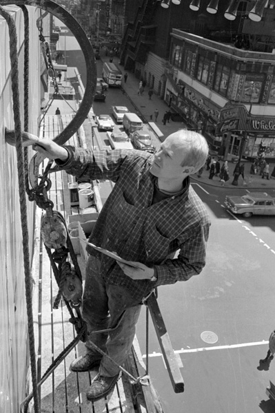
The consensus of opinion is that Dohanos was a skilled realist who was fascinated by everyday items such as telegraph poles and fire hydrants. One observer suggested that, unlike Rockwell, he was perhaps more interested in the setting than the people and actions that he was depicting. Ernest W. Watson in his 1946 book "Forty Illustrators and How They Work" quotes Dohanos stressing how exhaustively he researched his illustrations.

Gallery

Dohanos in an advertisement for the Famous Artists School

One of his posters during World War 2

Saturday Evening Post cover, 14 February 1948

Saturday Evening Post cover, 25 November 1950

Saturday Evening Post story illustration, 24 May 1958

Art museum scene - possible cover art

Dohanos left school at age 16 and received little formal art training, making him yet another example of a self-trained artist who did well. Apparently he engaged in fine art as well as commercial work, but nothing of note in that field turned up during a Google image search.

I find Dohanos' illustrations to be technically very well done, but they otherwise strike me as being conventional. So I'm offering faint praise. I find nothing wrong with his work, yet can't get excited about it either. For me, he deserves respect, but doesn't quite merit admiration; he was one of the good ones, but not one of the great ones. However, I am pleased that he found success during his lifetime.

Donato Paints Joan (of Arc)

$
0
0
I confess that I'm not as up to speed as I should be when it comes to Science Fiction and Fantasy art. But I'm working the problem, as they say.

Speaking of problems, a problem I have with regard to Fantasy art is that the stuff looks pretty much the same. That is, the subject matter seems to dictate the result to a degree that's puzzling when you realize that the subject matter is essentially imaginary rather than real. Consider Western art. Subjects here usually are Indians, cowboys and such from the nineteenth century, so depictions have to be reality-based and viewers can accept that.

Apparently something like that kind of acceptance happens when Fantasy fans view, say, covers of Fantasy fiction books. Even though they aren't real, viewers seem to have the same expectation of what a dragon looks like as they would for a trooper of the 7th Cavalry.

But what is, is. Therefore I'm pleased when I find a SciFi-Fantasy (SFF) artist who paints other subjects and does so with commercial success. One such artist is the half-blind Donato Giancolo, who professionally goes by his first name. Donato blogs at the Muddy Colors group blog (well worth your attention if your interests include SFF illustration). His Muddy Colors biographical sketch is here and his own website here.

Above is a painting of Eowyn and Nazgul, a Tolkien subject. I show it here as an example on Donato's Fantasy art.

Speaking of Tolkien, this is Donato's 2012 posthumous portrait of him. I am not a Tolkien fan, so here is Donato's explanation of the symbolism found in the painting.

This 2007 painting is titled "The Museum." I don't know its background, so I'm not sure if was for a book cover or is standalone art.

A recent painting that does not fall into the SFF category is of Joan of Arc.

Above is an in-progress view of it from two days into the final painting. Donato discusses this work here. For artists interested in how-it-was-done videos, one is available; see his blog link above for details.

Really Small American Cars, 1935-1955

$
0
0
During the early years of the American automobile industry, the size, mechanical configuration, type of power and general shape of cars was something being sorted out. That era was largely over by 1915 or thereabouts. And by 1930, most American cars fell into size ranges that were generally proportional to price classes. This became the norm until about 1960, when brands began sprouting "standard size," "compact," and "intermediate" models.

But even in that era of stable stratification there were exceptions in the form of cars built smaller than entry-level Fords, Chevrolets and Plymouths.

The 1938 American Bantam shown above was one of a little more than 4,000 built during the years leading up to World War 2. Other versions were produced in the early 1930s under the aegis of the American Austin Company.

The Crosley car was part of Powell Crosley's manufacturing and broadcasting empire. Cars were built from the late 1930s into the early 1950s with a wartime hiatus. The top image in this group shows a 1939 model. The middle image is of a 1947 sedan, about 14,000 of which were sold thanks to the postwar seller's market. The lower photo is of the Hotshot sports car from 1950-52. A roadster version with doors was manufactured 1949-52 and sold slightly better. Total postwar Crosley production was a little more than 75,000.

And then there was the King Midget, a tiny car built from 1946 until the late 1960s. Estimated production is 5,000. I have never been able to understand why anybody would buy one, but a few people did.

Adolph Treidler: Poster Style Illustration

$
0
0
Adolph Treidler (1886-1981) wrote a charming little memoir for Automobile Quarterly's Third Quarter 1976 issue. If you do the subtraction, that would have made him about 90 years old at the time. By that point, he had been retired from illustration for around 25 years. And some of his best known work was done as long ago as 1910 for Pierce-Arrow, one of the leading makers of luxury cars in America.

This site has a tiny biography along with examples showing a variety of Treidler's work. But there was no really useful biographical sketch that I could find on the Internet.

According to his AQ memoir, Treidler was born in West Cliff, Colorado. The family moved to various mining towns in that state until leaving for San Francisco about 1898. He worked for an advertising agency while in his teens, experiencing the 1906 earthquake and fire shortly before departing for Chicago. There he stayed for about a year and a half, working as an artist for the Chicago Tribune newspaper. Then he moved on to New York where one of his paintings that happened to include a Pierce-Arrow car caught the eye of a man who soon became an art director at the Calkins & Holden advertising agency, which held the Pierce-Arrow account. From that point, his career took off like a rocket.

Besides Pierce-Arrow ad art (which ended around 1930, when the company was rapidly declining), he did poster and other advertising art for the French Line, Bermuda tourism, the government war effort in both world wars, and Chesterfield cigarettes.

Gallery

Pierce-Arrow ad harking back to an earlier Treidler ad

Pierce Arrow ad art, Literary Digest - 5 January 1929

Chesterfield cigarette advertising

Poster for Bermuda tourism

World War 2 poster - 1942

Poster for Furness line

Treidler was surprisingly versatile when it came to style. The posters dealing with Bermuda would seem to have been done by another artist than the one who did the World War 2 poster. And it might have been a third artist who did the Chesterfield ad art and a fourth who worked for Pierce-Arrow. But of course this was all Treidler. I wouldn't quite place him in the top echelon of illustrators because he didn't do story illustration so far as I can tell. But as an advertising artist he was indeed good.

Molti Ritratti: Duke of Wellington

$
0
0
Some of my Molti Ritratti (many portraits) posts dealt with subjects who lived before the invention of photography. Others lived in the photographic era and had comparatively few portrait paintings made of them. Then there is the interesting situation where most of the subject's life was lived before photography, yet an image or two might exist. Such was the case for Andrew Jackson (1767-1845), subject of this post. The same is true for Arthur Wellesley, 1st Duke of Wellington (1769-1852), a near contemporary of Jackson.

The two led lives that mirrored each other in some important respects, though Jackson was born into humble circumstances of immigrant parents from Ireland, whereas Wellesley (his father spelled the family name "Wesley") was of the Anglo-Irish aristocracy. Both men became generals and fought important battles (New Orleans for Jackson and Waterloo for Wellington). Both became the political leader of their country (Jackson as President, Wellington as Prime Minister). And both sat to a number of portraits.

Below are images of Wellington.

This is a daguerreotype taken in 1844, if the information I found on the Web is correct. Wellington would have been about age 75.

This portrait is by John Jackson, a painter who was well known in his day, but is obscure enough that I hadn't heard of him before. The painting was probably made not many years before Jackson's death in1831.

These portraits were painted by George Hayter, yet another painter new to me. Hayter also painted Queen Victoria and other notables. The upper painting was made in 1839. I have no date for the lower one, but from Wellington's appearance it might have been done near the time of the Jackson work.

Here is one of the better-known Wellington portraits. It is by Francisco Goya, painted in 1812 as Wellington was nearing his final defeat of French forces in Spain.

The final three portraits are by Sir Thomas Lawrence, the leading English portraitist of the early 19th century. The one at the top is the best-known, and usually used when a depiction of Wellington is needed. It was painted around 1815-16, not long after Waterloo. The middle painting was commissioned in 1820 and probably completed within a year or two of that date. It looks suspiciously like it was to some degree a copy of the earlier painting (for instance, note the similarity of the nose shadows). I have no date for the final portrait, though from Wellington's appearance it was made after 1820 and before Lawrence's death in 1830. It strikes me as inferior to the first two.

New Book: Automobile Styling

$
0
0
I've been busy of late, and apologize for not replying to comments. For one thing, I've been traveling a lot this winter season, my wife wanting to get away from gloomy Seattle.

Also, I was writing another book.


That's the cover, and it's an e-book that can be found here. It can be downloaded to an iPad, Kindles, and perhaps other devices.

My thesis is that after a period of rapid, focused change in appearance during the 1930s and 40s, what followed has been largely a case of changing styles or fashions that were influenced to some degree by outside forces such as technological changes and government regulations.

Here is an excerpt:

* * * * *
Harley Earl’s legendary design taste seems to have failed him in his last few years as GM styling supremo.

The tepid public response to GM’s 1957 senior line resulted in a set of garish, panic-induced 1958 facelifts that a younger Earl likely would not have tolerated. My belief is that Earl’s success from the end of the 1920s to the mid-1950s was based on his ability to formulate a valid concept of styling evolution.

As noted, he strove to have cars seem long and low even if they physically were not. Indeed, automobiles did become longer and lower during his reign. He probably saw that car bodies would become integrated with passing attention given to aerodynamic streamlining and greater emphasis on visual streamlining. This too came to pass. Towards the end of the 1940s he must have considered jet planes and rocket ships as perhaps the next evolutionary direction, and for a time this seemed to work as well. And his judgment regarding styling trends might have remained acute enough that, by the mid-1950s, he perhaps realized that airplane and spaceship themes were not going to work well because they were impractical in terms of street and highway based everyday use. If this was his thought, he was correct yet again.

Earl’s real problem by 1956 or thereabouts was that he could not think of any valid new evolutionary styling path. And he could not do so because no such path existed. So he floundered, not being able to deal with a directionless styling environment.
* * * * *

Unlike my other e-book "Art Adrift," this book is richly illustrated because I was able to make use of advertising and other publicity material issued by the automobile companies.

I hope the car buff readers will enjoy it.

Théo van Rysselberghe's Brush with Pointillism

$
0
0
The Belgian painter Théo van Rysselberghe (1862-1926) is usually classified as a Post-impressionist, perhaps even a Pointillist. That seems to be a fair assessment if one is following the modernist version of art history. I'm more inclined to think that he is more difficult to pigeonhole.

Here is van Rysselberghe's Wikipedia entry. It is much more comprehensive than many other artist biographies I've linked to recently, so you might as well refer to it for details of his life and career.

So far as van Rysselberghe's painting styles are concerned, I would say that he began his career as a conventional representational painter, circa the early 1880s. That is, his style was more free, more painterly than what hard-core academic painters would use. As the entry above indicates, he discovered Impressionist painting and then the Pointillism of Seurat and soon becoming friends with others working in that style. However, van Rysselberghe usually tempered Pointillism, especially when painting portraits or otherwise incorporating people in his images. That is, faces were painted using more conventional brushwork. Many such paintings were made in the early 1900s when he was drifting away from Pointillism, so perhaps those faces served as part of the transformation mechanism. After 1910 his paintings were still brightly done, but had returned to more conventional brushwork. Van Rysselberghe does not seem to have indulged in any of the avant-garde styles that appeared in the decade or two before the Great War.

Gallery
Émile Verhaeren - 1892
Émile Verhaeren Writing - 1915
Setting the scene, here are portraits of a good friend of van Rysselberghe painted 23 years apart. The 1892 painting is strongly Pointillist, even extending to the subject's face. The later portrait is essentially conventional.

Butcher shop in Tangiers - 1882
Van Rysselberghe made three trips to Morocco, a place that fascinated him for several years. The work above seems to be more than a quick sketch, but is less detailed than some of his larger Moroccan paintings of that time.

Moonlit Night in Boulogne
A Pointillist landscape. I cannot find a date for it, though it was probably painted around 1899.

Madame van de Velde and Her Children - 1903
Femme au miroir - 1907
These are examples of paintings with Pointillist or Divisionist backgrounds and where subjects got a more conventional treatment,

White Peonies - 1913
Self-portrait - 1916
Here van Rysselberghe is returning to conventional representation.

Summer Resting - 1922
This was painted a few years before he died, when female nudes were a favorite subject for him.

Myron Perley: Illustrator Without a Biogrphy

$
0
0
I recently came across some advertising illustrations for the 1931 Pierce-Arrow luxury automobile line by Myron Perley (1883-1939). Those years of birth and death are all that I can find about him. Next to nothing on the first few pages of Google searches and nothing at all in my books with reference material.

Even the illustration work known to be by him or attributed to him is in short supply on the Internet. Which is too bad, because Perley seems to have been competent at his trade, though perhaps not one of the great illustrators.

Gallery

1931 Pierce-Arrow Town Car illustration

1931 Pierce-Arrow Sport Phaeton illustration
1931 Pierce-Arrow Sport Phaeton photo
Here I juxtapose a Purley illustration with the model he depicted.

1931 Pierce-Arrow Convertible Coupe illustration
1931 Pierce-Arrow Convertible Coupe photo
Another such juxtaposition.

1931 Pierce-Arrow Roadster illustration

Listerine advertisement illustration - 1925
A dozen or 15 years earlier, Perley did other Pierce-Arrow illustrations as well as illustrations for advertising other makes of cars. And as with this Listerine ad, he provided illustrationa for non-automotive companies.

If anyone has some biographic information on Perley, let us know in Comments.

John Beauchamp: Depression-Era Muralist

$
0
0
For some reason 1930s Depression-era art attracts my attention. I can't say I actually like it, so maybe that attraction might be because some of it was still around in the form of murals in public buildings such as schools and post offices when I was young, and seeing them triggers some kind of recognition reaction. But I really don't know.

I want to call your attention to two murals by John W. Beauchamp (1906-1957) because they include some interesting distortions.

This is called "Rachel Silverthorne's Ride," a 1938 public works mural in the Muncy, Pennsylvania post office building. Some background information is here (scroll down).

Although Beauchamp was trained in art, distortions are easy to find in this mural. Note the man holding the horse's bridle. By his size relative to the horse, he should be several feet in front of it. Note that his right leg is also large and distant compared to the animal's right foreleg. Could this be artistic license to stress the man's importance to the scene? Might it have been a composition consideration? Beauchamp is long gone and cannot tell us.

Another distortion seems more like a case of bad drawing. Look at Rachel's leg. It seems out of proportion or perhaps it's something to do with the way the rest of her is drawn.

Here is "The Arts, Education and the Sciences" from around 1943 (not all that long after the Depression) now in the Commission Chamber of the City-County Building of Helena, Montana. It and two others were originally commissioned by the owner of the Mint Cigar Store and Tavern of Helena. More details are here (scroll down for images by Beauchamp).

The photo I found on the Web was taken from below, so that alone might make things look a little odd. Even so, several of the heads of figures in the foreground strike me as being the same size as or smaller than those in the background. Examples are the artist at the left and the men wearing white at the right. Similar cases can be found in the other two murals pictured in the link, so I suppose Beauchamp had his reasons for doing what he did.

Multi Ritratti: Lady Hamilton

$
0
0
Lady Emma Hamilton (1765-1815) came from humble origins but, thanks to her beauty, soon entranced men of status and power including most notably Lord Nelson, England's greatest fighting admiral. Her life is reported in considerable detail here.

Among those struck by her looks was the painter George Romney who produced a large number of portraits of her striking various poses, usually of classical or literary characters. These are the best-known images of her.

She was painted by other artists, the most competent being Élisabeth Vigée-LeBrun. An excerpt from Vigée-LeBrun's memoirs dealing with Lady Hamilton is here.

Gallery

The paintings above are by Romney.

These last three are by Vigée-LeBrun.

Claude Buckle's Railway Posters

$
0
0
Claude Henry Buckle (1905–1973) trained in architecture, spent a number of years creating travel poster art for British railway companies, and in his final years became a skilled water color painter. Biographical information is here.

Thanks to his work as an architectural delineator, Buckle was able to paint convincing scenes of towns, cities and noted structures. Below are examples of posters containing his illustrations. Several scenes are familiar, whetting my desire to head for England and Wales to visit the rest.

Gallery


James Rosenquist on Art

$
0
0

The painting is "I Love You with My Ford" (1961) by James Rosenquist (b. 1933), who is usually labeled a Pop Artist, even though he insists that the term is misleading and, in any case, does not apply to him.

I confess that my knowledge of the personal lives of modernist artists active after the 1930s is rather thin, because I don't like most of their work. So I was surprised to learn (even though the rest of the world knew it) that Rosenquist gained much of his early experience as a painter doing billboards in New York City. Which is why his paintings are large as well; he knew how to do it.


A biographical sketch on Wikipedia is here and a chronology on Rosenquist's own Web site is here. A few years ago, Rosenquist and a collaborator wrote this rather interesting autobiography. It contains a few observations about art I'd like to pass along.

* * * * *
[About instructors at the Art Students League in the mid-1950s] That kind of teacher isn't around any more, there's nobody even near that caliber. All the people I studied with were true artists of the old school who had mastered composition and fine art. [page 34]

Billboard painting was really like an old master's school of painting. These people were journeyman artists, in a tradition that went back to the painters' guilds of the Middle Ages. The nearest thing to it would be for a kid to be mixing colors in an ink manufacturing plant. You would get to know color pretty well doing that. Of course there are still the scenic artists who work on Broadway shows. That's quite a complicated business because they use water-based paints that dry darker and differently than when you are working with them wet. They have to use water paint so it won't catch on fire so easily. That would be the nearest thing to getting an education painting billboards. [page 49]

[His thinking circa 1960] I wanted to do something totally different from anything being done by everyone around me. All the artists I knew had been taught to use paint expressively, to splash paint on a big canvas, look at the big blob you'd created and to have it suggest something back to you. It seemed to me too simple to put a mark on the canvas and have that be it. Once you've put that mark on the canvas you have the responsibility of cleaning up the mess, of making something unexpected out of it because you started out with a white canvas that was beautiful to begin with.

My question was, what do you do with that mark? There's a difference between trying to achieve a predetermined idea and letting your random action dictate what it may or may not suggest. Now, I like the first first idea better for many, many reasons. If you tackle a huge canvas, unless your idea is planned out, as in mural painting, everything can, may--and usually does--go awry. [page 78]

* * * * *

Virgil Finlay's Scratch and Stipple Illustrations

$
0
0
Let's face it. Despite the rehabilitation of pulp magazine illustration of roughly 1930-1955, much of it wasn't very good. In some cases, the artists were simply mediocre. In other instances, they were good, but still young and trying to get their careers launched; some were able to eventually make the jump to the prestigious and better paying "slick" magazines.

One of the very good ones who never really made the illustration Big Time was Virgil Finlay (1914-1971), who is best known for his science fiction illustration. He also did illustrations for a third-tier magazine and later in life kept his career going by providing illustrations for astrology magazines.

The jist of this can be found here in his Wikipedia entry. But a more useful source about his career and, as important, his unusual technique, is here.

It seems that Finlay was a scratchboard artist who supplemented normal scratchboard techniques with stippling (application of tiny dots of ink). The second link above provides a useful discussion of this.

Below are examples of his work. As you can see, Finlay apparently really liked to draw beautiful women, and he did this very well. Click on the images to enlarge.


The Bland Art of Fairfield Porter

$
0
0
I wrote a post called "The Bland Art of Giorgio Morandi. In that post, I blamed my assessment on the fact that I'm just not much into subtlety.

So along with Morandi, I'll toss in another painter whose work doesn't meet my need for flash and dash: Fairfield Porter (1907-1975). Porter's Wikipedia entry is here, and more information here.

On the other hand, some people I respect are Porter fans. Among them are The Wall Street Journal's theater critic Terry Teachout (see here, for instance) as well as my former 2Blowhards blogging colleagues (here).

Here are examples of Porter's work:

Gallery

Jane and Elizabeth

Porter painting ... the scene above?

Wheat - 1960

Broadway South of Union Square - 1974-75

Girl in a Landscape - 1965

A Day Indoors - 1962

Nothing wrong with Porter's work, mind you. It's just the eye of this particular beholder.
Viewing all 1103 articles
Browse latest View live


Latest Images